Archive
Classification of code updates
Version control systems usually include support for classifying each check-in as being a particular instance of some category, e.g., Adaptive, Corrective, Perfective, or Other (this software maintenance category has a long history).
Categories have been studied for over 2,000 years. Categories is the first subject of Aristotle’s six works on logical analysis and dialectic.
Categorization is used to perform inductive reasoning (i.e., the derivation of generalized knowledge from specific instances), and also acts as a memory aid (about the members of a category). Categories provide a framework from which small amounts of information can be used to infer, seemingly unconnected (to an outsider), useful conclusions.
Experimental work on human classification has produced a variety of theories. See “Classification and Cognition” by W. K. Estes for an evidence-based analysis.
The evidence clearly shows that the boundaries between different members of a category are fuzzy. How consistent are developers in assigning software activities to the same instance of a category?
The study Determining the Distribution of Maintenance Categories: Survey versus Measurement by Schach, Jin, Yu, Heller, and Offutt, asked two people to categorise 215 maintenance changes involving the first 20 versions of Linux. The rows/columns in the table below show the number of changes assigned to each category by each person:
Adaptive Corrective Perfective Other Total Adaptive 2 0 0 0 2 Corrective 0 82 16 0 98 Perfective 0 5 99 2 106 Other 0 0 0 9 9 Total 2 87 115 11 215 |
The terminology used in the statistics analysis of agreement uses the term “raters” to refer to the people who classify items into categories. Cohen’s Kappa,  , is a measure of agreement between two raters (not more), which varies from zero (i.e., raters chose at random) to one (perfect agreement). For this data (code+data):
  , which is very good agreement between the two raters.
Another classification dataset is described in the paper Two datasets of defect reports labelled by a crowd of annotators of unknown reliability by Hernández-González, Rodriguez, Inza, Harrison, and Lozano, where five unspecified people classified two defect datasets (the paper had five authors, hmm; the associated paper does not use any established statistical technique to measure rater agreement {the paper’s really about something else}), one containing 962 defects from the Compendium project, and the other 675 defects from the Mozilla project.
The study used the Orthogonal defect classification (ODC) defect impact classification (ODC involves eight different classifications, some easier to assign than others), which contains 13 impacts, i.e., Bug, Capability, Documentation, Feature, Installability, Integrity/Security, Migration, Performance, Reliability, Requirements, Standards, Support, Usability. The Mozilla data does not contain instances of three defect impacts: Serviceability, Standards, and Accessibility.
Conger’s kappa is an extension of Cohen’s kappa to handle more than two raters, and is applicable when all raters classify all items (which they do here). Fleiss’s kappa is the brand-name technique for this kind of data, and does not require that all raters classified all items. This experimental design matches the assumptions made in the derivation of Conger’s kappa, and do not match those made for Fleiss’s kappa.
The 95% confidence intervals for the two sets of agreements between five-raters are (code+data): 0.26 to 0.29 (962 items) and 0.28 to 0.33 (675 items). Both have fair to poor agreement.
I was not surprised by the poor inter-rater agreement for these two datasets. There is a lot of domain specific knowledge is needed to assign some of the members of the ODC defect impact classification, e.g., Installability and Migration. As outsiders (I assume), the raters in this study only had the text associated with the defect report to make their decision.
Does ODC only achieve the claimed benefits if the people using it have been trained so that their agreement rate is higher? I am not aware of any other studies comparing ODC defect classification consistency. But then, studies like this rarely get done anyway.
A model of fault experiences for a single functionality program
Some programs perform one basic task, e.g., analyse input to calculate some quantity. These programs often take a set of input values and produce some output.
If a program contains a single coding mistake  and the probability of producing incorrect output, for one set of inputs, is
  , the probability of the
  ‘th output being incorrect is:
 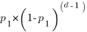 . This is a geometric distribution (an exponential distribution is a good enough approximation). The value can be thought of as the distance between incorrect outputs, measured in the number of distinct inputs correctly processed.
If the program contains a second, different, coding mistake,  whose probability of producing incorrect output, for a given input, is
  , the probability of incorrect output after inputs is now:
 ![(p_1+p_2)*[(1-p_1)*(1-p_2)]^(d-1)](https://shape-of-code.com/wp-content/plugins/wpmathpub/phpmathpublisher/img/math_982_853913cb24fec2f10818b3919fd640c5.png "(p_1+p_2)*[(1-p_1)*(1-p_2)]^(d-1)") . And so on for each distinct coding mistake.
. And so on for each distinct coding mistake.
The value of is driven by the likelihood that the input values cause the program’s flow of control to reach the code containing the coding mistake, and then for the execution of the coding mistake to produce a value that percolates through the executed code to produce an incorrect output value. It might be said that users cause faults by providing the necessary input values.
Each  in the expression
 ![(p_1+p_2+...+p_n)*[(1-p_1)*(1-p_2)*(...)*(1-p_n)]^(d-1)](https://shape-of-code.com/wp-content/plugins/wpmathpub/phpmathpublisher/img/math_982_86feb9ecd2aee2f767263419ffc8aca4.png "(p_1+p_2+...+p_n)*[(1-p_1)*(1-p_2)*(...)*(1-p_n)]^(d-1)") is created by the
is created by the  distinct coding mistakes,
  .
.
In practice the number of distinct coding mistakes, , is unknown, and a single probability is assigned to incorrect output:  , giving:
 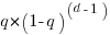 (the substitution
  is a good enough approximation because the are very small).
How accurate is this model in practice?
The analysis below uses data from my top, must read, paper on software fault analysis and a recent study of LLM driven N-version programming.
The N-Version Programming with Coding Agents tested 1-million inputs/outputs, and 14 of the programs in the published results contained 421 incorrect outputs (data kindly provided by Javier Ron). Before discussing the same incorrect counts, does the ‘distance’ between incorrect outputs have an exponential distribution?
This question can be answered using an exponential Q-Q plot (values predicted by theory on the x-axis, actual values on the y-axis). The plot below shows the actual values (blue/green) and a fitted regression line (data from running the claude_code__m_claude-haiku-4.5__l_rust__run000 generated code; code+data):
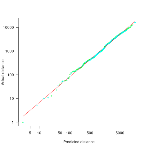
If the data had an exponential distribution the exponent of a fitted power law would be exactly 1. However, the fitted exponent is 1.07, and is statistically significant (for the sample size and standard error of the fit).
The above analysis assumes that the probability of incorrect output,  , is constant. In practice varies across different input values, but over very many inputs is assumed to be clustered around an unchanging average value. It is possible that the input values are divided into two clusters whose incorrect output probabilities are
  and
and  , i.e., a mixture of two exponentials. The worst case scenario is a mixture of umpteen exponentials.
Fitting the distance data to a mixture of two exponentials gives:  (code+data). This corresponds to 10% of the input having an average distance between incorrect output of 482, and 90% having a distance of 2,735 (average 2,482), i.e., one cluster of input values is a lot more likely to produce incorrect output than the other cluster. In the published data the average distance is 2,385.
The specification used for the N-version studies came from a study by Nagel and Skrivan who tracked down each of the coding mistakes in the programs tested. They found that around 80% of incorrect outputs were caused by the same coding mistake, and 16% by a second coding mistake (see figure 4.3.7.1-1; an analysis of the Knight & Leveson coding mistakes). Once these two coding mistakes were fixed, other coding mistakes caused incorrect output.
For the LLM generated code, 14 out of the 59 programs had 421 incorrect outputs. Did the LLMs all generate code containing the same coding mistake? I have yet to track down any of the coding mistakes, or get an LLM to do it for me. Once a few coding mistakes have been fixed, ‘allowing’ other coding mistakes to produce incorrect output, will partially correct LLM generated programs stop having correlated failures?
How much does the number of incorrect output change when a different set of random inputs are used?
The random seed used in the published results is: 42. I replicated this output for all 56 programs (it takes around 8.5 hours on my system), and then ran the 1-million inputs on just four programs using the seeds: 101, 20101, 321, 789, and 6000 (which each took around 1-hour). The table below shows the number of incorrect outputs for the various seeds (each numeric column corresponds to a different seed):
Generation information Number of incorrect outputs claude_code__m_claude-haiku-4.5__l_rust 421 432 374 404 424 452 codex__m_gpt-5.1-codex__l_pascal 421 431 372 402 424 451 claude_code__m_claude-sonnet-4.6__l_pascal 1222 1224 1214 1237 1207 1282 codex__m_gpt-5.4-mini__l_python 10052 10063 10181 9944 9963 10122 |
Two (claude_code__m_claude-haiku-4.5__l_rust and codex__m_gpt-5.1-codex__l_pascal) of the 14 programs that had the same number of incorrect outputs with seed 42, had slightly different number of incorrect outputs with other seeds. This suggests that their coding mistakes are slightly different.
All the generated programs had some deviation from the pure single exponential model discussed above.
This simple model for ‘distance’ between incorrect outputs is a good fit to reality because the program performs one basic function and is relatively short (around 500 lines). Larger programs supporting a selection of functionality are going to require much more complicated models.
Reliability via N-version programming?
N-version programming was first proposed in 1978, probably the most known paper on the subject was published in 1986, after which activity was mostly within safety-critical systems circles. Cost was a major issue, it’s expensive to create one version of a program, and producing  independent versions is around times more expensive.
Now that LLM have significantly reduced the cost of creating programs, people have started to experiment with creating many versions of a specification.
In the past, interest in N-version programming focused on reliability. The idea is that independent implementations of the same specification will contain different coding mistakes, and that when a fault is experienced in one implementation the others will behave as intended, e.g., in a system with  , a two-out-of-three vote is enough to ensure correct behavior.
The 1986 Knight and Leveson paper found that coding mistakes were correlated, i.e., different implementations, written by different people, sometimes contained the same mistake (so three systems might not be enough to ensure high reliability). The results were replicated, with varying percentages of total and common faults experienced. The possibility that using the same specification for all implementations might be a significant contributor to common mistakes is often raised, but I am not aware of any published studies. There are also implementations issues such as the fuzziness of floating-point arithmetic.
On Monday this week the paper: Do programming languages still matter to your AI coding agent teammate? Evidence at scale from chess engines discussed using LLMs to create 34 chess engines spanning 17 programming languages, and on Thursday the paper N-Version Programming with Coding Agents by Ron, Baudry, and Monperrus (RBM) replicated the Knight/Leveson (KL) paper using programs generated by a variety of LLMs from the specification used by KL (originally used in my top, must-read paper on software fault analysis).
How did the KL and RBM results compare? The KL study involved 27 students each creating an implementation of the same specification in Pascal and had to pass an acceptance test containing 200 tests (randomly generated for each implementation, to prevent filtering of shared faults). The RBM study created 69 implementations (23 in each of Pascal, Python and Rust) of the same KL specification using different coding agents from five vendors. Implementations that failed the acceptance test (10 Pascal, 5 Python, 6 Rust) were not given the opportunity to fix the code.
Each implementation was given the same set of 1-million inputs, and the results compared against those obtained from an Oracle. Based on the number of times each implementation failed (i.e., produced incorrect output), and assuming that each implementation’s failures are independent of other implementations, it’s possible to calculate the expected number of cases where two or more distinct implementations fail on the same input (Kimi steps through the maths). The expected number of multiple failures on the same input is (the actual numbers are in brackets): KL 127 (1,255); RBM Pascal 6 (426), Python 57 (424), Rust 6 (424).
There are a lot more actual instances of two or more implementations failing on the same input, than would be the case if the failures were independent of each other (the statistical analysis shows that the much larger values are extremely unlikely; code+data). The implication is that similar coding mistakes are being made across implementations, leading to correlated failures.
The error rates for the LLM generated programs look a lot lower than those in the KL study. Are the LLM generated programs more reliable than the human written programs? Later studies with human subjects also had a much lower error rate, suggesting that the higher error rate in the KL study was caused by the use of student subjects.
Fans of a particular language will often claim that it has various desirable characteristics, e.g., readability, maintainability and reliability. There is no evidence for any of these claims, and I have always thought that, post-release of the program, programming language is essentially irrelevant. Mistakes and assumptions tend to be language independent. This small sample of programs for one problem don’t show any significant differences between languages (perhaps there is one, but a much larger sample will be needed to see it). In the past, multi-language studies have often used examples from Rosetta Code (also see sections 2.5 and 7.2.9 of my book). Given the perennial interest in comparing programming languages, I am expecting many papers on the subject over the next few years.
A more interesting question is the variability in the source code generated by different LLMs, for the same specification. I am expecting that it will contain some of the patterns in human written code, as well as some patterns of human variation.
Perhaps LLM source code generation does not need to become as reliable as compiler machine code generation, vendors just have to make sure that the mistakes they make are not correlated.
Statistical note: KL uses the Wald interval to estimate the statistical significance (and RBM replicates). There are issues with this approximation when the probability of failure is close to zero (it does not matter here because the difference between theory and practice is so large). These days libraries implementing the complicated, technically correct, approach are available, e.g., binomtest is in Python’s scipy.stats package and binomial.test is included in R’s base system.
Answering via a scale to improve estimation accuracy
The human brain differs from the brain of other animals in having two number processing systems: 1) the approximate number system (present in other animals), and 2) language.
Round numbers are often given in answers when using language, to questions having a numeric answer. While use of round numbers may be conversationally appropriate, they decrease the accuracy of the answer.
Numeric values can be specified without using language. For instance, by pointing at a position on a scale representing a sequence of increasing/decreasing values, such as a ruler. Are answers given by pointing at a scale less likely to be round numbers, and more importantly are they likely to be more accurate than answers given using language?
Various studies by psychologists have investigated response differences between answering using language and scales. The analysis below is based on data from the paper: On the round number bias and wisdom of crowds in different response formats for numerical estimation by Honda, Kagawa and Shirasuna. This study asked 1,805 subjects to estimate the number of dots in an image, like the one below, with images containing: 183, 287, 360, 453, 554, 633, 719, 807, or 986 dots (randomly selected):

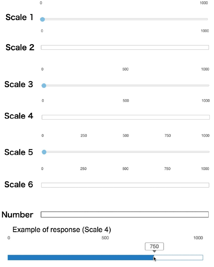
Subjects responded using a randomly selected one of six different scales or using language (i.e., typing a number). The scales differed in axis labeling and some were zero based (subjects had to slide the blue colored circle from zero to a position, rather than clicking on a position); see image below:
The plot below shows the normalised occurrences of estimate values (rounded to the nearest value divisible by five) made using language (red) and one of the scales (blue/green), with grey line showing actual number of dots. There was little difference between the various kinds of scales, and all the scale answers have been aggregated (code+data):
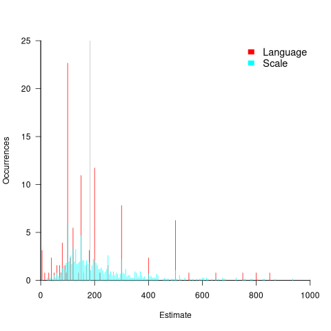
The red spikes clearly show many language given answers are at round numbers. The answers given using a scale are much less likely to be round numbers, with the blue/green lines showing the use of a wider selection of estimates.
Are answers given using language likely to be more or less accurate than answer given using a scale?
The plot above shows that few responses are close to the actual value, which means that no fitted model is going to explain much of the variability in the data. All the regression models I fitted to the difference between answers and actuals found that languages responses were less accurate, on average (code+data). Combining the explanatory variables in a variety of different ways did not significantly affect the quality of the fitted model.
In hand-wavy terms, the average error in the language responses was at most 10% larger than the scale responses.
To summaries, scale responses are likely to be more accurate, but a lot less likely to be a round number.
People are willing to tradeoff accuracy for being able to communicate using a round number. For instance, I once pointed out to a manager that changing all 1-hour estimates to 1.25 hours would significantly improve accuracy; he was unwilling to give up the greater uncertainty implied by the 1-hour estimate.
Will this behavior replicate for software task estimates? Is it possible to shift a scale answer to the closest round number without losing the accuracy advantage?
We will have to wait until somebody does the appropriate study.
Identifier names chosen to hold the same information
Identifier naming is a contentious issue dominated by opinions and existing habits, with almost no experimental evidence (rather like software engineering practices in general).
One study found that around 40% of all non-white-space characters in the visible source of C programs are identifiers (comments representing 31% of the characters in the .c files), representing 29% of the visible tokens in the .c files.
Some years ago I spent a long time studying the word related experiments run by psychologists, looking for possible parallels with identifier usage. The crucial identifier naming factor is the semantic associations a name triggers in the reader’s mind. Choosing a name requires making a cost-benefit tradeoff. The greater quantity of information that might be communicated by longer names has to be balanced against both the cost of reading the name and ignoring the name when searching for other information.
The semantic association network present in a person’s head is the result of the words they have encountered and the context in which they were encountered. Different people are likely to make different associations. Shared culture and experiences increases the likelihood of shared naming associations.
A study by Nelson, McEvoy, and Schreiber gave subjects (over time, 6,000 students at the University of South Florida) a booklet containing 100 words, and asked them to write down the first word that came to mind that was meaningfully related or strongly associated to each of these words (data here, a total of 612,627 responses to 5,024 distinct words). The mean number of different responses to the same word was 14.4, with a standard deviation of 5.2.
There are patterns in the names of identifiers. For instance, operands of bitwise and logical operators have names that include words whose semantics is associated with the operations usually performed by these operands, such as: flag, status, state, and mask. One experiment (with a small sample size) found that developers make use of operand names to make operator precedence decisions.
A study by Feitelson, Mizrahi, Noy, Shabat, Eliyahu, and Sheffer, investigated the variable names chosen by developers to hold specific information. The 334 subjects (students and professional developers) were asked to suggest a name for a variable, constant, or data structure based on a description of the information it would contain, plus other questions relating to interpreting the semantics associated with a name.
The authors cite a problem that I think is actually a benefit: “A major problem in studying spontaneous naming is that the description of the context and the question itself necessarily use words.” When writing code a well-chosen name communications information about the context, which helps readers understand what is going on. The authors’ solution to this perceived problem was to give the description in either Hebrew or English (the subjects were native Hebrew speakers who are fluent in English), with subjects providing the name in English.
The answers to the 21 name generation questions had a mean of 53 distinct names (standard deviation 20.2; code and data). The table below shows the names chosen and the number of subjects choosing that name after seeing the description in Hebrew or English, for one of the questions.
Name Hebrew English b_elevator_door_state 1 b_is_door_open 1 curr_state 2 current_doors_state 1 door 3 1 door_current_status 1 door_is_closed 1 door_is_open 1 door_open 3 door_stat 1 door_state 10 12 door_status 4 doorstate 1 1 elevator_door_state 1 1 elevator_state 1 is_closed 1 1 is_door_closed 2 1 is_door_open 11 3 is_door_opened 2 2 is_elevator_open 1 is_o_pen 1 is_open 7 5 is_opened 2 state 1 status 1 status_of_door 1 |
While the names are distinct, some only differ by a permutation of words, e.g., door_is_open and is_door_open, or with one word missing, e.g., door_open and is_open, or two words missing, e.g., door.
If subjects are influenced by the description (e.g., using the word ordering that appears in the description, or only words from the description), the number of unique names would be smaller than if there was no such influence. The impact of influence would be that subjects seeing the English descriptions are likely to produce fewer unique names.
In 13 out of 21 questions, Hebrew subjects produced more unique names. However, a bootstrap test shows that the difference is not statistically significant.
I think a big threat to the validity of the study is only having subjects create one name. Writing software involves creating names for many variables, which has different cost-benefit tradeoffs than when creating a single variable. The names within a program share a common context and developers tend to follow informal patterns so that naming within the code has some degree of consistency. Adhering to these patterns restricts the possible set of names that might be chosen. Also, the existing use of a name may prevent it being reused for a new variable.
Programming competitions are one source for variable names implementing the same specification, at least for short program. Longer programs are more likely to have some variation in the algorithms used to implement the same functionality.
I expect greater consistency of identifier name selection within an LLM than across developers. LLM training will direct them down existing common patterns of usage, plus some random component.
Naming convergence in a network of pairwise interactions
While naming and categorizing things are perhaps the two most contentious issues in software engineering, there is often a great deal of similarity in the names and categorizes used by unconnected groups. These characteristics of naming and categorization are general observed behaviors across cultures and languages, with software engineering being a particular example.
Studies have found that a particular name for a thing is likely to become adopted by a group, if around 25% of its members actively promote the use of the name. The terms tipping point and critical mass have been applied to the 25% quantity.
What factors could cause 25% of the members of a group to select a particular name, and why does a tipping point occur at around this percentage?
The paper Experimental evidence for scale-induced category convergence across populations by Douglas Guilbeault (PhD thesis behind the paper), Andrea Baronchelli, and Damon Centola experimentally investigated factors that can cause a name to be adopted by 25% of a group’s members, and the researchers proposed a model that exhibits behavior similar to the experimental results (the supplement contains the technical details).
The experiment asked subjects to play the “Grouping Game”. The 1,480 online subjects were divided into networks containing either 2, 6, 8, 24 or 50 members. The interaction between members of a network only occurred via randomly selected pairs (the same pair for the network of two), with one person designated as the speaker and the other as the hearer. A pair saw three randomly selected images, such as the one below. For the speaker only, one of the images was highlighted, and they had to give a name containing at most six characters to the image. The hearer saw the name given by the speaker to one of the images, and had 30 seconds to choose the image they considered to have been named. If the image selected by the hearer was the one named by the speaker, both received a small payment, otherwise an even smaller amount was deducted from their final payment. Each subject played 100 rounds with the randomly chosen members of their network.

The images were created as a series of 50+ distinct patterns whose shape slowly morphed along a continuum, as in the following image:

The experimental results were that larger networks converged to a consistent, within group, naming of the images (using a few names), while smaller groups rarely converged and used many different names. The researchers proposed that as the network size grew, common names were encountered more often than rarer names, increasing the likelihood of reaching a tipping point. This behavior is similar to the birthday paradox, where there is a 50% probability that in a room of 23 people, two people will share the same birthday.
In the experiment, some networks included confederates trained to use a small subset of names, i.e., the researchers created a common set of names. It was hypothesized built-in human preferences would produce common patterns in the real world that, for larger groups, would cause tipping points to occur, amplifying the more common patterns to become group norms.
The supplement to the paper develops a theoretical model based on the probability of  identical items being contained in a sample of items, when sampling without replacement. The solution involves the hypergeometric distribution, which is difficult to deal with analytically, so simulation is needed. The results show a tipping point at around 25%.
The plot below shows a density plot for one 50-subject network over 15 trials (after 100 rounds of pairwise interaction), with each color denoting one of the 14 chosen names (height of the curve denotes likelihood of the same name being chosen for that image; code and data):
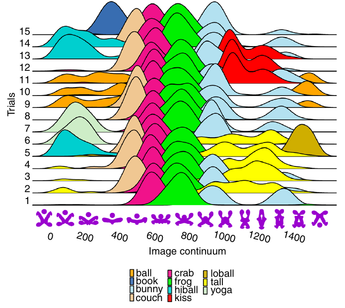
This plot shows that the same name is often used across trials, and naming boundaries between some images.
The plot below shows a density plot for one 2-subject network over 15 trials (after 100 rounds of pairwise interaction), with each color denoting one of the 72 chosen names (height of the curve denotes likelihood of the same name being chosen for that image; code and data):
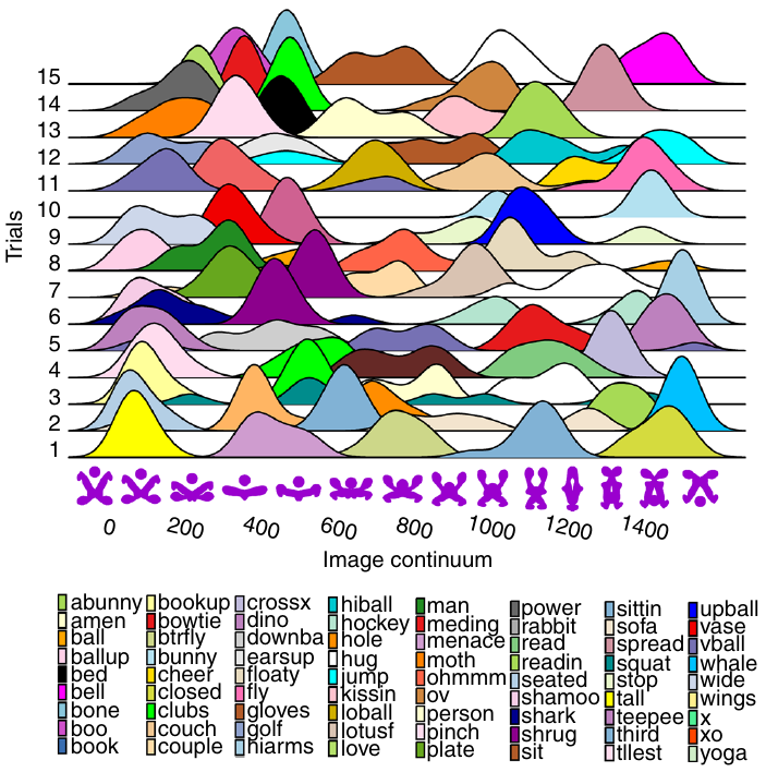
Here there is no consistent naming across trials, a much greater diversity of names appearing, and no obvious naming boundaries between images.
Positive and negative descriptions of numeric data
Effective human communication is based on the cooperative principle, i.e., listeners and speakers act cooperatively and mutually accept one another to be understood in a particular way. However, when seeking to present a particular point of view, speakers may prefer to be economical with the truth.
To attract citations and funding, researchers sell their work via the papers they publish (or blogs they write), and what they write is not subject to the Advertising Standards Authority rule that “no marketing communication should mislead, or be likely to mislead, by inaccuracy, ambiguity, exaggeration, omission or otherwise” (my default example).
When people are being economical with the truth, when reporting numeric information, are certain phrases or words more likely to be used?
The paper: Strategic use of English quantifiers in the reporting of quantitative information by Silva, Lorson, Franke, Cummins and Winter, suggests some possibilities.
In an experiment, subjects saw the exam results of five fictitious students and had to describe the results in either a positive or negative way. They were given a fixed sentence and had to fill in the gaps by selecting one of the listed words; as in the following:
             all                      all
             most                     most                  right
In this exam .... of the students got .... of the questions .....
             some                     some                  wrong
none none |
If you were shown exam results with 2 out of 5 students failing 80% of questions and the other 3 out of 5 passing 80% of questions, what positive description would you use, and what negative description would you use?
The 60 subjects each saw 20 different sets of exam results for five fictitious students. The selection of positive/negative description was random for each question/subject.
The results found that when asked to give a positive description, most responses focused on questions that were right, and when asked to give a negative description, most responses focused on questions that were wrong
How many questions need to be answered correctly before most can be said to be correct? One study found that at least 50% is needed.
“3 out of 5 passing 80%” could be described as “… most of the students got most of the questions right.”, and “2 out of 5 students failing 80%” could be described as “… some of the students got most of the questions wrong.”
The authors fitted a Bayesian linear mixed effect models, which showed a somewhat complicated collection of connections between quantifier use and exam results. The plots below provide a visual comparison of the combination of quantifier use for positive (upper) and negative (lower) descriptions.
The alluvial plot below shows the percentage flow, for Positive descriptions, of each selected quantifier through student and question, and then adjective (code+data):

For the same distribution of exam results, the alluvial plot below shows the percentage flow, for Negative descriptions, of each selected quantifier through student and question, and then adjective (code+date):
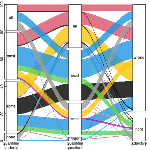
Other adjectives could be used to describe the results (e.g., few, several, many, not many, not all), and we will have to wait for the follow-up research to this 2024 paper.
Impact of developer uncertainty on estimating probabilities
For over 50 years, it has been known that people tend to overestimate the likelihood of uncommon events/items occurring, and underestimate the likelihood of common events/items. This behavior has replicated in many experiments and is sometimes listed as a so-called cognitive bias.
Cognitive bias has become the term used to describe the situation where the human response to a problem (in an experiment) fails to match the response produced by the mathematical model that researchers believe produces the best output for this kind of problem. The possibility that the mathematical models do not reflect the reality of the contexts in which people have to solve the problems (outside of psychology experiments), goes against the grain of the idealised world in which many researchers work.
When models take into account the messiness of the real world, the responses are a closer match to the patterns seen in human responses, without requiring any biases.
The 2014 paper Surprisingly Rational: Probability theory plus noise explains biases in judgment by F. Costello and P. Watts (shorter paper), showed that including noise in a probability estimation model produces behavior that follows the human behavior patterns seen in practice.
If a developer is asked to estimate the probability that a particular event,  , occurs, they may not have all the information needed to make an accurate estimate. They may fail to take into account some s, and incorrectly include other kinds of events as being s. This noise, , introduces a pattern into the developer estimate:

where:  is the developer’s estimated probability of event occurring,
  is the actual probability of the event, and is the probability that noise produces an incorrect classification of an event as
  or (for simplicity, the impact of noise is assumed to be the same for both cases).
The plot below shows actual event probability against developer estimated probability for various values of , with a red line showing that at  , the developer estimate matches reality (code):

The effect of noise is to increase probability estimates for events whose actually probability is less than 0.5, and to decrease the probability when the actual is greater than 0.5. All estimates move towards 0.5.
What other estimation behaviors does this noise model predict?
If there are two events, say  and
and  , then the noise model (and probability theory) specifies that the following relationship holds:

where:  denotes the probability of its argument.
The experimental results show that this relationship does hold, i.e., the noise model is consistent with the experiment results.
This noise model can be used to explain the conjunction fallacy, i.e., Tversky & Kahneman’s famous 1970s “Lindy is a bank teller” experiment.
What predictions does the noise model make about the estimated probability of experiencing  (
( ) occurrences of the event in a sequence of
  assorted events (the previous analysis deals with the case
  )?
)?
An estimation model that takes account of noise gives the equation:

where:  is the developer’s estimated probability of experiencing s in a sequence of length , and
  is the actual probability of there being .
The plot below shows actual event probability against developer estimated probability for various values of , with a red line showing that at , the developer estimate matches reality (code):

This predicted behavior, which is the opposite of the case where , follows the same pattern seen in experiments, i.e., actual probabilities less than 0.5 are decreased (towards zero), while actual probabilities greater than 0.5 are increased (towards one).
There have been replications and further analysis of the predictions made by this model, along with alternative models that incorporate noise.
To summarise:
When estimating the probability of a single event/item occurring, noise/uncertainty will cause the estimated probability to be closer to 50/50 than the actual probability.
When estimating the probability of multiple events/items occurring, noise/uncertainty will cause the estimated probability to move towards the extremes, i.e., zero and one.
Evolution has selected humans to prefer adding new features
Assume that clicking within any of the cells in the image below flips its color (white/green). Which cells would you click on to create an image that is symmetrical along the horizontal/vertical axis?

In one study, 80% of subjects added a block of four green cells in each of the three white corners. The other 20% (18 of 91 subjects) made a ‘subtractive’ change, that is, they clicked the four upper left cells to turn them white (code+data).
The 12 experiments discussed in the paper People systematically overlook subtractive changes by Adams, Converse, Hales, and Klotz (a replication) provide evidence for the observation that when asked to improve an object or idea, people usually propose adding something rather than removing something.
The human preference for adding, rather than removing, has presumably evolved because it often provides benefits that out weigh the costs.
There are benefits/costs to both adding and removing.
Creating an object:
- may produce a direct benefit and/or has the potential to increase the creator’s social status, e.g., ‘I made that’,
- incurs the cost of time and materials needed for the implementation.
Removing an object may:
- produce savings, but these are not always directly obvious, e.g., simplifying an object to reduce the cost of adding to it later. Removing (aka sacking) staff is an unpopular direct saving,
- generate costs by taking away any direct benefits it provides and/or reducing the social status enjoyed by the person who created it (who may take action to prevent the removal).
For low effort tasks, adding probably requires less cognitive effort than removing; assuming that removal is not a thoughtless activity. Chesterton’s fence is a metaphor for prudence decision-making, illustrating the benefit of investigating to find out if any useful service provided by what appears to be a useless item.
There is lots of evidence that while functionality is added to software systems, it is rarely removed. The measurable proxy for functionality is lines of code. Lots of source code is removed from programs, but a lot more is added.
Some companies have job promotion requirements that incentivize the creation of new software systems, but not their subsequent maintenance.
Open source is a mechanism that supports the continual adding of features to software, because it does not require funding. The C++ committee supply of bored consultants proposing new language features, as an outlet for their creative urges, will not dry up until the demand for developers falls below the supply of developers.
Update
The analysis in the paper More is Better: English Language Statistics are Biased Toward Addition by Winter, Fischer, Scheepers, and Myachykov, finds that English words (based on the Corpus of Contemporary American English) associated with an increase in quantity or number are much more common than words associated with a decrease. The following table is from the paper:
     Word       Occurrences
     add          361,246
     subtract       1,802
     addition      78,032
     subtraction      313
     plus         110,178
     minus         14,078
     more       1,051,783
     less         435,504
     most         596,854
     least        139,502
     many         388,983
     few          230,946
     increase      35,247
decrease 4,791 |
Deciding whether a conclusion is possible or necessary
Psychologists studying human reasoning have primarily focused on syllogistic reasoning, i.e., the truthfulness of a necessary conclusion from two stated premises, as in the following famous example:
    All men are mortal.
    Socrates is a man.
Therefore, Socrates is mortal. |
Another form of reasoning is modal reasoning, which deals with possibilities and necessities; for example:
    All programmers like jelly beans,
    Tom likes jelly beans,
Therefore, it is possible Tom is a programmer. |
Possibilities and necessities are fundamental to creating software. I would argue (without evidence) that possibility situations occur much more frequently during software development than necessarily situations.
What is the coding impact of incorrect Possible/Necessary decisions (the believability of a syllogism has been found to influence subject performance)?
- Conclusion treated as possible, while being necessary: A possibility involves two states, while necessity is a single state. A possible condition implies coding an
if/else(or perhaps one arm of anif), while a necessary condition is at most one arm of anif(or perhaps nothing).The likely end result of making this incorrect decision is some dead code.
- Conclusion treated as necessary, while being possible: Here two states are considered to be a single state.
The likely end result of making this incorrect decision is incorrect code.
What have the psychology studies found?
The 1999 paper: Reasoning About Necessity and Possibility: A Test of the Mental Model Theory of Deduction by J. St. B. T. Evans, S. J. Handley, C. N. J. Harper, and P. N. Johnson-Laird, experimentally studied three predictions (slightly edited for readability):
- People are more willing to endorse conclusions as Possible than as Necessary.
- It is easier to decide that a conclusion is Possible if it is also Necessary. Specifically, we predict more endorsements of Possible for Necessary than for Possible problems.
- It is easier to decide that a conclusion is not Necessary if it is also not Possible. Specifically, we predict that more Possible than Impossible problems will be endorsed as Necessary.
Less effort is required to decide that a conclusion is Possible because just one case needs to be found, while making a Necessary decision requires evaluating all cases.
In one experiment, subjects (120 undergraduates studying psychology) saw a screen containing a question such as the following (an equal number of questions involved NECESSARY/POSSIBLE):
   GIVEN THAT
     Some A are B
   IS IT NECESSARY THAT
Some B are not A |
Subjects saw each of the 28 possible combinations of four Premises and seven Conclusions. The table below shows eight combinations of the four Premises and seven conclusions, the Logic column shows the answer (N=Necessary; I=Impossible; P=Possible), and the Necessary/Possible columns show the number of subjects answering that the conclusion was Necessary/Possible:
Premise Conclusion Logic Necessary Possible All A are B Some A are B N 65 82 All A are B No A are B I 3 12 Some A are B All A are B P 3 53 Some A are B No A are B I 8 55 No A are B Some A are not B N 77 80 No A are B No B are A I 7 25 Some A are not B All A are B I 2 3 Some A are not B Some B are A P 70 95 |
The table below shows the percentage of answer specifying that the conclusion was Necessary/Possible (2nd/3rd rows), when the Logical answer was one of Impossible/Necessary/Possible (code+data):
  Logic   I     N     P
    N     8%   59%   38%
P 19% 71% 60% |
The percentage of Possible answers is always much higher than Necessary answers (when a Conclusion is Necessary, it is also Possible), even when the Conclusion is Impossible. The 38% of Necessary answers for when the Conclusion is only Possible is somewhat concerning, as this decision could produce coding mistakes.
The paper ran a second experiment involving two premises, like the Jelly bean example, attempting to distinguish strong/weak forms of Possible.
Do these results replicate?
The 2024 study Necessity, Possibility and Likelihood in Syllogistic Reasoning by D. Brand, S. Todorovikj, and M. Ragni, replicated the results. This study also investigated the effect of using Likely, as well as Possible/Necessary. The results showed that responses for Likely suggested it was a middle ground between Possible/Necessary.
After writing the above, I asked Grok: list papers that have studied the use of syllogistic reasoning by software developers: nothing software specific. The same question for modal reasoning returned answers on the use of Modal logic, i.e., different subject. Grok did a great job of summarising the appropriate material in my Evidence-base Software Engineering book.
Recent Comments