Archive
Example of an initial analysis of some new NASA data
For the last 20 years, the bug report databases of Open source projects have been almost the exclusive supplier of fault reports to the research community. Which, if any, of the research results are applicable to commercial projects (given the volunteer nature of most Open source projects and that anybody can submit a report)?
The only way to find out if Open source patterns are present in closed source projects is to analyse fault reports from closed source projects.
The recent paper Software Defect Discovery and Resolution Modeling incorporating Severity by Nafreen, Shi and Fiondella caught my attention for several reasons. It does non-trivial statistical analysis (most software engineering research uses simplistic techniques), it is a recent dataset (i.e., might still be available), and the data is from a NASA project (I have long assumed that NASA is more likely than most to reliable track reported issues). Lance Fiondella kindly sent me a copy of the data (paper giving more details about the data)!
Over the years, researchers have emailed me several hundred datasets. This NASA data arrived at the start of the week, and this post is an example of the kind of initial analysis I do before emailing any questions to the authors (Lance offered to answer questions, and even included two former students in his email).
It’s only worth emailing for data when there looks to be a reasonable amount (tiny samples are rarely interesting) of a kind of data that I don’t already have lots of.
This data is fault reports on software produced by NASA, a very rare sample. The 1,934 reports were created during the development and testing of software for a space mission (which launched some time before 2016).
For Open source projects, it’s long been known that many (40%) reported faults are actually requests for enhancements. Is this a consequence of allowing anybody to submit a fault report? It appears not. In this NASA dataset, 63% of the fault reports are change requests.
This data does not include any information on the amount of runtime usage of the software, so it is not possible to estimate the reliability of the software.
Software development practices vary a lot between organizations, and organizational information is often embedded in the data. Ideally, somebody familiar with the work processes that produced the data is available to answer questions, e.g., the SiP estimation dataset.
Dates form the bulk of this data, i.e., the date on which the report entered a given phase (expressed in days since a nominal start date). Experienced developers could probably guess from the column names the work performed in each phase; see list below:
    Date Created
    Date Assigned
    Date Build Integration
    Date Canceled
    Date Closed
    Date Closed With Defect
    Date In Test
    Date In Work
    Date on Hold
    Date Ready For Closure
    Date Ready For Test
    Date Test Completed
Date Work Completed |
There are probably lots of details that somebody familiar with the process would know.
What might this date information tell us? The paper cited had fitted a Cox proportional hazard model to predict fault fix time. I might try to fit a multi-state survival model.
In a priority queue, task waiting times follow a power law, while randomly selecting an item from a non-prioritized queue produces exponential waiting times. The plot below shows the number of reports taking a given amount of time (days elapsed rounded to weeks) from being assigned to build-integration, for reports at three severity levels, with fitted exponential regression lines (code+data):
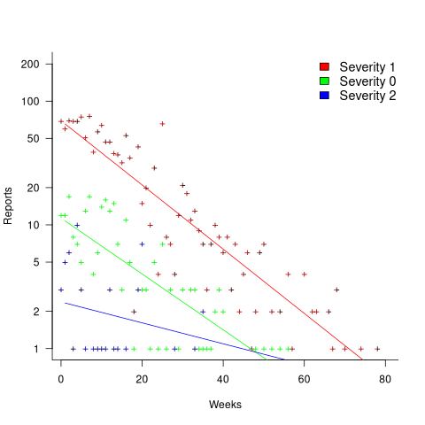
Fitting an exponential, rather than a power law, suggests that the report to handle next is effectively selected at random, i.e., reports are not in a priority queue. The number of severity 2 reports is not large enough for there to be a significant regression fit.
I now have some familiarity with the data and have spotted a pattern that may be of interest (or those involved are already aware of the random selection process).
As always, reader suggestions welcome.
My 2024 in software engineering
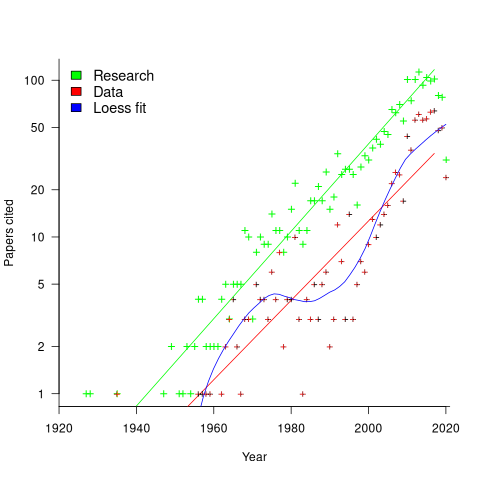
Readers are unlikely to have noticed something that has not been happening during the last few years. The plot below shows, by year of publication, the number of papers cited (green) and datasets used (red) in my 2020 book Evidence-Based Software Engineering. The fitted red regression lines suggest that the 20s were going to be a period of abundant software engineering data; this has not (yet?) happened (the blue line is a local regression fit, i.e., loess). In 2020 COVID struck, and towards the end of 2022 Large Language Models appeared and sucked up all the attention in the software research ecosystem, and there is lots of funding; data gathering now looks worse than boring (code+data):
LLMs are showing great potential as research tools, but researchers are still playing with them in the sandpit.
How many AI startups are there in London? I thought maybe one/two hundred. A recruiter specializing in AI staffing told me that he would estimate around four hundred; this was around the middle of the year.
What did I learn/discover about software engineering this year?
Regular readers may have noticed a more than usual number of posts discussing papers/reports from the 1960s, 1970s and early 1980s. There is a night and day difference between software engineering papers from this start-up period and post mid-1980s papers. The start-up period papers address industry problems using sophisticated mathematical techniques, while post mid-1980s papers pay lip service to industrial interests, decorating papers with marketing speak, such as maintainability, readability, etc. Mathematical orgasms via the study of algorithms could be said to be the focus of post mid-1980s researchers. So-called software engineering departments ought to be renamed as Algorithms department.
Greg Wilson thinks that the shift happened in the 1980s because this was the decade during which the first generation of ‘trained in software’ people (i.e., emphasis on mathematics and abstract ideas) became influential academics. Prior generations had received a practical training in physics/engineering, and been taught the skills and problem-solving skills that those disciplines had refined over centuries.
My research is a continuation of the search for answers to the same industrial problems addressed by the start-up researchers.
In the second half of the year I discovered the mathematical abilities of LLMs, and started using them to work through the equations for various models I had in mind. Sometimes the final model turned out to be trivial, but at least going through the process cleared away the complications in my mind. According to reports, OpenAI’s next, as yet unreleased, model has super-power maths abilities. It will still need a human to specify the equations to solve, so I am not expecting to have nothing to blog about.
Analysis/data in the following blog posts, from the last 12-months, belongs in my book Evidence-Based Software Engineering, in some form or other:
Small business programs: A dataset in the research void
Putnam’s software equation debunked (the book is non-committal).
if statement conditions, some basic measurements
Number of statement sequences possible using N if-statements; perhaps.
A new NASA software dataset from the 1970s
A surprising retrospective task estimation dataset
Average lines added/deleted by commits across languages
Census of general purpose computers installed in the 1960s
Some information on story point estimates for 16 projects
Agile and Waterfall as community norms
Median system cpu clock frequency over last 15 years
The evidence-based software engineering Discord channel continues to tick over (invitation), with sporadic interesting exchanges.
Confidence intervals: my one recommended practice
What recommended practices should developers/managers follow when analysing data they have collected/available?
The scientific approach to data analysis mandates specifying a hypothesis before gathering the data, let alone analysing it. This approach has proven workable when researchers are familiar with an evidence-based body of knowledge. In this environment it’s acceptable, even required, to criticise anyone who analyses data without having a hypothesis and just follow along where ever the data appears to lead.
In fields lacking an evidence-based body of knowledge, such as software engineering (which does have an extensive body of folklore), it can be difficult to articulate a reasonable set of hypothesis to test against, before analysing the date. Time and cost are the incentives that push developers/managers in to simply following the data where ever it leads them:
- understandably, they are only interested in solving their own local problem, not building global theories of software engineering practices,
- as occasional data analysts, developers/managers probably have little or no experience in formulating hypothesis, and don’t have the time to become familiar with the existing evidence around the processes of interest,
- formulating a hypothesis, along with its associated model of the world, can require a surprising amount of work, often involving many interacting factors to consider (an ad-hoc approach based on an evolving analysis of data can appear to need a lot less effort).
Following the data can feel like the agile approach to data analysis. However, thoughtlessly following the data is fraught with dangers, particularly with small sample sizes (while there are often copious quantities of source, the human side of software engineering often involves miniscule sample sizes). It has always been difficult to get developers to slow down and think when writing code, it seems unrealistic to expect habits to change for data analysis.
I take a somewhat schizophrenic approach in my workshop for software developers, with many slides illustrating the dangers of just jumping in, along with other slides showing how to quickly find patterns in data (the main topic of conversation during the hands-on sessions).
My one recommended practice is that confidence intervals be calculated and included in the presented results. Why just one recommendation? I think recommendations involving sample size, hypothesis, thinking hard, etc will be ignored. Results showing wide confidence intervals highlight a range of possible problems: insufficient sample sizes, along with marginal effects and other uncertainties.
The scientific recommendation approach would be to use p-values. The problem with these is that they will probably have to be explained to developers/managers, who will have little idea about how to interpret them.
The presence of confidence intervals in a summary of results is a major step up from current practices. My experiences with developer/manager driven data analysis include:
- using data, that happens to be available, that has no connection to the questions of interest,
- collecting data, but fail to extract much information (because primitive analysis techniques were used). This situation is also very common in software engineering research papers,
- selling an idea, not the results, sometimes blatantly going against the direction implied by the data analysis (not so common in research papers),
- getting lucky/unlucky with subject performance, in a tiny sample, and claim certainty in the results.
Workshop on data analysis for software developers
I’m teaching a workshop on data analysis for software engineers on 22 June. The workshop is organized by the British Computer Society’s SPA specialist group, and can be attended remotely.
Why is there a small registration charge (between £2 and £15)? Typically, 30% to 50% of those registered for a free event actually turn up. It is very frustrating when all the places are taken, people are turned away, and then only half those registered turn up. We decided to charge a minimal amount to deter the uncommitted, and include lunch. Why the variable pricing? The BCS have a rule that members have to get a discount, and HMRC does not allow paid+free options (I suspect this has more to do with the software the BCS are using).
It’s a hands-on workshop that aims to get people up and running with practical data analysis. As always, my data analysis hammer of choice is regression analysis.
A few things are being updated since I last gave this workshop?
While my completed book Evidence-based Software Engineering was not available when the last workshop was given, the second half containing the introductory statistics material was available for download. There has not been any major changes to the statistical material in this second half.
The one new statistical observation I plan to highlight is that in software engineering, there is a lot of data that does not have a normal distribution. Many data analysis are aimed at the social sciences (the biggest market), and they frequently just assume that all the data is normally distributed; software engineering data is different.
For a very long time I have known that most developers/managers do not collect and analyse measurements of their development processes. However, I had underestimated ‘most’, which I now think is at least 99%.
Given the motivation, developers/managers would measure and analyse processes. I plan to update the material to have a motivational theme, along with illustrating the statistical points being made. The purpose of the motivational examples is to give attendees something to take back and show their managers/coworkers: Look, we can find out where all our money/time is being wasted. I assume that attendees are already interested in analysing software engineering data (why else would they be spending a Saturday at the workshop).
I have come up with a great way of showing how many of software engineering’s cited ‘facts’ are simply folklore derived from repeating opinions from papers published long ago (or derived from pitifully small amounts of data). The workshop is hands-on, with attendees individually working through examples. The plan is for examples to be based on the data behind some of these ‘facts’, e.g., Halstead & McCabe metrics, and COCOMO.
Tips, and suggestions for topics to discuss welcome.
Average lines added/deleted by commits across languages
Are programs written in some programming language shorter/longer, on average, than when written in other languages?
There is a lot of variation in the length of the same program written in the same language, across different developers. Comparing program length across different languages requires a large sample of programs, each implemented in different languages, and by many different developers. This sounds like a fantasy sample, given the rarity of finding the same specification implemented multiple times in the same language.
There is a possible alternative approach to answering this question: Compare the size of commits, in lines of code, for many different programs across a variety of languages. The paper: A Study of Bug Resolution Characteristics in Popular Programming Languages by Zhang, Li, Hao, Wang, Tang, Zhang, and Harman studied 3,232,937 commits across 585 projects and 10 programming languages (between 56 and 60 projects per language, with between 58,533 and 474,497 commits per language).
The data on each commit includes: lines added, lines deleted, files changed, language, project, type of commit, lines of code in project (at some point in time). The paper investigate bug resolution characteristics, but does not include any data on number of people available to fix reported issues; I focused on all lines added/deleted. Modifying a line will be treated as an deleted/added line.
Different projects (programs) will have different characteristics. For instance, a smaller program provides more scope for adding lots of new functionality, and a larger program contains more code that can be deleted. Some projects/developers commit every change (i.e., many small commit), while others only commit when the change is completed (i.e., larger commits). There may also be algorithmic characteristics that affect the quantity of code written, e.g., availability of libraries or need for detailed bit twiddling.
It is not possible to include project-id directly in the model, because each project is written in a different language, i.e., language can be predicted from project-id. However, program size can be included as a continuous variable (only one LOC value is available, which is not ideal).
The following R code fits a basic model (the number of lines added/deleted is count data and usually small, so a Poisson distribution is assumed; given the wide range of commit sizes, quantile regression may be a better approach):
alang_mod=glm(additions ~ language+log(LOC), data=lc, family="poisson") dlang_mod=glm(deletions ~ language+log(LOC), data=lc, family="poisson") |
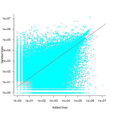
Some of the commits involve tens of thousands of lines (see plot below). This sounds rather extreme. So two sets of models are fitted, one with the original data and the other only including commits with additions/deletions containing less than 10,000 lines.
These models fit the mean number of lines added/deleted over all projects written in a particular language, and the models are multiplicative. As expected, the variance explained by these two factors is small, at around 5%. The two models fitted are (code+data):
 or
or  , and
, and  or
or  , where the value of
  is listed in the following table, and
  is the number of lines of code in the project:
                    Original          0 < lines < 10000
    Language     Added     Deleted     Added   Deleted
    C              1.0       1.0         1.0     1.0
    C#             1.7       1.6         1.5     1.5
    C++            1.9       2.1         1.3     1.4
    Go             1.4       1.2         1.3     1.2
    Java           0.9       1.0         1.5     1.5
    Javascript     1.1       1.1         1.3     1.6
    Objective-C    1.2       1.4         2.0     2.4
    PHP            2.5       2.6         1.7     1.9
    Python         0.7       0.7         0.8     0.8
Ruby 0.3 0.3 0.7 0.7 |
These fitted models suggest that commit addition/deletion both increase as project size increases, by around  , and that, for instance, a commit in Go adds 1.4 times as many lines as C, and delete 1.2 as many lines (averaged over all commits). Comparing adds/deletes for the same language: on average, a Go commit adds
  lines, and deletes
  lines.
There is a strong connection between the number of lines added/deleted in each commit. The plot below shows the lines added/deleted by each commit, with the red line showing a fitted regression model  (code+data):
What other information can be included in a model? It is possible that project specific behavior(s) create a correlation between the size of commits; the algorithm used to fit this model assumes zero correlation. The glmer function, in the R package lme4, can take account of correlation between commits. The model component (language | project) in the following code adds project as a random effect on the language variable:
del_lmod=glmer(deletions ~ language+log(LOC)+(language | project), data=lc_loc, family=poisson) |
It takes around 24hr of cpu time to fit this model, which means I have not done much experimentation…
Software companies in the UK
How many software companies are there in the UK, and where are they concentrated?
This question begs the question of what kinds of organization should be counted as a software company. My answer to this question is driven by the available data. Companies House is the executive agency of the British Government that maintains the register of UK companies, and basic information on 5,562,234 live companies is freely available.
The Companies House data does not include all software companies. A very small company (e.g., one or two people) might decide to save on costs and paperwork by forming a partnership (companies registered at Companies House are required to file audited accounts, once a year).
When registering, companies have to specify the business domain in which they operate by selecting the appropriate Standard Industrial Classification (SIC) code, e.g., Section J: INFORMATION AND COMMUNICATION, Division 62: Computer programming, consultancy and related activities, Class 62.01: Computer programming activities, Sub-class 62.01/2: Business and domestic software development. A company’s SIC code can change over time, as the business evolves.
Searching the description associated with each SIC code, I selected the following list of SIC codes for companies likely to be considered a ‘software company’:
   62011 Ready-made interactive leisure and entertainment
                                                 software development
   62012 Business and domestic software development
   62020 Information technology consultancy activities
   62030 Computer facilities management activities
   62090 Other information technology service activities
   63110 Data processing, hosting and related activities
63120 Web portals |
There are 287,165 companies having one of these seven SIC codes (out of the 1,161 SIC codes currently used); 5.2% of all currently live companies. The breakdown is:
All 62011 62012 62020 62030 62090 63110 63120 5,562,234 7,217 68,834 134,461 3,457 57,132 7,839 8,225 100% 0.15% 1.2% 2.4% 0.06% 1.0% 0.14% 0.15% |
Only one kind of software company (SIC 62020) appears in the top ten of company SIC codes appearing in the data:
Rank SIC Companies 1 68209 232,089 Other letting and operating of own or leased real estate 2 82990 213,054 Other business support service activities n.e.c. 3 70229 211,452 Management consultancy activities other than financial management 4 68100 194,840 Buying and selling of own real estate 5 47910 165,227 Retail sale via mail order houses or via Internet 6 96090 134,992 Other service activities n.e.c. 7 62020 134,461 Information technology consultancy activities 8 99999 130,176 Dormant Company 9 98000 118,433 Residents property management 10 41100 117,264 Development of building projects |
Is the main business of a company reflected in its registered SIC code?
Perhaps a company started out mostly selling hardware with a little software, registered the appropriate non-software SIC code, but over time there was a shift to most of the income being derived from software (or the process ran in reverse). How likely is it that the SIC code will change to reflect the change of dominant income stream? I have no idea.
A feature of working as an individual contractor in the UK is that there were/are tax benefits to setting up a company, say A Ltd, and be employed by this company which invoices the company, say B Ltd, where the work is actually performed (rather than have the individual invoice B Ltd directly). IR35 is the tax legislation dealing with so-called ‘disguised’ employees (individuals who work like payroll staff, but operate and provide services via their own limited company). The effect of this practice is that what appears to be a software company in the Companies House data is actually a person attempting to be tax efficient. Unfortunately, the bulk downloadable data does not include information that might be used to filter out these cases (e.g., number of employees).
Are software companies concentrated in particular locations?
The data includes a registered address for each company. This address may be the primary business location, or its headquarters, or the location of accountants/lawyers working for the business, or a P.O. Box address. The latitude/longitude of the center of each address postcode is available. The first half of the current postcode, known as the outcode, divides the country into 2,951 areas; these outcode areas are the bins I used to count companies.
Are there areas where the probability of a company being a software company is much higher than the national average (5.265%)? The plot below shows a heat map of outcode areas having a higher than average percentage of software companies (36 out of 2,277 outcodes were at least a factor of two greater than the national average; BH7 is top with 5.9 times more companies, then RG6 with 3.7 times, BH21 with 3.6); outcodes having fewer than 10 software companies were excluded (red is highest, green lowest; code+data):
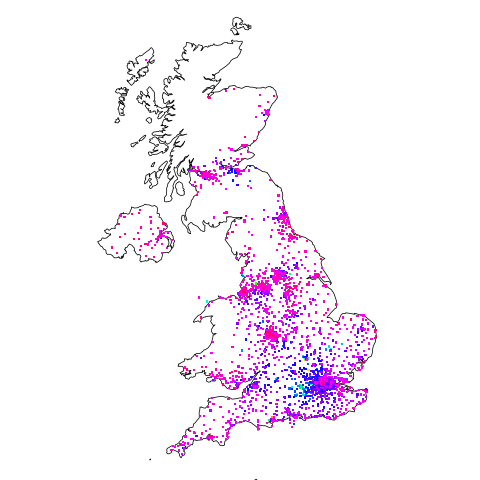
The higher concentrations are centered around the country’s traditional industrial towns and cities, with a cluster sprawling out from London. Cambridge is often cited as a high-tech region, but its highest outcode, CB4, is ranked 39th, at twice the national average (presumably the local high-tech is primarily non-software oriented).
Which outcode areas contain the most software companies? The following list shows the top ten outcodes, by number of registered companies (only BN3 and CF14 are outside London):
   Rank Outcode  Software companies
    1     WC2H      10,860
    2     EC1V       7,449
    3     N1         6,244
    4     EC2A       3,705
    5     W1W        3,205
    6     BN3        2,410
    7     CF14       2,326
    8     WC1N       2,223
    9     E14        2,192
10 SW19 1,516 |
I’m surprised to see west-central London with so many software companies. Perhaps these companies are registered at their accountants/lawyers, or they are highly paid contractors who earn enough to afford accommodation in WC2. East-central London is the location of nearly all the computer companies I know in London.
Local variable naming: some previously unexplored factors
Naming is a complicated topic, with factors including the semantic associations triggered by a name in the developer’s mind (e.g., arithmetic or bitwise operand), visual similarity to other identifiers, and usability (e.g., fewer characters).
Within a method, local variables coexist with other local variables that are visible over some number of lines of code.
Does the size of a method, in lines of code, or number of local variables have an impact on the names chosen (e.g., does the need to think up many different names affect the length of the name chosen)?
The paper A Large-Scale Investigation of Local Variable Names in Java Programs: Is Longer Name Better for Broader Scope Variable? appears to address this question, but the paper is not freely available (although its data is available). I learned about it, and its data, while reading another paper: Reanalysis of Empirical Data on Java Local Variables with Narrow and Broad Scope by Dror Feitelson.
The data was extracted from 1,000 popular Java projects, whose 46,283 files contained 637,077 local variables. The collected information includes: source filename, name, line variable defined, and line last used. Additional columns include the number of characters in the name, and a classification of the components of the name (e.g., dictionary word, abbreviation, number).
For the following analysis, I mapped each variable to a most likely associated method by coalescing overlapping variable defined/last-used ranges. A total of 204,503 methods were formed.
To analyse the impact of other local variables and method size on naming, we first need some information on the number of local variables defined in Java methods, and the number of lines contained in Java methods.
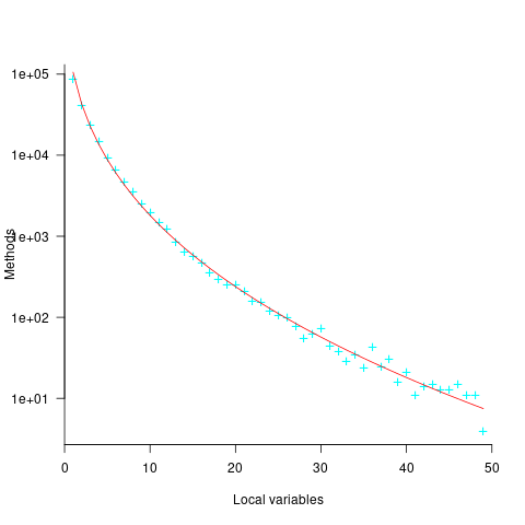
Approximately 50% of Java methods define five or fewer local variables. The plot below shows the number of Java methods defining a given number of local variables; the fitted regression equation, red line, has the form  , where
  is the number of local variables (code+data):
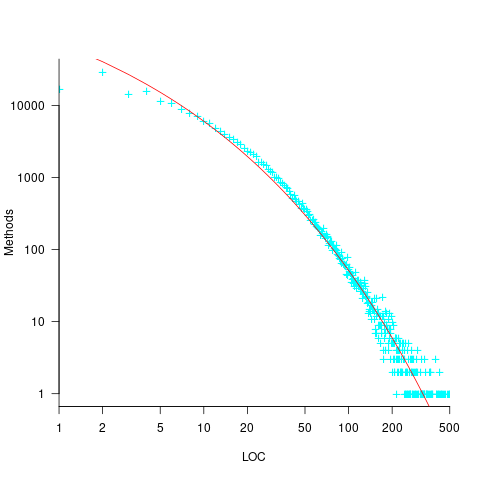
The reason most method define few local variables is that most methods only contain a few lines. The plot below shows the number of Java methods containing an estimated number of lines of code; the fitted regression equation, red line, has the form  , where
  is estimated lines of code (code+data):
The plot below shows the number of local variables against estimated lines of code in the corresponding method; the fitted regression equation, red line, has the form  , where is the number of local variables (code+data):
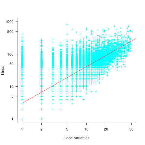
The strong connection between the number of lines of code and number of local variables in a method means that these two factors are effectively interchangeable in a regression model.
A local variable name is likely to be chosen before all, or even any, of the code that uses it is written. The hypothesis that the choice of a variable name is influenced by the length of a method, or the span of lines over which the variable is used, assumes some degree of foresight on the part of the developer.
The cited papers posed the question at the start of this post, and I built a variety of regression models looking to find those factors that are the best predictors of the length of the name (measured in characters or number of subcomponents), or the extent to which the length of the name predicted the amount of code over which it was used (either as a percentage or actual number of lines). Factors used include: order of variable definition in function, percentage of method code over which variable was used. See code+data.
The better models explained up to around 5% of the variance in the data. So there is an effect, but it’s very small. For instance, the model , where
  is the number of lines between variable definition and its last use, and
  is the number of characters in its name, is effectively a relationship between the mean value of these two factors that captures some of the variance around their means.
The difference is significant
A statement that invariably appears in the published results of empirical studies comparing some property of two or more sets of numbers is that the difference is significant (if the difference is not significant, the paper is unlikely to be published). Here, the use of the word significant is the shortened form of the term statistically significant.
It is possible that two sets of measurements just so happen to have, for instance, the same/different mean value. Statistical significance is an estimate of the likelihood that an observed result is unlikely to have occurred by chance. The mechanics of calculating a numeric value for statistical significance can be complicated; the commonly seen p-value applies to a particular kind of statistical significance.
The fact that a difference is unlikely to have occurred by chance does not mean that the magnitude of the difference is of any practical use, or of any theoretical interest.
How large must a difference be to make it of practical use?
When I was in the business of selling code optimization tools for microcomputer software, a speed/code size improvement of at least 10% was needed before a worthwhile number of people were likely to pay for the software (a few would pay for less, and a few wanted more improvements before they would pay). I would not be surprised to find that very different percentages were applicable in other developer ecosystems.
In software engineering research papers, presentation of the practical use of work is often nothing more than a marketing pitch by the authors, not a list of estimated usefulness for different software ecosystems.
These days the presentation of material in empirical software engineering papers is often organized around a series of research questions, e.g., “How does X vary across projects?”, “Does the presence of X significantly impact the issue resolution time?”. One or more of these research questions are pitched as having practical relevance, and the statistical significance of the results is presented as vindication of this claimed relevance. Getting a paper published requires that those asked to review agree that the questions it asks and answers are interesting.
This method of paper organization and presentation is not unique to researchers in software engineering. To attract funding, all researchers need to actively promote the value of their wares.
The problem I have with software engineering papers is the widespread use of simplistic techniques (e.g., a Wilcoxon signed-rank test to check the significance of the difference between the means of two samples), and reporting little more than p-value significance; yes, included plots may sometimes be visually appealing, but other times just confused.
If researchers fitted regression models to their data, it becomes possible to estimate the contribution made by each of the attributes measured to the observed behavior. Surprisingly often, the size of the contribution is relatively small, while still being statistically significant.
By not building regression models, software researchers are cluttering up the list of known statistically significant behaviors with findings about factors whose small actual contribution makes it unlikely that they will be of practical interest.
Small team estimating in story points; a project dataset
Just before the end of last year a regular reader, Mr A., emailed to ask if I would be interested in analysing the software project data for the company he worked for. The wishing to be anonymous company sold physical products, and bespoke software that supported the business was written by a team of three.
Two factors made this dataset interesting, 1) it was for a small team, 2) story points were used for estimating tasks and actual time was recorded (I had not seen such data before).
There are probably hundreds of thousands of small software teams working in companies whose main line of business is far removed from software (a significant percentage of developers work within a small team supporting the activities of non-software companies; I cannot find the bls page listing developer employment across industry codes). These small teams are rarely studied. Software engineering research usually focuses on the practices of software based companies, or large software development projects, i.e., groups likely to be easily visible to external researchers.
To be widely applicable, evidence-based software engineering has to be of practical use to small development teams, not just large development groups.
The wide variety of opinions on the accuracy of story point estimates are unsupported by data; at least I have not yet been able to find any. Here was an opportunity to analyse story point estimates against actual hours.
The reason for analysing task implementation data is to help those involved understand what is going on, with the intent of improving processes. A small team presents two major challenges:
- relatively high levels of variability in the data. When there are only a few people working on a project, the impact of individual events can have a dramatic impact on project metrics, e.g., somebody going on holiday results in a big drop in work performed. Statistical analysis looks for general patterns in data, and small sample sizes have a higher variance than large sample sizes. With a large team, the impact of individual events tends to be smoothed out by the activities of many other events,
- the project lead of a small team is likely to have a good understanding of what is going on. Mr A. was always able to give me detailed explanations behind the patterns I found in the data. There is a lot more going on in a large team, and the team lead is unlikely to have a detailed understanding of everything.
The dataset contained some of the usual patterns found in other datasets (code+data):
- Round numbers. Actual task time finishing on 15/10/30/20 minute boundaries. With stories estimated at between one and five story points, there was little scope for round number use here.
- Consistent under/over estimation. A small sample size limited the chances of seeing both under and over estimation, and only under estimation was seen.
- Estimation accuracy. The factor of two/four accuracy pattern seen is close to that seen in data from other companies.
What did I learn from the analysis of this dataset?
I was pleased to see that the multiplication factors around estimation accuracy were similar to those seen with time-based estimates. I had no feel for how estimation accuracy might compare. We will have to wait and see whether the same pattern is found in other projects using story point estimates.
The analysis conversation for other project datasets had involved exchange of emails. Updating a Markdown formatted project analysis file has proved to be a more usable approach for the conversation between me and the domain expert. I used Visual Studio Code to edit this file and generate a pdf.
I asked Mr A. what would he thought was the most useful part of the analysis, for him.
Mr A. “The most useful part of the analysis? I think it was great to get an outsider’s perspective on the data.”
I hope that this dataset is the first of many from small team projects. With enough experience, it ought to be possible to create a template spreadsheet/markdown file that is generally usable for non-experts.
Patterns in the LSST:DM Sprint/Story-point/Story ‘done’ issues
Projects that use Scrum as their project management framework estimate tasks (known as a user story, or just story) in units of Story-points. A collection of User stories are grouped together to be implemented during a Sprint (a time-boxed interval, often lasting 2-weeks).
What are Story-points, and how do they map to time (in hours and minutes)? For this post, let’s ignore these questions, simply assuming that the people who assign a story-point value to a story have some mapping in their head.
What is the average number of story-points in a story, and how does this average vary across teams? What is the distribution of number of stories estimated per sprint, how many are actually implemented, and how does this vary across teams?
The data required to answer these questions has not been publicly available, or rather public data is not known to me. Until this week, I had only known of a few public Jira repos where story-points were given for at most a few hundred stories.
The LSST Corporation, a not-for-profit involved in astronomy and physics research, has a Data Management (DM) project. The Jira repo for this project contains 26,671 ‘Done’ issues (as of Aug 2022), of which 11,082 (41.5%) have assigned story-points; there have been 469 sprints, which involved 33% of the issues. The start/end implementation date/time for stories is mostly rather granular, and not fine enough to be used to attempt to correlate individual stories with hours. I found this repo, and a couple of others, via the paper Story points changes in agile iterative development, and downloaded all available issues.
What patterns are present in the story-point and sprint data?
Story points are commonly thought of as being integer valued, but 28% of the values are non-integer. If any developers are using the Fibonacci scale, there are not enough to have a noticeable impact. The plot below shows the number of stories estimated to involve a given number of story-points (black pluses are non-integer values, which have been rounded to fit the regression model). The green curved line is a fitted biexponential (sum of two exponentials), with the two straight lines being the two component exponentials (code+data):
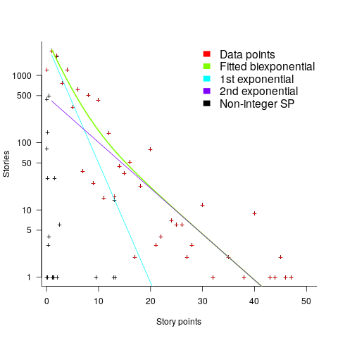
One exponential is dominant for stories assigned up to 10 story-points, and the second exponential for higher story-point values.
The development team decides to implement a story and allocates it to a sprint. A story may be reallocated to another sprint before the start of the original sprint, or after the sprint is finished when its implementation is incomplete or not yet started (the data does not allow for these cases to be distinguished). How many sprints is a story allocated to, before the story implementation is complete?
The plot below shows the number of stories allocated to a given number of sprints, with a fitted regression line of the form  (code+data):

So around 14% of stories are allocated to two sprints, 5% to three and 2% to four.
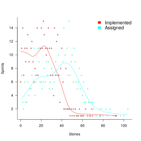
How many stories are assigned to a sprint? The plot below shows the number of sprints having a given number of stories assigned to them, and the number of sprints implementing a given number of stories; lines are fitted loess models (code+data):
Are the Story/Story-point/Sprint patterns found in the DM project likely to occur in other projects using Scrum?
I don’t know, but I hope so. Developing theories of software development processes requires that there be consistent patterns of behavior.
Not knowing what stories were assigned to a sprint at the start of the sprint, rather assigned earlier and then moved to another sprint, potentially undermines the sprint patterns. We will have to wait and see.
If anybody knows of any public Jira repos where a high percentage (say 40%) of the issues have been assigned story-points, please let me know (all the ones I know of on the Atlassian site contain a tiny percentage of story-points).
Recent Comments