Archive
Relative performance of computers since the 1990s
What was the range of performance of desktop’ish computers introduced since the 1990s, and what was the annual rate of performance increase (answers for earlier computers)?
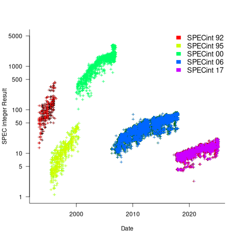
Microcomputers based on Intel’s x86 family was decimating most non-niche cpu families by the early 1990s. During this cpu transition a shift to a new benchmark suite followed a few years behind. The SPEC cpu benchmark originated in 1989, followed by a 1992 update, with the 1995 update becoming widely used. Pre-1995 results don’t appear on the SPEC website: “Because SPEC’s processes were paper-based and not electronic back when SPEC CPU 92 was the current benchmark, SPEC does not have any electronic storage of these benchmark results.” Thanks to various groups, some SPEC89/92 results are still available.
The following analysis uses the results from the SPEC integer benchmarks, which was changed in 1992, 1995, 2000, 2008, and 2017.
Every time a benchmark is changed, the reported results for the same computer change, perhaps by a lot. The plot below shows the results for each version of the benchmark (code+data):
Provide a few conditions are met, it is possible to normalise each set of results, allowing comparisons to be made across benchmark changes. First, results from running, say, both SPEC92 and SPEC95 on some set of computer needs to be available. These paired results can be used to build a model that maps result values from one benchmark to the other. The accuracy of the mapping will depend on there being a consistent pattern of change, i.e., a strong correlation between benchmark results.
The plot below shows the normalised results, along with regression models fitted to each release (code+data):
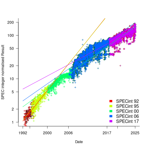
What happened around 2007? Dennard scaling stopped, and there is an obvious meeting of two curves as one epoch transitioned into another. Since 2007 performance improvements have been driven by faster memory, larger caches, and for some applications multiple on-die cpus.
The table below shows the annual growth in SPECint performance for each of the benchmark start years, over their lifetime.
      Year   Annual growth
      1992       26.2%
      1995       25.9%
      2000       14.2%
      2007       13.9%
2017 10.5% |
In 2025, the cpu integer performance of the average desktop system is over 100 times faster than the average 1992 desktop system. With the first factor of 10 improvement in the first 10 years, and the second factor of 10 in the previous 20 years.
Investigating an LLM generated C compiler
Spending over $20,000 on API calls, a team at Anthropic plus an LLM (Claude Opus version 4.6) wrote a C compiler capable of compiling the Linux kernel and other programs to a variety of cpus. Has Anthropic commercialised monkeys typing on keyboards, or have they created an effective sheep herder?
First of all, does this compiler handle a non-trivial amount of the C language?
Having written a variety of industrial compiler front ends, optimizers, code generators and code analysers (which paid off the mortgage on my house), along with a book that analysed of the C Standard, sentence by sentence (download the pdf), I’m used to finding my way around compilers.
Claude’s C compiler source appears to be surprisingly well written/organised (based on a few hours reading of the code). My immediate thought was that this must be regurgitation of pieces from existing compilers. Searches for a selection of comments in the source failed to find any matches. Stylistically, the code is written by an entity that totally believes in using abstractions; functions call functions that call functions, that call …, eventually arriving at a leaf function that just assigns a value. Not at all like a human C compiler writer (well, apart from this one).
There are some oddities in an implementation of this (small) size. For instance, constant folding includes support for floating-point literals. Use of floating-point is uncommon, and opportunities to fold literals rare. Perhaps this support was included because, well, an LLM did the work. But it increases the amount of code that can be incorrect, for little benefit. When writing a compiler in an implementation language different from the one being compiled, differences between the two languages can have an impact. For instance, Claude C uses Rust’s 128-bit integer type during constant folding, despite this and most other C compilers only supporting at most 64-bit integer types.
A README appears in each of the 32 source directories, giving a detailed overview of the design and implementation of the activities performed by the code. The average length is 560 lines. These READMEs look like edited versions of the prompts used.
To get a sense of how the compiler handled rarely used language features and corner cases, I fed it examples from my book (code). The Complex floating point type is supported, along with Universal Character Names, fiddly scoping rules, and preprocessor oddities. This compiler is certainly non-trivial.
The compiler’s major blind spot is failing to detect many semantic constraints, e.g., performing arithmetic on variables having a struct type, or multiple declarations of functions and variables with the same name in the same scope (the parser README says “No type checking during parsing”; no type checking would be more accurate). The training data is source code that compiles to machine code, i.e., does not contain any semantic errors that a compiler is required to flag. It’s not surprising that Claude C fails to detect many semantic errors. There is a freely available collection of tests for the 80 constraint clauses in the C Standard that can be integrated into the Claude C compiler test suite, including the prompts used to generate the tests.
A compiler is an information conveyor belt. Source is first split into tokens (based on language specific rules), which are parsed to build a tree representation and a symbol table, which is then converted to SSA form so that a sequence of established algorithms can be used to lower the level of abstraction and detect common optimizations patterns, the low-level representation is mapped to machine code, and written to a file in the format for an executable program.
The prompts used to orchestrate the information processing conveyor belt have not been released. I’m guessing that the human team prompted the LLM with a detailed specification of the interfaces between each phase of the compiler.
The compiler is implemented in Rust, the currently fashionable language, and the obvious choice for its PR value. The 106K of source is spread across 351 files (average 531 LOC), and built in 17.5 seconds on my system.
LLMs make mistakes, with coding benchmark success rates being at best around 90%. Based on these numbers, the likelihood of 351 files being correctly generated, at the same time, is  (with 99% probability of correctness we get
  ). Splitting the compiler into, say, 32 phases each in a directory containing 11 files, and generating and testing each phase independently significantly increases the probability of success (or alternatively, significantly reduces the number of repetitions of the generate code and test process). The success probability of each phase is:
  , and if the same phase is generated 13 times, i.e.,
 }/{log(1-0.90^{11})}") , there is a 99% probability that at least one of them is correct.
, there is a 99% probability that at least one of them is correct.
Some code need not do anything other than pass on the flow of information unchanged. For instance, code to perform the optimization common subexpression elimination does exist, but the optimization is not performed (based on looking at the machine code generated for a few tests; see codegen.c). Detecting non-functional code could require more prompting skill than generating the code. The prompt to implementation this optimization (e.g., write Rust code to perform value numbering) is very different from the prompt to write code containing common subexpressions, compile to machine code and check that the optimization is performed.
There is little commenting in the source for the lexer, parser, and machine code generators, i.e., the immediate front end and final back end. There is a fair amount of detailed commenting in source of the intervening phases.
The phases with little commenting are those which require lots of very specific, detailed information that is not often covered in books and papers. I suspect that the prompts for this code contains lots of detailed templates for tokenizing the source, building a tree, and at the back end how to map SSA nodes to specific instruction sequences.
The intermediate phases have more publicly available information that can be referenced in prompts, such as book chapters and particular papers. These prompts would need to be detailed instructions on how to annotate/transform the tree/SSA conveyed from earlier phases.
Algorithm complexity and implementation LOC
As computer functionality increases, it becomes easier to write programs to handle more complicated problems which require more computing resources; also, the low-hanging fruit has been picked and researchers need to move on. In some cases, the complexity of existing problems continues to increase.
The Linux kernel is an example of a solution to a problem that continues to increase in complexity, as measured by the number of lines of code.
The distribution of problem complexities will vary across application domains. Treating program size as a proxy for problem complexity is more believable when applied to one narrow application domain.
Since 1960, the journal Transactions on Mathematical Software has been making available the source code of implementations of the algorithms provided with the papers it publishes (before the early 1970s they were known as the Collected Algorithms of the ACM, and included more general algorithms). The plot below shows the number of lines of code in the source of the 893 published implementations over time, with fitted regression lines, in black, of the form  before 1994-1-1, and
  after that date (black dashed line is a LOESS regression model; code+data).
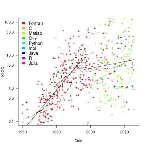
The two immediately obvious patterns are the sharp drop in the average rate of growth since the early 1990s (from 15% per year to 2% per year), and the dominance of Fortran until the early 2000s.
The growth in average implementation LOC might be caused by algorithms becoming more complicated, or because increasing computing resources meant that more code could be produced with the same amount of researcher effort, or another reason, or some combination. After around 2000, there is a significant increase in the variance in the size of implementations. I’m assuming that this is because some researchers focus on niche algorithms, while others continue to work on complicated algorithms.
An aim of Halstead’s early metric work was to create a measure of algorithm complexity.
If LLMs really do make researchers more productive, then in future years LOC growth rate should increase as more complicated problems are studied, or perhaps because LLMs generate more verbose code.
The table below shows the primary implementation language of the algorithm implementations:
  Language   Implementations
   Fortran        465
         C         79
    Matlab         72
       C++         24
    Python          7
         R          4
      Java          3
     Julia          2
MPL 1 |
If algorithms are becoming more complicated, then the papers describing/analysing them are likely to contain more pages. The plot below shows the number of pages in the published papers over time, with fitted regression line of the form  (0.38 pages per year; red dashed line is a LOESS regression model; code+data).
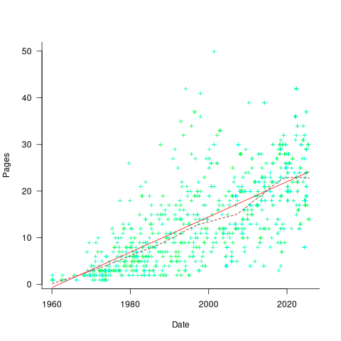
Unlike the growth of implementation LOC, there is no break-point in the linear growth of page count. Yes, page count is influence by factors such as long papers being less likely to be accepted, and being able to omit details by citing prior research.
It would be a waste of time to suggest more patterns of behavior without looking at a larger sample papers and their implementations (I have only looked at a handful).
When the source was distributed in several formats, the original one was used. Some algorithms came with build systems that included tests, examples and tutorials. The contents of the directories: CALGO_CD, drivers, demo, tutorial, bench, test, examples, doc were not counted.
Dennard scaling a necessary condition for Moore’s law
Dennard scaling was a necessary, but not sufficient, condition for Moore’s law to play out over many decades. Transistors generate heat, and continually adding more transistors to a device will eventually cause it to melt, because the generated heat cannot be removed fast enough. However, if the fabrication of transistors on the surface of a monolithic silicon semiconductor follows the Dennard scaling rules, then more, smaller transistors can be added without any increase in heat generated per unit area. These scaling rules were first given in the 1974 paper Design of Ion-Implanted MOSFET’S with Very Small Physical Dimensions by Dennard, Gaensslen, Hwa-Nien, Rideout, Bassous, and LeBlanc.
The plot below shows a vertical slice through a Metal–Oxide–Semiconductor Field-Effect Transistor (the kind of transistor used to build microprocessors), with the fabrication parameters applicable to Dennard scaling labelled. A transistor has three connections (only one is show), to the Source, the Drain, and the Gate. The Source and Drain are doped with an element from Group V to produce a surplus of electrons, while the substrate is doped with an element from Group III to create holes that accept electrons. A voltage applied to the Gate creates an electric field that modifies the shape of the depletion region (area above blue dashed line), enabling the flow of electrons between the Source and Drain to be switched on or off.
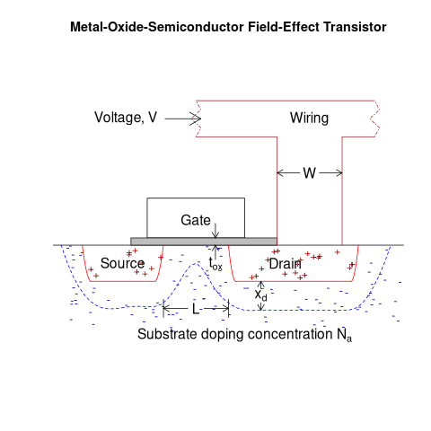
The parameters are: operating voltage,  , width of the connecting wires,
  , length of the channel between the Source and Drain,
  , thickness of the dielectric material (e.g., silicon oxynitride) under the Gate (shown in grey),
  , doping concentration,
  , and length of the depletion region,
  .
.
The power,  , consumed by any electronic device is
  , where
  is the current through it and the voltage across it. In an ideal transistor, in the off state
  and no power is consumed, and in the on state is at its maximum, but
  and no power is consumed. Power is only consumed during the transition between the two states, when both and are non-zero. In real transistors, there is some amount of leakage in the off/on states and a small amount of power is consumed.
Increasing the frequency,  , at which a transistor is operated increases the number of state transitions, which increases the power consumed. The power consumed per unit time by a transistor is
  . If there are
  transistors per unit area, the power consumed within that area is:
  .
.
The current, , can be written in terms of the factors that control it, as:  .
.
If the values of , , , and are all reduced by a factor of  (often around 30%, giving
  ), then
  is reduced by a factor of
  ,
, ^2=2") .
.
^2}}/{{L/alpha}*{t_{ox}/alpha}}}{V/alpha}={{N*f}/alpha^2}{{W*V^3}/{L*t_{ox}}}")
The area occupied by a transistor,  , decreases by , making it possible to increase the number of transistors within the same unit area to:
  . The transistors consume less power, but there are more of them, and power per unit area after the size reduction is the same as before reduction,
  .
.
Reducing the channel length, , has a detrimental impact on device performance. However, this can be overcome by increasing the density of the doping in the substrate, , by .
The maximum frequency at which a transistor can be operated is limited by its capacitance. The Gate capacitance is the major factor, and this decreases in proportion to the device dimensions, i.e., . A decrease in capacitance enables the operating frequency, , to increase. Capacitance was not included in the previous formula for power consumption. An alternative derivation finds that  , where
  is the capacitance, i.e., power consumption is unchanged when a frequency increase is matched by a corresponding decrease in capacitance.
The first working transistor was created in 1947 and the first MOSFET in 1959. The plot below, with data from various sources, shows the energy consumed by a transistor, fabricated in various years, switching between states, the red line is the fitted regression equation  , the green line is the fitted equation
  , and the grey line shows the Landauer limit for the energy consumption of a computation at room temperature (code and data; also see The End of Moore’s Law: A New Beginning for Information Technology by Theis and Wong):
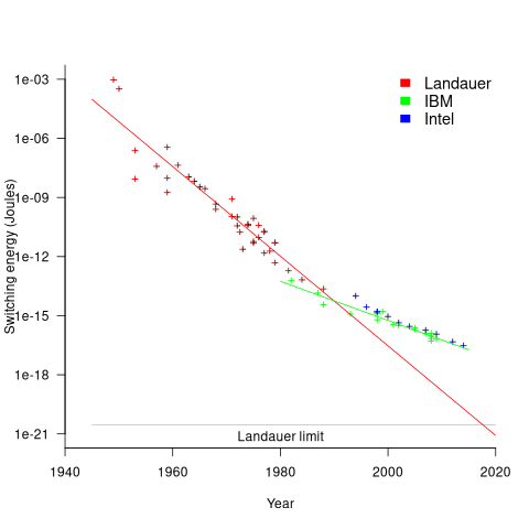
Scaling cannot go on forever. The two limits reached were voltage (difficulty reducing below 1V) and the thickness of the Gate dielectric layer (significant leakage current when less than 7 atoms thick).
The slow-down in the reduction of switching energy, in the plot above, is due to a slow-down in voltage reduction, i.e., reduction of less than .
In 2007, cpu clock frequency stopped increasing and Dennard scaling halted. In this year, the Gate and its dielectric was completely redesigned to use a high-k dielectric such as Hafnium oxide, which allowed transistor size to continue decreasing. However, since around 2014 the rate of decrease has slowed and process node numbers have become marketing values without any connection to the size of fabricated structures. Is 2014 the year that Moore’s law died? Some people think the year was 2010, while Intel still trumpet the law named after one of their founders.
Public documents/data on the internet sometimes disappears
People are often surprised when I tell them that documents/data regularly disappears from the internet. By disappear I mean: no links to websites hosting the data are returned by popular search engines, nothing on the Wayback Machine (including archive.org, which now has a Scholar page), and nothing on LLM suggested locations.
There is the drip-drip-drip of universities deleting the webpages they host of academics who leave the university (MIT is one of the few exceptions). Researchers often provide freely downloadable copies of their own papers via these pages, which may be the only free access (research papers are generally available behind a paywall). It’s great that the ACM has gone fully Open Access
Datasets that were once publicly available on government or corporate sites sometimes just disappear. Two ‘missing’ datasets I have written about are DACS dataset and Linux Counter data. This week, I found out that the detailed processor price lists that Intel used to publish are now disappeared from the web (one site hosts a dozen or so price lists; please let me know if you have any of these price lists).
I have lots of experience asking researchers for a copy of the data analysed in a paper they wrote, to be told something along the lines of “It’s on my old laptop”, i.e., disappeared.
It is to be expected that data from pre-digital times will only sometimes be available online. My interest in tracking the growth of digital storage has led to a search for details of annual sales of punched cards. I’m hoping that a GitHub repo of known data will attract more data.
The sites where researchers host the data analysed in their papers include (ordered in roughly the frequency I encounter them): GitHub, personal page, Zenodo, Figshare and the Center for Open Science.
Some journals offer a data hosting option for published papers. Access to this data can be problematic (e.g., agreeing to an overly restrictive license), or the link to the data might dead (one author I contacted was very irate that the journal was not hosting the data he had carefully curated, after they had assured him they were hosting it).
Research papers are connected by a web of citations. Being able to quickly find cited/citing papers makes it possible to do a much more thorough search of related work, compared to traditional manual methods. When it launched in 1997, CiteSeer was a revelation (it probably doubled the citations in my C book). Many non-computing papers could still only be found in university libraries, but by 2013 I no longer bothered visiting university libraries. ResearchGate launched in 2008, and in 2010 Semantic Scholar arrived. Unfortunately, the functionality of both CiteseerX and Semantic Scholar is a shadow of its former glory. ResearchGate continues to plod along, and Google Scholar has slowly gotten better and better, to become my paper search site of choice.
Keep a copy of your public documents/data on an Open access repository (e.g., GitHub, Zenodo, Figshare, etc). By all means make a copy available on your personal pages, but remember that these are likely to disappear.
Number of calls to/from functions vs function length
Depending on the language the largest unit of code is either a sequence of statements contained in a function/procedure/subroutine or a set of functions/methods contained in a larger unit, e.g., class/module/file. Connections between these largest units (e.g., calls to functions) provide a mechanism for analysing the structure of a program. These connections form a graph, and the structure is known as a call graph.
It is not always possible to build a completely accurate call graph by analysing a program’s source code (i.e., a static call graph) when the code makes use of function pointers. Uncertainty about which functions are called at certain points in the code is a problem for compiler writers wanting to do interprocedural flow analysis for code optimization, and static analysis tools looking for possible coding mistakes.
The following analysis investigates two patterns in the function call graph of C/C++ programs. While calls via function pointers can be very common at runtime, they are uncommon in the source. Function call information was extracted from 98 GitHub projects using CodeQL.
Functions that contain more code are likely to contain more function calls. The plot below shows lines of code against number of function calls for each of the 259,939 functions in whatever version of the Linux kernel is on GitHub today (25 Jan 2026), the red line is a regression fit showing  (the fit systematically deviates for larger functions {yet to find out why}; code and data):
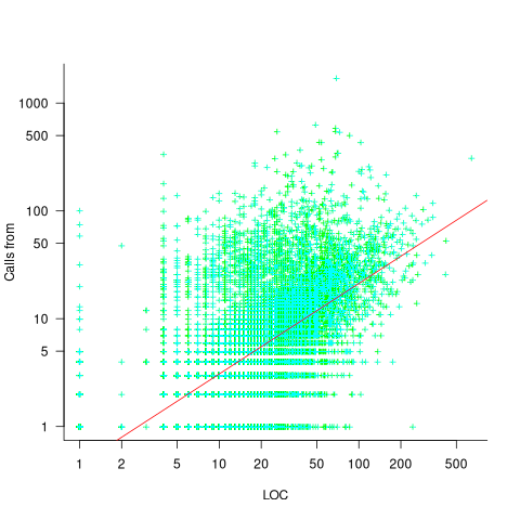
Researchers sometimes make a fuss of the fact that the number of calls per function is a power law, failing to note that this power law is a consequence of the number of lines per function being a power law (with an exponent of 2.8 for C, 2.7 for Java and 2.6 for Pharo). There are many small functions containing a few calls and a few large functions containing many calls.
Are more frequently called functions smaller (perhaps because they perform a simple operation that often needs to be done)? Widely used functionality is often placed in the same source file, and is usually called from functions in other files. The plot below shows the size of functions (in line of code) and the number of calls to them, for the 259,939 functions in the Linux kernel, with lines showing a LOESS fit to the corresponding points (code and data):
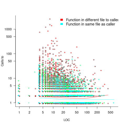
The apparent preponderance of red towards the upper left suggests that frequently called functions are short and contained in files different from the caller. However, the fitted LOESS lines show that the average difference is relatively small. There are many functions of a variety of sizes called once or twice, and few functions called very many times.
The program structure visible in a call graph is cluttered by lots of noise, such as calls to library functions, and the evolution baggage of previous structures. Also, a program may be built from source written in multiple languages (C/C++ is the classic example), and language interface issues can influence organization locally and globally (for instance, in Alibaba’s weex project the function main (in C) essentially just calls serverMain (in C++), which contains lots of code).
I suspect that many call graphs can be mapped to trees (the presence of recursion, though a chain of calls, sometimes comes as a surprise to developers working on a project). Call information needs to be integrated with loops and if-statements to figure out story structures (see section 6.9.1 of my C book). Don’t hold your breath for progress.
I expect that the above patterns are present in other languages. CodeQL supports multiple languages, but CodeQL source targeting one language has to be almost completely reworked to target another language, and it’s not always possible to extract exactly the same information. C/C++ appears have the best support.
Function calls are a component information
Formal methods and LLM generated mathematical proofs
Formal methods have been popping up in the news again, or at least on the technical news sites I follow.
Both mathematics and software share the same pattern of usage of formal methods. The input text is mapped to some output text. Various characteristics of the output text are checked using proof assistant(s). Assuming the mapping from input to output is complete and accurate, and the output has the desired characteristics, various claims can then be made about the input text, e.g., internally consistent. For software systems, some of the claims of correctness made about so-called formally verified systems would make soap powder manufacturers blush.
Mathematicians have been using LLMs to help find proofs of unsolved maths problems. Human written proofs are traditionally checked by other humans reading them to verify that the claimed proof is correct. LLMs generated proofs are sometimes written in what is called a formal language, this proof-as-program can then be independently checked by a proof assistant (the Lean proof assistant is a popular choice; Rocq is popular for proofs about software).
Software developers are well aware that LLM generated code contains bugs, and mathematicians have discovered that LLM generated proof-programs contain bugs. A mathematical proof bug involves Lean reporting that the LLM generated proof is true, when the proof applies to a question that is different from the actual question asked. Developers have probably experienced the case where an LLM generates a working program that does not do what was requested.
An iterative verification-and-refinement pipeline was used for LLMs well publicised solving of International Mathematical Olympiad problems.
A cherished belief of fans of formal methods is that mathematical proofs are correct. Experience with LLMs shows that a sequence of steps in a generated proof may be correct, but the steps may go down a path unrelated to the question posed in the input text. Also, proof assistants are programs, and programs invariably contain coding mistakes, which sometimes makes it possible to prove that false is true (one proof assistant currently has 83 bug reports of false being proved true).
It is well known, at least to mathematicians, that many published proofs contain mistakes, but that these can be fixed (not always easily), and the theorem is true. Unfortunately, journals are not always interested in publishing corrections. A sample of 51 reviews of published proofs finds that around a third contain serious errors, not easily corrected.
Human written proofs contain intentional gaps. For instance, it is assumed that readers can connect two steps without more details being given, or the author does not want to deter reviewers with an overly long proof. If LLM generated proofs are checked by proof assistants, then the gap between steps needs to be of a size supported by the assistant, and deterring reviewers is not an issue. Does this mean that LLM generated proof is likely to be human unfriendly?
Software is often expressed in an imperative language, which means it can be executed and the output checked. Theorems in mathematics are often expressed in a declarative form, which makes it difficult to execute a theorem to check its output.
For software systems, my view is that formal methods are essentially a form of -version programming, with  . Two programs are written, with one nominated to be called the specification; one or more tools are used to analyse both programs, checking that their behavior is consistent, and sometimes other properties. Mistakes may exist in the specification program or the non-specification program.
Using LLMs to help solve mathematical problems is a rapidly evolving field. We will have to wait and see whether end-to-end LLM generated proofs turn out to be trustworthy, or remain as a very useful aid.
Distribution of small project completion times
Records of project estimates and actual task times show that round numbers are very common. Various possible reasons have been suggested for why actual times are often reported as a round number. This post analyses the impact of round number reports of actual times on the accuracy of estimates.
The plot below shows the number of tasks having a given reported completion time for 1,525 tasks estimated to take 1-hour (code+data):
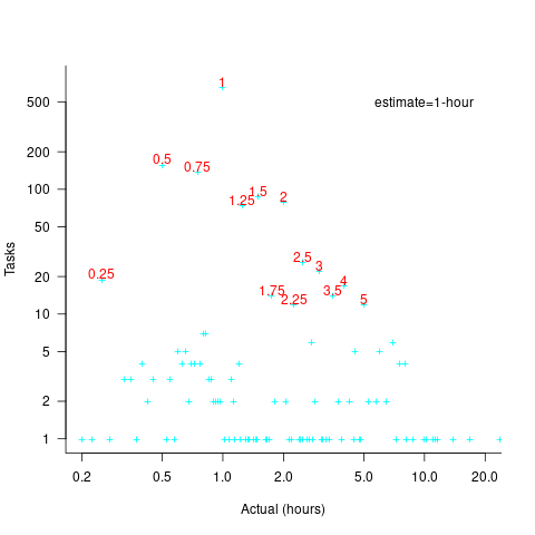
Of those 1,525 tasks estimated to take 1-hour, 44% had a reported completion time of 1-hour, 26% took less than 1-hour and 30% took more than 1-hour. The mean is 1.6 hours and the standard deviation 7.1. The spikiness of the distribution of actual times rules out analytical statistical analysis of the distribution.
If a large task is broken down into, say, smaller tasks, all estimated to take the same amount of time  , what is the distribution of actual times for the large task?
In the case of just two possible actual times to complete each smaller task, some percentage,  , of tasks are completed in actual time
  , and some percentage,
  , completed in actual time
  (with
(with  ). The probability distribution of the large task time,
 ") , for the two actual times case is:
, for the two actual times case is:
=(matrix{2}{1}{N k})(1-p_{t1})^k {p_{t1}}^{N-k}=(matrix{2}{1}{N k}){p_{t2}}^k (1-p_{t2})^{N-k}")
where:  , and
, and  .
.
The right-most equation is the probability distribution of the Binomial distribution, ") . The possible completion times for the large task start at
. The possible completion times for the large task start at  , followed by time increments of .
When there are three possible actual completion times for each smaller task, the calculation is complicated, and become more complicated with each new possible completion time.
A practical approach is to use Monte Carlo simulation. This involves simulating lots of large tasks containing smaller tasks. A sample of tasks is randomly drawn from the known 1,525 task actual times, and these actual times added to give one possible completion time. Running this process, say, 10,000 times produces what is known as the empirical distribution for the large task completion time.
The plot below shows the empirical distribution  smaller 1-hour tasks. The blue/green points show two peaks, the higher peak is a consequence of the use of round numbers, and the lower peak a consequence of the many non-round numbers. If the total times are rounded to 15 minute times, red points, a smoother distribution with a single peak emerges (code+data):

When a large task involves smaller tasks estimated to take a variety of times, the empirical distribution of the actual time for each estimated time can be combined to give an empirical distribution of the large task (see sum_prob_distrib).
Provided enough information on task completion times is available, this technique works does what it says on the tin.
Modelling time to next reported fault
After the arrival of a fault report for a program, what is the expected elapsed time until the next fault report arrives (assuming that the report relates to a coding mistake and is not a request for enhancement or something the user did wrong, and the number of active users remains the same and the program is not changed)? Here, elapsed time is a proxy for amount of program usage.
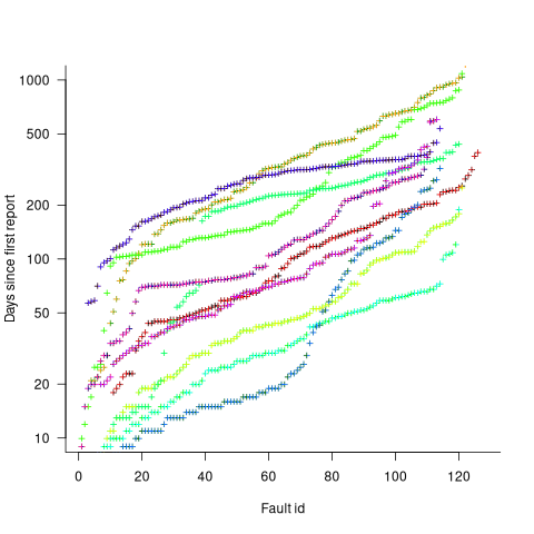
Measurements (here and here) show a consistent pattern in the elapsed time of duplicate reports of individual faults. Plotting the time elapsed between the first report and the n’th report of the same fault in the order they were reported produces an exponential line (there are often changes in the slope of this line). For example, the plot below shows 10 unique faults (different colors), the number of days between the first report and all subsequent reports of the same fault (plus character); note the log scale y-axis (discussed in this post; code+data):
The first person to report a fault may experience the same fault many times. However, they only get to submit one report. Also, some people may experience the fault and not submit a report.
If the first reporter had not submitted a report, then the time of first report would be later. Also, the time of first report could have been earlier, had somebody experienced it earlier and chosen to submit a report.
The subpopulation of users who both experience a fault and report it, decreases over time. An influx of new users is likely to cause a jump in the rate of submission of reports for previously reported faults.
It is possible to use the information on known reported faults to build a probability model for the elapsed time between the last reported known fault and the next reported known fault (time to next reported unknown fault is covered at the end of this post).
The arrival of reports for each distinct fault can be modelled as a Poisson process. The time between events in a Poisson process with rate  has an exponential distribution, with mean
  . The distribution of a sum of multiple Poisson processes is itself a Poisson process whose rate is the sum of the individual rates. The other key point is that this process is memoryless. That is, the elapsed time of any report has no impact on the elapsed time of any other report.
If there are  different faults whose fitted report time exponents are:
  ,
,  …
…  , then summing the Poisson rates,
  , gives the mean
  , for a probability model of the estimated time to next any-known fault report.
To summarise. Given enough duplicate reports for each fault, it’s possible to build a probability model for the time to next known fault.
In practice, people are often most interested in the time to the first report of a previous unreported fault.
tl;dr Modelling time to next previously unreported fault has an analytic solution that depends on variables whose values have to be approximately approximated.
The method used to build a probability model of reports of known fault can be used extended to build a probability model of first reports of currently unknown faults. To build this model, good enough values for the following quantities are needed:
- the number of unknown faults,
 , remaining in the program. I have some ideas about estimating the number of unknown faults, , and will discuss them in another post,
 - the time,
 , needed to have received at least one report for each of the unknown faults. In practice, this is the lifetime of the program, and there is data on software half-life. However, all coding mistakes could trigger a fault report, but not all coding mistakes will have done so during a program’s lifetime. This is a complication that needs some thought,
 - the values of
 ,
,  …
…  for each of the unknown faults. There is some data suggesting that these values are drawn from an exponential distribution, or something close to one. Also, an equation can be fitted to the values of the known faults. The analysis below assumes that the
  for each unknown fault that might be reported is randomly drawn from an exponential distribution whose mean is .
This rate will be affected by program usage (i.e., number of users and the activities they perform), and source code characteristics such as the number of executions paths that are dependent on rarely true conditions.
Putting it all together, the following is the question I asked various LLMs (which uses , rather than ):
There are independent processes. Each process,  , transmits a signal, and the number of signals transmitted in a fixed time interval, , has a Poisson distribution with mean
  for
for  . The values are randomly drawn from the same exponential distribution. What is the cumulative distribution for the time between the successive first signals from the processes.
The cumulative distribution gives the probability that an event has occurred within a given amount of time, in this case the time since the last fault report.
The ChatGPT 5.2 Thinking response (Grok Thinking gives the same formula, but no chain of thought): The probability that the  unknown fault is reported within time
  of the previous report of an unknown fault,
 ") , is given by the following rather involved formula:
, is given by the following rather involved formula:
=1-(a/{a+t})^{N-k}{}_{2}F_1(N-k, k; N+1; t/{a+t})")
where: is the initial number of faults that have not been reported,  , and
, and  is the hypergeometric function.
The important points to note are: the value  decreases as more unknown faults are reported, and the dominant contribution of the value .
Deepseek’s response also makes complicated use of the same variables, and the analysis is very similar before making some simplifications that don’t look right (text of response). Kimi’s response is usually very good, but for this question failed to handle the consequences of .
Almost all published papers on fault prediction ignore the impact of number of users on reported faults, and that report time for each distinct fault has a distinct distribution, i.e., their analysis is not connected to reality.
My 2025 in software engineering
Unrelenting talk of LLMs now infests all the software ecosystems I frequent.
- Almost all the papers published (week) daily on the Software Engineering arXiv have an LLM themed title. Way back when I read these LLM papers, they seemed to be more concerned with doing interesting things with LLMs than doing software engineering research.
- Predictions of the arrival of AGI are shifting further into the future. Which is not difficult given that a few years ago, people were predicting it would arrive within 6-months. Small percentage improvements in benchmark scores are trumpeted by all and sundry.
- Towards the end of the year, articles explaining AI’s bubble economics, OpenAI’s high rate of loosing money, and the convoluted accounting used to fund some data centers, started appearing.
Coding assistants might be great for developer productivity, but for Cursor/Claude/etc to be profitable, a significant cost increase is needed.
Will coding assistant companies run out of money to lose before their customers become so dependent on them, that they have no choice but to pay much higher prices?
With predictions of AGI receding into the future, a new grandiose idea is needed to fill the void. Near the end of the year, we got to hear people who must know it’s nonsense claiming that data centers in space would be happening real soon now.
I attend one or two, occasionally three, evening meetups per week in London. Women used to be uncommon at technical meetups. This year, groups of 2–4 women have become common in meetings of 20+ people (perhaps 30% of attendees); men usually arrive individually. Almost all women I talked to were (ex) students looking for a job; this was also true of the younger (early 20s) men I spoke to. I don’t know if attending meetups been added to the list of things to do to try and find a job.
Tom Plum passed away at the start of the year. Tom was a softly spoken gentleman whose company, PlumHall, sold a C, and then C++, compiler validation suite. Tom lived on Hawaii, and the C/C++ Standard committees were always happy to accept his invitation to host an ISO meeting. The assets of PlumHall have been acquired by Solid Sands.
Perennial was the other major provider of C/C++ validation suites. It’s owner, Barry Headquist, is now enjoying his retirement in Florida.
The evidence-based software engineering Discord channel continues to tick over (invitation), with sporadic interesting exchanges.
What did I learn/discover about software engineering this year?
Software reliability research is a bigger mess than I had previously thought.
I now regularly use LLMs to find mathematical solutions to my experimental models of software engineering processes. Most go nowhere, but a few look like they have potential (here and here and here).
Analysis/data in the following blog posts, from the last 12-months, belongs in my book Evidence-Based Software Engineering, in some form or other (2025 was a bumper year):
Naming convergence in a network of pairwise interactions
Lifetime of coding mistakes in the Linux kernel
Decline in downloads of once popular packages
Distribution of method chains in Java and Python
Modeling the distribution of method sizes
Distribution of integer literals in text/speech and source code
Percentage of methods containing no reported faults
Half-life of Open source research software projects
Positive and negative descriptions of numeric data
Impact of developer uncertainty on estimating probabilities
After 55.5 years the Fortran Specialist Group has a new home
When task time measurements are not reported by developers
Evolution has selected humans to prefer adding new features
One code path dominates method execution
Software_Engineering_Practices = Morals+Theology
Long term growth of programming language use
Deciding whether a conclusion is possible or necessary
CPU power consumption and bit-similarity of input
Procedure nesting a once common idiom
Functions reduce the need to remember lots of variables
Remotivating data analysed for another purpose
Half-life of Microsoft products is 7 years
How has the price of a computer changed over time?
Deep dive looking for good enough reliability models
Apollo guidance computer software development process
Example of an initial analysis of some new NASA data
Extracting information from duplicate fault reports
I visited Foyles bookshop on Charing cross road during the week (if you’re ever in London, browsing books in Foyles is a great way to spend an afternoon).
Computer books once occupied almost half a floor, but is now down to five book cases (opposite is statistics occupying one book case, and the rest of mathematics in another bookcase):

Around the corner, Gender Studies and LGBTQ+ occupies seven bookcases (the same as last year, as I recall):

Recent Comments