Archive
Software task estimation using LLMs is fake research
Developers hate having to provide an estimate for the time needed to implement some functionality. Given the extent to which LLMs have become embedded in the software world, offloading the estimation question to an LLM appears to be an obvious solution.
The problem is that LLMs are very unlikely to give a meaningful answer. However, given that 33% of human estimates are accurate (for tasks of a few hours), 66% within a factor of two (over or under), and 95% within a factor of four (over or under), the accuracy bar for LLMs is low.
Given enough training data, LLMs can do amazing things, e.g., help solve difficult maths problems. LLMs often being good-enough at producing source code is dependent on them having been trained on huge amounts of source code.
The miniscule amount of publicly available software task estimation data is orders of magnitude smaller than the quantity needed to effectively fine-tune a software oriented LLM. Estimation training data needs to contain the following information:
- an appropriately detailed description of the problem,
- the source code of the program being updated, as it existed prior to this or any later features being added (similar descriptions may involve different implementation activities on different projects),
- the actual implementation time,
- a summary of the skill set of the developers who did the work (a developer familiar with the source is likely to complete a task faster than a developer new to the project).
There are datasets (here {10K rows} and here {62K rows}) that contain items (1) and (3).
There are datasets (e.g., here {37K rows} and here {23K rows}) that contain (1) for Open source projects, so (2) could be obtained. These datasets contain estimates (usually in Story Points), and a handful of recorded actuals (and often a status change date-time for each issue, which might/perhaps/maybe used as a proxy for actual work time).
Estimation data (in story points, function points, or time) is much more common than Actual (when available, usually time). Needless to say, there are papers (e.g., here and here) that use human estimation data for training, and then measure LLM performance on close it comes to the human estimates, not the actuals.
My 2024 summary of what is known about task estimation did not discuss the impact of LLMs. What was known is 2024 is that several human factors (e.g., use of round numbers and individual risk profile) play a major role in task estimation. LLMs may reduce the time needed for some tasks, but the human factors remain.
The use of round numbers is deeply embedded in the brain. I suspect the impact of LLM usage will not be to reduce implementation time estimates for tasks, but to increase the amount of functionality included in a task to match the established round number times of 1,2,4 and 7 hours.
Users of story points have the option of leaving everything unchanged. However, there are users of story points who equate one story point to one hour. Will the amount of task functionality be increased to maintain this equating?
Users of function points can continue to count them in the same way. What changes, in an LLM world, is the cost of implementing a function point. Given that the method of calculating the number of function points is specified in various national/international standards, it is not possible to simply increase the amount of functionality to maintain the existing price of a function point.
To summarise: LLMs are being trained on small datasets that don’t contain all the required information to give responses that mimic human estimates made in a pre-LLM world.
One of my most popular blog posts is: Software effort estimation is mostly fake research. The adverb “mostly” can be dropped once LLMs are involved.
Repo of software estimation datasets
I have finally gotten around to creating a GitHub repository for the publicly available software estimation datasets. My reasons for doing this include increasing the visibility of the large datasets, having something to reference when I tell people about the miniscule size of most of the datasets modeled in research papers (one of my most popular posts explains why software estimation is mostly fake research), and to help me remember what datasets I do have.
There is a huge disparity in dataset sizes. The main reason for this is that some datasets contain one row for each task within a project, while others contain one row for the whole project.
The Albrecht dataset from 1983 contains 24 rows, and I’m treating it as the minimum size for a dataset to be included in this repo. Smaller datasets have been published, but I don’t see any value including them. Albrecht is only included because it is used by earlier papers.
The current state of knowledge about the characteristics of individual task estimates is discussed in an earlier post.
What of the row per project datasets? Other than overestimates being common, there is not enough data to reliably spot/claim recurring project patterns across datasets. The estimates have probably occurred in a competitive environment, i.e., there is an incentive to bid low. The common techniques used to estimate projects are either based on counting Function points, or on estimating the number of lines of code contained in the delivered system (this value, plus other values, is plugged in to a cost estimation model, e.g., COCOMO).
The problem with estimating using LOC (which is itself estimated) is that there can be large differences in the number of LOC written by different developers to implement the same functionality.
The datasets in the initial upload include those that are commonly cited in research papers, and those analysed on this blog. I will probably discover (i.e., remember) more datasets in the coming weeks, as happened for the repository of reliability datasets created a few months ago.
Accuracy of Function Point estimates
The number of Function points, FP, contained in the implementation of a software system are counted by following a specified counting process. The number of FP counted for a project is mapped to a cost estimate by multiplying the number of FP by the predetermined cost value of one FP; the predetermined value is based on cost data from similar previous projects within the company. The FP process is so popular as a unit of cost estimation that there are six different ISO standards specifying six different Function point measurement processes.
TL;DR: Estimated cost is not as accurate as traditional time based estimating, although the estimation process may produce consistent FP counts.
The FP certification schemes run by various organizations require applicants to pass exams that check they are consistently following the specified processes to produce consistent FP counts, i.e., that certified practitioners give very similar answers for the same implementation problem. Experiments where subjects used different counting processes to count FP for the same task, have found what looks like a linear relationship between various pairs of FP counting processes.
Having certified FP employees/consultants produce similar counts is all well and good, but what management actually wants is a close correspondence between estimated and actual costs. What does the available data show with regard to FP cost estimation accuracy?
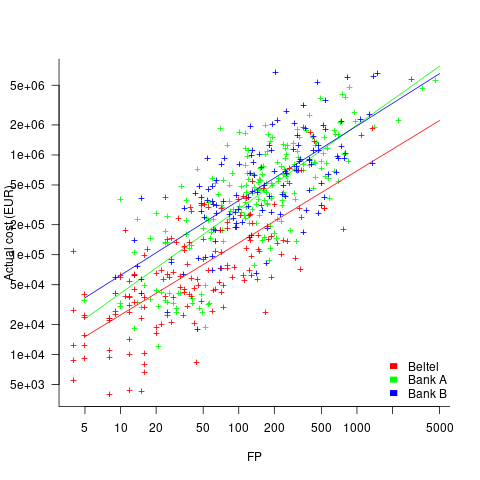
I know of two FP/Cost datasets, one containing 149 points from one company (actual costs have been normalised), and the other 492 points from three companies (actual costs in Euros; FP used is IFPUG); this dataset also includes additional context information and is used in this post’s analysis.
What is the relationship between an estimate based on FP and actual cost? The plot below show FP against actual cost, the red line is the fitted regression equation  , the grey line shows
  (code+data):

The power law exponent, 0.8, is slightly smaller than the 0.85 value found when fitting time estimates to actual times.
The dataset includes information specifying: anonymous organization ID, development method (78.5% plan driven and 21.5% Scrum), business domain (e.g., Call center, Mortgages, Front office), and various 0/1 flags each denoting a particular characteristic.
Including this information in a regression model finds that some of them have an impact on the FP to actual cost mapping. This is not surprising, since the FP/cost mapping is intended to be based on similar previous projects. The fitted model has the form:

where:  ,
,  ,
,  , and
, and  are constants for the corresponding items from the fitted regression model.
The fitted value for the scrum the development method is  , and
, and  for plan based (i.e., waterfall), i.e., Agile FP are cheaper than Waterfall FP. The idea of using both FP and scrum had not crossed my mind. Estimating via FP requires a detailed breakdown of the work to be done, while scrum is a process that discovers the work to be done. Perhaps a scrum like methodology was used to implement the detailed breakdown used to count FPs. The apparent lower cost of scrum FPs could just be a result of discovering that some planned functionality was not required.
How accurate were the FP estimates?
It is not possible to answer this question between we don’t know the cost assigned to one FP; in the above plot, the grey lines shows  .
.
We can calculate an estimate accuracy relative to the fitted model (the red line above). The mapping from FP to cost can vary between organizations, and the following analysis is based on the data for each distinct organization. The plot below shows the points, and associated fitted regression line, for the three organizations (code+data):
Each organization’s fitted regression model can be used to calculate confidence intervals. Approximately 68% of FP estimates could be off by over a factor two (between 2.3 and 2.5) from the mean actual cost, while for the 95% interval FP estimates could be off by over a factor five (it varied between 5.0 and 5.8); code+data. The corresponding factors for traditional developer time estimation are two and four.
The exponent varies between 0.72 and 0.84, with Beltel and Bank B having very similar values (the exponent for time estimates is often close to 0.85). The FP/Cost mapping is likely to be similar for the two banks, but lower for the telecoms company.
Does slicing the data by organization and business domain reduce the width of the confidence intervals, i.e., smaller multiplication factor? In some cases the width is reduced, but in other cases the width is increased; the 68% factor is between 1.9 and 3.1, the 95% factor is between 3.2 and 9.4.
NoEstimates panders to mismanagement and developer insecurity
Why do so few software development teams regularly attempt to estimate the duration of the feature/task/functionality they are going to implement?
Developers hate giving estimates; estimating is very hard and estimates are often inaccurate (at a minimum making the estimator feel uncomfortable and worse when management treats an estimate as a quotation). The future is uncertain and estimating provides guidance.
Managers tell me that the fear of losing good developers dissuades them from requiring teams to make estimates. Developers have told them that they would leave a company that required them to regularly make estimates.
For most of the last 70 years, demand for software developers has outstripped supply. Consequently, management has to pay a lot more attention to the views of software developers than the views of those employed in most other roles (at least if they want to keep the good developers, i.e., those who will have no problem finding another job).
It is not difficult for developers to get a general idea of how their salary, working conditions and practices compares with other developers in their field/geographic region. They know that estimating is not a common practice, and unless the economy is in recession, finding a new job that does not require estimation could be straight forward.
Management’s demands for estimates has led to the creation of various methods for calculating proxy estimate values, none of which using time as the unit of measure, e.g., Function points and Story points. These methods break the requirements down into smaller units, and subcomponents from these units are used to calculate a value, e.g., the Function point calculation includes items such as number of user inputs and outputs, and number of files.
How accurate are these proxy values, compared to time estimates?
As always, software engineering data is sparse. One analysis of 149 projects found that  , with the variance being similar to that found when time was estimated. An analysis of Function point calculation data found a high degree of consistency in the calculations made by different people (various Function point organizations have certification schemes that require some degree of proficiency to pass).
Managers don’t seem to be interested in comparing estimated Story points against estimated time, preferring instead to track the rate at which Story points are implemented, e.g., velocity, or burndown. There are tiny amounts of data comparing Story points with time and Function points.
The available evidence suggests a relationship connecting Function points to actual time, and that Function points have similar error bounds to time estimates; the lack of data means that Story points are currently just a source of technobabble and number porn for management power-points (send me Story point data to help change this situation).
Plotting artifacts when the axis involves lines of code
While reading a report from the very late Rome period, the plot below caught my attention (the regression line was not in the original plot). The points follow a general trend, suggesting that when implementing a module, lines of code written per man-hour increases as the size of the module increases (in LOC). There are explanations for such behavior: perhaps module implementation time is mostly think-time that is independent of LOC, or perhaps larger modules contain more lines that can be quickly implemented (code+data).
Then I realised that the pattern of points was generated by a mathematical artifact. Can you spot the artifact?

The x-axis shows LOC, and the y-axis shows LOC/man-hour. Just plotting LOC against LOC would produce a row of points along a straight line, and if we treat dividing by man-hours as roughly equivalent to dividing by a random number (which might have some correlation with LOC), the result is points scattered around a line going up to the right.
If LOC-per-hour were constant, the points would form a horizontal line across the plot.
In the below left plot, from a different report (whose axis are function-points, and function-points implemented per month), the author has fitted a line, and it is close to horizontal (suggesting that the mean FP-per-month is constant).
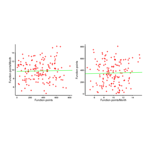
In fact the points are essentially random, and the line is a terrible fit (just how terrible is shown by switching the axis and refitting the line, above right; the refitted line should be vertical, but is horizontal. There is no connection between FP and FP-per-month, which is a good thing because the creators of function-points intended this to be true).
What process might generate this random scattering, rather than the trend seen in the first plot? If the implementation time was proportional to both the number of FP and some uniform random component, then the FP/time ratio would have the pattern seen.
The plots below show module size (in LOC) against man-hour (left) and FP against months (right):
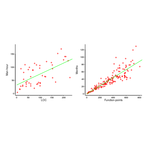
The module-LOC points are all over the place, while the FP points look as-if they are roughly consistent. Perhaps the module-LOC measurements came from a wide variety of sources, and we should not expect a visually pleasant trend.
Plotting LOC against LOC appears in other guises. Perhaps the most common being plotting fault-density against LOC; fault-density is generally calculated as faults/LOC.
Of course the artifacts also occur when plotting other kinds of measurements. Lines of code happens to be a commonly plotted quantity (at least in software engineering).
Recent Comments