Archive
Distribution of small project completion times
Records of project estimates and actual task times show that round numbers are very common. Various possible reasons have been suggested for why actual times are often reported as a round number. This post analyses the impact of round number reports of actual times on the accuracy of estimates.
The plot below shows the number of tasks having a given reported completion time for 1,525 tasks estimated to take 1-hour (code+data):
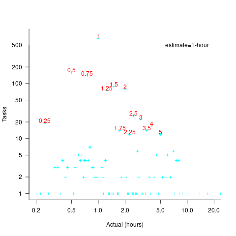
Of those 1,525 tasks estimated to take 1-hour, 44% had a reported completion time of 1-hour, 26% took less than 1-hour and 30% took more than 1-hour. The mean is 1.6 hours and the standard deviation 7.1. The spikiness of the distribution of actual times rules out analytical statistical analysis of the distribution.
If a large task is broken down into, say,  smaller tasks, all estimated to take the same amount of time
  , what is the distribution of actual times for the large task?
In the case of just two possible actual times to complete each smaller task, some percentage,  , of tasks are completed in actual time
  , and some percentage,
  , completed in actual time
  (with
(with  ). The probability distribution of the large task time,
 ") , for the two actual times case is:
, for the two actual times case is:
=(matrix{2}{1}{N k})(1-p_{t1})^k {p_{t1}}^{N-k}=(matrix{2}{1}{N k}){p_{t2}}^k (1-p_{t2})^{N-k}")
where:  , and
, and  .
.
The right-most equation is the probability distribution of the Binomial distribution, ") . The possible completion times for the large task start at
. The possible completion times for the large task start at  , followed by time increments of .
When there are three possible actual completion times for each smaller task, the calculation is complicated, and become more complicated with each new possible completion time.
A practical approach is to use Monte Carlo simulation. This involves simulating lots of large tasks containing smaller tasks. A sample of tasks is randomly drawn from the known 1,525 task actual times, and these actual times added to give one possible completion time. Running this process, say, 10,000 times produces what is known as the empirical distribution for the large task completion time.
The plot below shows the empirical distribution  smaller 1-hour tasks. The blue/green points show two peaks, the higher peak is a consequence of the use of round numbers, and the lower peak a consequence of the many non-round numbers. If the total times are rounded to 15 minute times, red points, a smoother distribution with a single peak emerges (code+data):

When a large task involves smaller tasks estimated to take a variety of times, the empirical distribution of the actual time for each estimated time can be combined to give an empirical distribution of the large task (see sum_prob_distrib).
Provided enough information on task completion times is available, this technique works does what it says on the tin.
Decline in downloads of once popular packages
What happens to the popularity of Open source packages, measured in monthly downloads, once they cease to be updated or attract new users?
If the software does not have any competition within its domain, there is no reason why its popularity should decline. In practice, there are usually alternative packages offering the same or similar functionality. Even when alternatives are available, existing practice and sunk costs can slow migration. A year or so after I started using Asciidoc to write by Software Engineering book, the author announced that he was no longer going to update the software; initially there was no alternative, but the software did what I wanted, and I have been happily using it over the last 12 years.
The paper: Do All Software Projects Die When Not Maintained? Analyzing Developer Maintenance to Predict OSS Usage by Emily Nguyen measured the monthly downloads, commits and other characteristics of 38K GitHub packages having at least 10K downloads during any month between January 2015 and December 2020. The data made available (more here) is a subset, i.e., downloads for 1,583 projects starting in May 2015.
The author investigated the connection between various project characteristics (focusing on commits or lack thereof in particular) and downloads by fitting a Cox proportional hazards model.
The plot below shows the 67 monthly downloads for a selection of packages; the red line is a fitted local regression used to smooth the data (code and data):

Reasons for a decline from a peak number of downloads include: competition from alternative packages, change of fashion, and market saturation, or perhaps the peak was caused by a one-off event. Whatever the reason for a peak+decline, my interest is learning about patterns in the rate of decline.
Some of the monthly package downloads in the above plot have an obvious peak and decline, with others continually increasing, and others having multiple peaks. The following algorithm was used to select packages having a peak followed by a decline, based on the predicted values from a fitted loess model:
- find the month with the most downloads, this is the primary peak,
- if this month is within 10 months of the end of the measurement period, this is not a peak/decline package,
- does a secondary peak exist? A secondary peak is a month containing the most downloads from 10 months after the end of the primary peak, where the number of downloads is within 66% of the primary peak downloads,
- the secondary peak becomes the primary peak, provided it is not within 10 months of the end of the measurement period.
The final fraction of the primary peak is the average monthly download during the last three months divided by the peak month downloads.
The plot below shows the 693 packages whose final fraction of peak was below 0.6 against months from peak to the last month (at the end of 2020), with the red line showing a fitted regression of the form  (code and data):

As the above plot shows, there don’t appear to be any patterns in the decline of package downloads, and  is a poor predictor of fraction of peak.
Perhaps a more sophisticated peak+decline selection algorithm will uncover some patterns. Both ChatGPT (its generated python script failed) and Grok (very wrong answers) failed miserably at classifying the plots. Deepseek will only process images to extract text.
Fifth anniversary of Evidence-based Software Engineering book
Yesterday was the 5th anniversary of the publication of my book Evidence-based Software Engineering.
The general research trajectory I was expecting in the 2020s (e.g., more sophisticated statistical analysis and more evidence based studies) has been derailed by the arrival of LLMs three years ago. Almost all software engineering researchers have jumped on the LLM bandwagon, studying whatever LLM use case is likely to result in a published paper. While I have noticed more papers using statistical techniques discovered after the digital computer was invented (perhaps influenced by the second half of the book), there seems to be a lot fewer evidence based papers being published. I don’t expect researches studying software engineering to jump off the LLM bandwagon in the next few years.
The net result of this lack of new research findings is that the book contents are not yet in need of an update.
On a positive note, LLMs’ mathematical problem-solving capabilities have significantly reduced the time needed to analyse models of software engineering processes.
Had today’s LLMs been available while I was writing the book, the text would probably have included many more theoretical models and their analysis. ‘Probably’, because sometimes the analysis finds that a model does not provide meaningfully mimic reality, so it’s possible that only a few more models would have been included.
My plan for the next year is to use LLM’s mathematical problem-solving capabilities to help me analyse models of software engineering processes. A discussion of any interested results found will appear on this blog. I’m hoping that there will be active conversations on the evidence based software engineering Discord channel.
It makes sense to hone my model analysis skills by starting with the subject I am most familiar with, i.e., source code. It also helps that tools are available for obtaining more source measurement data.
I will continue to write about any interesting papers that appear on the arXiv lists cs.se and cs.PL, as well as the major conferences. There won’t be time to track the minor conferences.
Questions raised during model analysis sometimes suggest ideas that, when searched for, lead to new data being discovered. Discovering new data using a previously untried search phrase is always surprising.
Modeling the distribution of method sizes
The number of lines of code in a method/function follows the same pattern in the three languages for which I have measurements: C, Java, Pharo (derived from Smalltalk-80).
The number of methods containing a given number of lines is a power law, with an exponent of 2.8 for C, 2.7 for Java and 2.6 for Pharo.
This behavior does not appear to be consistent with a simplistic model of method growth, in lines of code, based on the following three kinds of steps over a 2-D lattice: moving right with probability  , moving up and to the right with probability
  , and moving down and to the right with probability
  . The start of an
 if or for statement are examples of coding constructs that produce a step followed by a step at the end of the statement; steps are any non-compound statement. The image below shows the distinct paths for a method containing four statements:

For this model, if  the probability of returning to the origin after taking
  is a complicated expression with an exponentially decaying tail, and the case
  is a well studied problem in 1-D random walks (the probability of returning to the origin after taking steps is
  approx n^{-1.5}") ).
).
Possible changes to this model to more closely align its behavior with source statement production include:
- include terms for the correlation between statements, e.g., assigning to a local variable implies a later statement that reads from that variable,
- include context terms in the up/down probabilities, e.g., nesting level.
Measuring statement correlation requires handling lots of special cases, while measurements of up/down steps is easily obtained.
How can / probabilities be written such that step length has a power law with an exponent greater than two?
ChatGPT 5 told me that the Langevin equation and Fokker–Planck equation could be used to derive probabilities that produced a power law exponent greater than two. I had no idea had they might be used, so I asked ChatGPT, Grok, Deepseek and Kimi to suggest possible equations for the / probabilities.
The physics model corresponding to this code related problem involves the trajectories of particles at the bottom of a well, with the steepness of the wall varying with height. This model is widely studied in physics, where it is known as a potential well.
Reaching a possible solution involved refining the questions I asked, following suggestions that turned out to be hallucinations, and trying to work out what a realistic solution might look like.
One ChatGPT suggestion that initially looked promising used a Metropolis–Hastings approach, and a logarithmic potential well. However, it eventually dawned on me that ^a") , where
, where  is nesting level, and
  some constant, is unlikely to be realistic (I expect the probability of stepping up to decrease with nesting level).
Kimi proposed a model based on what it called algebraic divergence:
=r/{z(y)},U(y)={u_0y^{1-2/{alpha}}}/{z(y)}, D(y)={d_0y^{1-2/{alpha}}}/{z(y)}")
where: ") normalises the probabilities to equal one,
normalises the probabilities to equal one, =r+u_0y^{1-2/alpha}+d_0y^{1-2/alpha}") ,
,  is the up probability at nesting 0,
  is the down probability at nesting 0, and
  is the desired power law exponent (e.g., 2.8).
For C,  , giving
 =r/{z(y)},U(y)={u_0y^{0.29}}/{z(y)}, D(y)={d_0y^{0.29}}/{z(y)}")
The average length of a method, in LOC, is given by:
![E[LOC]={alpha r}/{2(d_0-u_0)}+O(e^{lambda}-1)](https://shape-of-code.com/wp-content/plugins/wpmathpub/phpmathpublisher/img/math_969.5_ffcacf0bb8190096d4d17fb475c0a290.png "E[LOC]={alpha r}/{2(d_0-u_0)}+O(e^{lambda}-1)") , where:
, where: }/{d_0+u_0}")
For C, the mean function length is 26.4 lines, and the values of  , , and need to be chosen subject to the constraint
  .
.
Combining the normalization factor with the requirement  , shows that as increases,
 ") slowly decreases and
slowly decreases and ") slowly increases.
slowly increases.
One way to judge how closely a model matches reality is to use it to make predictions about behavior patterns that were not used to create the model. The behavior patterns used to build this model were: function/method length is a power law with exponent greater than 2. The mean length, ![E[LOC]](https://shape-of-code.com/wp-content/plugins/wpmathpub/phpmathpublisher/img/math_981.5_0ac27fa76bd7c6e393f3497c9f30db7e.png "E[LOC]") , is a tuneable parameter.
, is a tuneable parameter.
Ideally a model works across many languages, but to start, given the ease of measuring C source (using Coccinelle), this one language will be the focus.
I need to think of measurable source code patterns that are not an immediate consequence of the power law pattern used to create the model. Suggestions welcome.
It’s possible that the impact of factors not included in this model (e.g., statement correlation) is large enough to hide any nesting related patterns that are there. While different kinds of compound statements (e.g., if vs. for) may have different step probabilities, in C, and I suspect other languages, if-statement use dominates (Table 1713.1: if 16%, for 4.6% while 2.1%, non-compound statements 66%).
Why is actual implementation time often reported in whole hours?
Estimates of the time needed to implement a software task are often given in whole hours (i.e., no minutes), with round numbers being preferred. Surprisingly, reported actual implementation times also share this ‘preference’ for whole hours and round numbers (around a third of short task estimates are accurate, so it is to be expected that around a third of actual implementation times will be some number of whole hours, at least for the small percentage of projects that record task implementation time).
Even for accurate estimates, some variation in minutes around the hour boundary is to be expected for the actual implementation time. Why are developers reporting integer hour values for actual time?
The following are some of the possible reasons, two at opposite ends of the spectrum, for developers to log actual time as an integer number of hours:
- Parkinson’s law, i.e., the task was completed earlier and the minutes before the whole hour were filled with other activities,
- striving to complete a task by the end of the hour, much like a marathon runner strives to complete a race on a preselected time boundary,
- performing short housekeeping tasks once the primary task is complete, where management is aware of this overhead accounting.
Is it possible to distinguish between these developer behaviors by analysing many task durations?
My thinking is that all three of these practices occur, with some developers having a preference for following Parkinson’s law, and a few developers always striving to get things done.
Given that Parkinson’s law is 70 years old and well known, there ought to be a trail of research papers analysing a variety of models.
Parkinson specified two ‘laws’. The less well known second law, specifies that the number of bureaucrats in an organization tends to grow, regardless of the amount of work to be done. Governments and large organizations publish employee statistics, and these have been used to check Parkinson’s second law.
With regard to Parkinson’s first law, there are papers whose titles suggest that something more than arm waving is to be found within. Sadly, I have yet to find a non-arm waving paper. Given the extreme difficulty of obtaining data on task durations, this lack of papers is not surprising.
Perhaps our LLM overlords, having been trained on the contents of the Internet, will succeed where traditional search engines have failed. The usual suspects (Grok, ChatGPT, Perplexity and Deepseek) suggested various techniques for fitting models to data, rather than listing existing models.
A new company, Kimi, launched their highly-rated model yesterday, and to try it out I asked: “Discuss mathematical models that analyse the impact of project staff following Parkinson’s law”. The quality of the reply was impressive (my registration has not yet been accepted, so I cannot obtain a link to Kimi’s response). A link to Grok 3’s evaluation of Kimi’s five suggested modelling techniques.
Having spent a some time studying the issues of integer hour actual times, I have not found a way to distinguish between the three possibilities listed above, using estimate/actual time data. Software development involves too many possible changeable activities to be amenable to Taylor’s scientific management approach.
Good luck trying to constrain what developers can do and when they can do it, or requiring excessive logging of activities, just to make it possible to model the development process.
Good enough reliability models: still an unknown
Estimating the likelihood that a software system will operate as intended, for some period of time, is one of the big problems within the field of software reliability research. When software does not operate as intended, a fault, or bug, or hallucination is said to have occurred.
Three events need to occur for a user of a software system to experience a fault:
- a developer writes code that does not always behave as intended, i.e., a coding mistake,
- the user of the software feeds it input that causes the coding mistake to produce unintended behavior,
- the unintended behavior percolates through the system to produce a visible fault (sometimes an unintended behavior does not percolate very far, and does not produce any change of visible behavior).
Modelling each kind of event and their interaction is a huge undertaking. Researchers in one of the major subfields of software reliability take a global approach, e.g., they model time to next fault experience, using data on the number of faults experienced per given amount of cpu/elapsed time (often obtained during testing). Modelling the fault data obtained during testing results in a model of the likelihood of the next fault experienced using that particular test process. This is useful for doing a return-on-investment calculation to decide whether to do more testing. If the distribution of inputs used during testing is similar to the distribution of customer inputs, then the model can be of use in estimating the rate of customer fault experiences.
Is it possible to use a model whose design was driven by data from testing one or more software systems to estimate the rate of fault experiences likely when testing other software systems?
The number of coding mistakes will differ between systems (because they have different sizes, and/or different developer abilities), and the testers’ ability will be different, and the extent to which mistaken behavior percolates through code will differ. However, it is possible for there to be a general model for rate of fault experiences that contains various parameters that need to be fitted for each situation.
Since that start of the 1970s, researchers have been searching for this general model (the first software reliability model is thought to be: “Program errors as a birth-and-death process” by G. R. Hudson, Report SP-3011, System Development Corp., 1967 Dec 4; please send me a copy, if you have one).
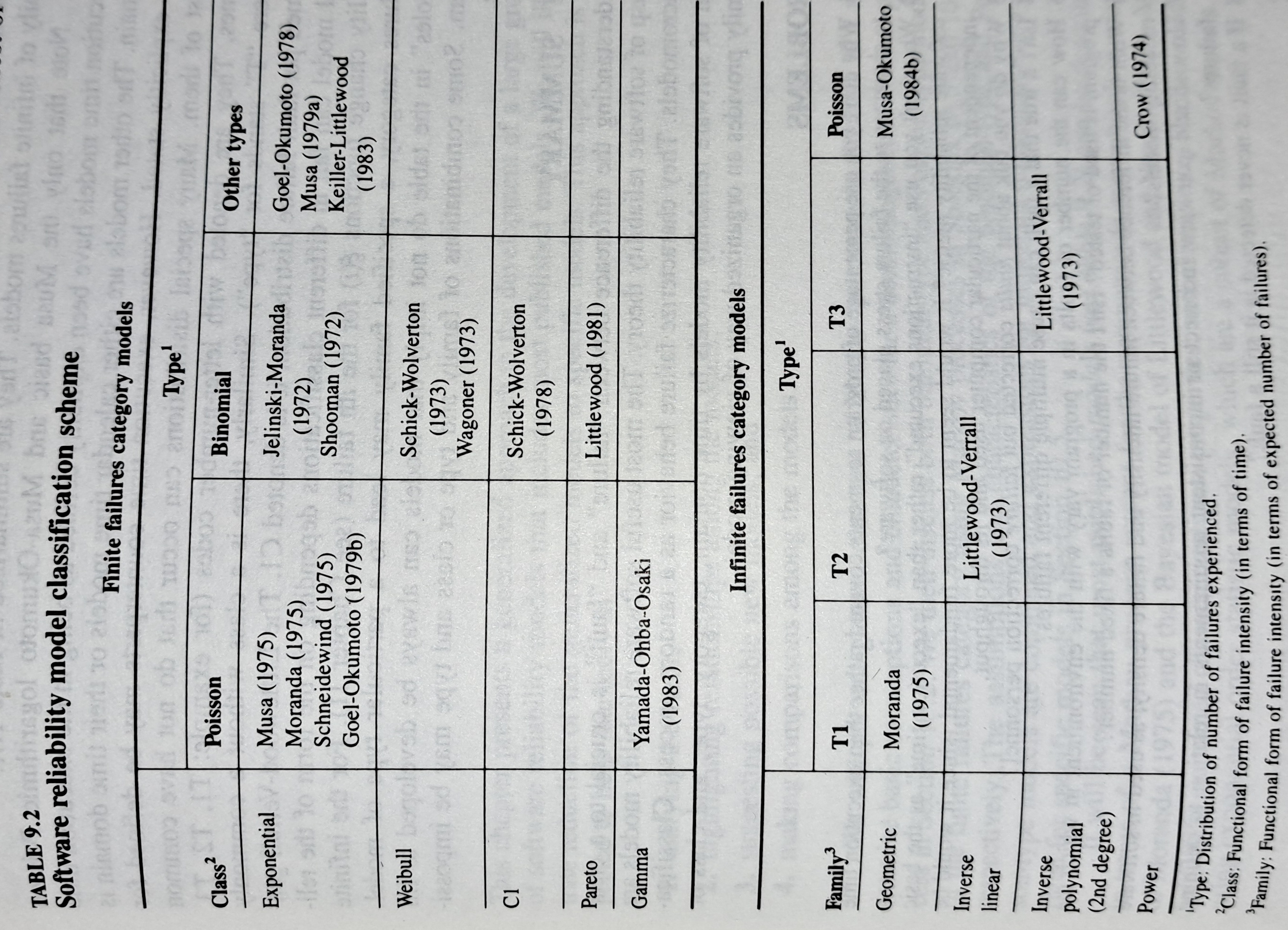
The image below shows the 18 models discussed in the 1987 book “Software Reliability: Measurement, Prediction, Application” by Musa, Iannino, and Okumoto (later editions have seriously watered down the technical contents, and lack most of the tables/plots). It’s to be expected that during the early years of a new field, many different models will be proposed and discussed.
Did researchers discover a good-enough general model for rate of fault experiences?
It’s hard to say. There is not enough reliability data to be confident that any of the umpteen proposed models is consistently better at predicting than any other. I believe that the evidence-based state of the art has not yet progressed beyond the 1982 report Software Reliability: Repetitive Run Experimentation and Modeling by Nagel and Skrivan.
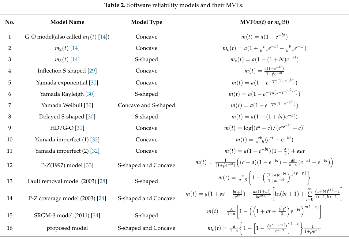
Fitting slightly modified versions of existing models to a small number of tiny datasets has become standard practice in this corner of software engineering research (the same pattern of behavior has occurred in software effort estimation). The image below shows 16 models from a 2021 paper.
Nearly all the reliability data used to create these models is from systems built in the 1960s and 1970s. During these decades, software systems were paid for organizations that appreciated the benefits of collecting data to build models, and funding the necessary research. My experience is that few academics make an effort to talk to people in industry, which means they are unlikely to acquire new datasets. But then researchers are judged by papers published, and the ecosystem they work within is willing to publish papers extolling the virtues of another variant of an existing model.
The various software fault datasets used to create reliability models tends to be scattered in sometimes hard to find papers (yes, it is small enough to be printed in papers). I have finally gotten around to organizing all the public data that I have in one place, a Reliability data repo on GitHub.
If you have a public fault dataset that does not appear in this repo, please send me a copy.
Modeling program LOC growth with recurrence equations
Models predicting the growth, in lines of code, of a program are based on the assumption that future growth follows the same pattern of behavior as past growth. One such model is the recurrence relation:
 , where:
  is LOC at time
  ,
,  is the LOC carried over from release , and
  is the LOC added after release .
The solution to this recurrence relation is: }/{1-a}+a^n*L_0") , where:
, where:  is the LOC at time
  .
.
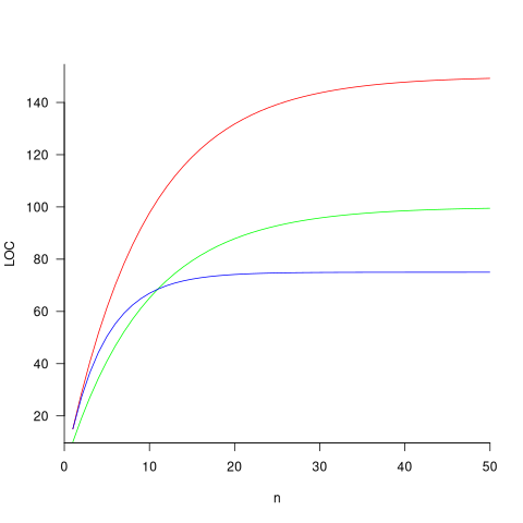
The plot below shows the growth predicted by this model, for various values of and (code+data):
How close is the fit between this model and actual project growth? The plot below shows the growth in LOC for FreeBSD between 1993 and 2006, data from Herraiz; the red line shows the above equation fitted using non-linear regression, with the blue line showing a fitted linear regression model of the form  (code+data):
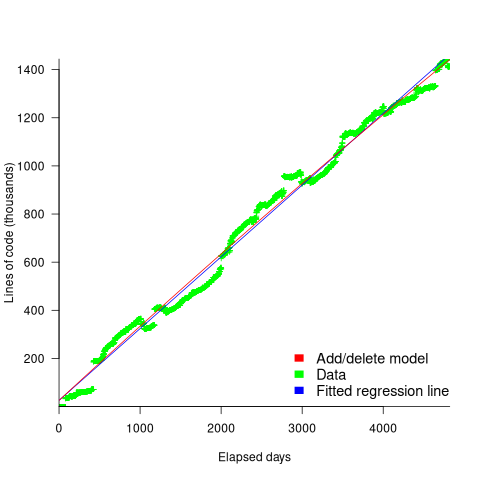
Plugging the fitted coefficients into the recurrence equation when  gives a prediction for the final maximum LOC in FreeBSD of:
}/{1-a} = 0.3124766/(1-0.9999750) = 12,477 KLOC")
The FreeBSD growth is unusual in not having a slow start to its growth, or rather no data is available prior to 1993.
Long-lived, successful projects usually attract new developers, and over time some developers leave. The size of a project, and the predispositions of those involved, can limit the number of active core developers. The above model can be applied to the growth in the number of active developers, i.e.,
 , where:
  is active developers at time ,
  is the developers ceasing to be active , and
  is the number of new active developers at . The solution is:
}/{1-c}+c^n*P_0")
Adding the developer growth equation in to the LOC model, we get:
 , where is now multiplied by the number of developers at time
  , i.e.,
  . The solution to these recurrence equations is somewhat involved (note: if you are using an LLM to check the answers, ChatGPT makes multiple mistakes, but the Grok response contains just one algebra mistake); when
  the equation is:
-d)/{c(1-c)}-b*d/{(1-c)(1-a)})*a^n+{b*(P_0*(1-c)-d)/{c(1-c)}}*c^{n-1}+b*d/{(1-c)(1-a)}")
Checking this more complicated model against another project, the plot below shows the growth of the GNU C library between 1990 and 2011, data from Gonzalez-Barahona, Robles, Herraiz and Ortega; the red line is the fitted equation /935}}") (code+data):
(code+data):
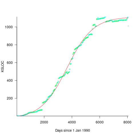
Unsurprisingly, I was not able to fit the more complicated growth model, using non-linear least squares, to the glibc LOC data. The problem was not being able to mimic the slow initial growth rate. I suspect that the developer growth model might be just wrong. Development work on a project does not last forever, and the number of developers will start decreasing at some point. For large projects, the Rayleigh distribution has been found to approximate staffing levels.
Data on project developer numbers over time is rare. The Linux kernel data shows an exponential developer growth rate, but I suspect that this is mostly caused by many one-time only developer contributing towards a new device driver (which are responsible for much of the Kernel growth).
Chinchilla Scaling: A replication using the pdf
The paper Chinchilla Scaling: A replication attempt by Besiroglu, Erdil, Barnett, and You caught my attention. Not only a replication, but on the first page there is the enticing heading of section 2, “Extracting data from Hoffmann et al.’s Figure 4”. Long time readers will know of my interest in extracting data from pdfs and images.
This replication found errors in the original analysis, and I, in turn, found errors in the replication’s data extraction.
Besiroglu et al extracted data from a plot by first converting the pdf to Scalable Vector Graphic (SVG) format, and then processing the SVG file. A quick look at their python code suggested that the process was simpler than extracting directly from an uncompressed pdf file.
Accessing the data in the plot is only possible because the original image was created as a pdf, which contains information on the coordinates of all elements within the plot, not as a png or jpeg (which contain information about the colors appearing at each point in the image).
I experimented with this pdf-> svg -> csv route and quickly concluded that Besiroglu et al got lucky. The output from tools used to read-pdf/write-svg appears visually the same, however, internally the structure of the svg tags is different from the structure of the original pdf. I found that the original pdf was usually easier to process on a line by line basis. Besiroglu et al were lucky in that the svg they generated was easy to process. I suspect that the authors did not realize that pdf files need to be decompressed for the internal operations to be visible in an editor.
I decided to replicate the data extraction process using the original pdf as my source, not an extracted svg image. The original plots are below, and I extracted Model size/Training size for each of the points in the left plot (code+data):

What makes this replication and data interesting?
Chinchilla is a family of large language models, and this paper aimed to replicate an experimental study of the optimal model size and number of tokens for training a transformer language model within a specified compute budget. Given the many millions of £/$ being spent on training models, there is a lot of interest in being able to estimate the optimal training regimes.
The loss model fitted by Besiroglu et al, to the data they extracted, was a little different from the model fitted in the original paper:
Original:  = 1.69+406.40/N^{0.34}+410.7/D^{0.28}")
Replication:  = 1.82+514.0/N^{0.35}+2115.2/D^{0.37}")
where: is the number of model parameters, and is the number of training tokens.
If data extracted from the pdf is different in some way, then the replication model will need to be refitted.
The internal pdf operations specify the x/y coordinates of each colored circle within a defined rectangle. For this plot, the bottom left/top right coordinates of the rectangle are: (83.85625, 72.565625), (421.1918175642, 340.96202) respectively, as specified in the first line of the extracted pdf operations below. The three values before each rg operation specify the RGB color used to fill the circle (for some reason duplicated by the plotting tool), and on the next line the /P0 Do is essentially a function call to operations specified elsewhere (it draws a circle), the six function parameters precede the call, with the last two being the x/y coordinates (e.g., x=154.0359138125, y=299.7658568695), and on subsequent calls the x/y values are relative to the current circle coordinates (e.g., x=-2.4321790463 y=-34.8834544196).
Q Q q 83.85625 72.565625 421.1918175642 340.96202 re W n 0.98137749 0.92061729 0.86536915 rg 0 G 0.98137749 0.92061729 0.86536915 rg 1 0 0 1 154.0359138125 299.7658568695 cm /P0 Do 0.97071849 0.82151775 0.71987163 rg 0.97071849 0.82151775 0.71987163 rg 1 0 0 1 -2.4321790463 -34.8834544196 cm /P0 Do |
The internal pdf x/y values need to be mapped to the values appearing on the visible plot’s x/y axis. The values listed along a plot axis are usually accompanied by tick marks, and the pdf operation to draw these tick marks will contain x/y values that can be used to map internal pdf coordinates to visible plot coordinates.
This plot does not have axis tick marks. However, vertical dashed lines appear at known Training FLOP values, so their internal x/y values can be used to map to the visible x-axis. On the y-axis, there is a dashed line at the 40B size point and the plot cuts off at the 100B size (I assumed this, since they both intersect the label text in the middle); a mapping to the visible y-axis just needs two known internal axis positions.
Extracting the internal x/y coordinates, mapping them to the visible axis values, and comparing them against the Besiroglu et al values, finds that the x-axis values agreed to within five decimal places (the conversion tool they used rounded the 10-digit decimal places present in the pdf), while the y-axis values appeared to differ differed by about 10%.
I initially assumed that the difference was due to a mistake by me; the internal pdf values were so obviously correct that there had to be a simple incorrect assumption I made at some point. Eventually, an internal consistency check on constants appearing in Besiroglu et al’s svg->csv code found the mistake. Besiroglu et al calculate the internal y coordinate of some of the labels on the y-axis by, I assume, taking the internal svg value for the bottom left position of the text and adding an amount they estimated to be half the character height. The python code is:
y_tick_svg_coords = [26.872, 66.113, 124.290, 221.707, 319.125] y_tick_data_coords = [100e9, 40e9, 10e9, 1e9, 100e6] |
The internal pdf values I calculated are consistent with the internal svg values 26.872, and 66.113, corresponding to visible y-axis values 100B and 40B. I could not find an accurate means of calculating character heights, and it turns out that Besiroglu et al’s calculation was not accurate.
I published the original version of this article, and contacted the first two authors of the paper (Besiroglu and Erdil). A few days later, Besiroglu replied with details of why they thought that the 40B line I was using as a reference point was actually at either 39.5B or 39.6B (based on published values for the Gopher budget on the x-axis), but there was uncertainty.
What other information was available to resolve the uncertainty? Ah, the right plot has Model size on the x-axis and includes lines that appear to correspond with axis values. The minimum/maximum Model size values extracted from the right plot closely match those in the original paper, i.e., that ’40B’ line is actually at 39.554B (mapping this difference from a log scale is enough to create the 10% difference in the results I calculated).
My thanks to Tamay Besiroglu and Ege Erdil for taking the time to explain their rationale.
The y-axis uses a log scale, and the ratio of the distance between the 10B/100B virtual tick marks and the 40B/100B virtual tick marks should be -log(10)}/{log(100)-log(40)}") . The Besiroglu et al values are not consistent with this ratio; consistent values below (code+data):
. The Besiroglu et al values are not consistent with this ratio; consistent values below (code+data):
# y_tick_svg_coords = [26.872, 66.113, 124.290, 221.707, 319.125] y_tick_svg_coords = [26.872, 66.113, 125.4823, 224.0927, 322.703] |
When these new values are used in the python svg extraction code, the calculated y-axis values agree with my calculated y-axis values.
What is the equation fitted using these corrected Model size value? Answer below:
Replication:
Corrected size:  = 1.82+548.5/N^{0.35}+2113.2/D^{0.37}")
The replication paper also fitted the data using a bootstrap technique. The replication values (Table 1), and the corrected values are below (standard errors in brackets; code+data):
Parameter  Replication     Corrected
A             482.01         370.16
             (124.58)       (148.31)
B            2085.43        2398.85
            (1293.23)      (1151.75)
E               1.82           1.80
               (0.03)         (0.03)
α               0.35           0.33
               (0.02)         (0.02)
β               0.37           0.37
(0.02) (0.02) |
where the fitted equation is:  = E+A/N^{alpha}+B/D^{beta}")
What next?
The data contains 245 rows, which is a small sample. As always, more data would be good.
Patches for the code of Peter Turchin’s Attrition Warfare Model
The paper Empirically Testing Predictions of an Attrition on Warfare Model for the War in Ukraine, by Peter Turchin, recently showed up during one of my regular searches for software engineering data. A quick scan of the paper founded that it is very empirical, and that the analysis coding was done in R; I could not resist checking out the source code.
One of my first jobs was helping academics fix coding issues with the programs they had written to solve scientific/engineering problems, and this R code reminded me of several habits of scientists who code: the single letter variables used in equations are directly mapped to identifier names, and there is no structure to the code. The code is so short (86 lines) that the lack of structure is a minor inconvenience; a few thousand lines, and it becomes a major headache. The code for Imperial’s COVID model was ten times larger.
Two mistakes in the code/paper jumped out at me, leading to this post. First, some background.
The empirical predictions in the paper are intended to provide insight into who is likely to win the ongoing Ukraine/Russia war. Fighting requires soldiers and these are killed/wounded over time. The country that does not have enough soldiers to at least keep the opposition at bay, looses.
Turchin has proposed what he calls the Attrition War model, based on Lanchester’s laws (various attempts to validate Lanchester’s models, lots of maths to shake a stick at), and the paper solves this model’s set of eight differential equations (each country has the same set of four equations; the connection between the two sets is that one country’s casualty rate and Army size is influenced by the opposing country’s stock of war matériel). The four quantities modelled are casualties, army size, stock of warfare matériel, and production capacity.
Getting predictions out of differential equations requires being able to find a solution to the equations and feeding in numeric values for the various parameters.
Solving the equations is a maths problem, i.e., no knowledge of military matters required. Selecting the equations to solve and the numeric values to feed into the solution is what requires military knowledge. I don’t know anything about military matters; the following analysis is purely related to writing code to solve a set of differential equations, using the equations plus numeric values in Turchin’s November 2023 paper.
For obvious reasons, countries involved in the war do not publish information on the quantities modelled by these equations (which are also likely to be time-dependent). Turchin addresses the changeable nature of the numeric values by introducing various random components into his Attrition model.
From the perspective of solving the eight equations and presenting the results, the following are the two mistakes that jumped out at me (both involving the implementation of the random component):
- When a model contains a random component, there will be a huge/infinite number of possible solutions. The takeaway plots in the paper show a single solution (for each of the four variables/two countries), with the width of the plotted lines and their fluctuating appearance suggesting that they contain multiple solutions. The plot below left shows the solution for artillery shell production over time, as it appears in the paper, while the plot below right shows 100 solutions (each line is a different solution; code):
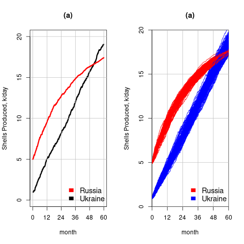
The wedge of lines shows the range of possible solutions (each line drawn overwrites anything previously drawn, and plotting with transparent colors would show the density of solution at a given point; I decided to keep the code simple).
- All the random components are assumed to have a Gaussian distribution. When distribution information is not available, this is usually a safe choice. However, two of the random components must always have non-negative values (i.e., casualties and matériel used can never be negative). The Poisson distribution is the obvious candidate, and a simple search turned up an empirical paper agreeing with this choice (at least for casualties).
The plot below left shows one solution for the number of casualties over time, using the original code, while the plot below right shows 100 solutions using a Poisson distribution for the random component (code):
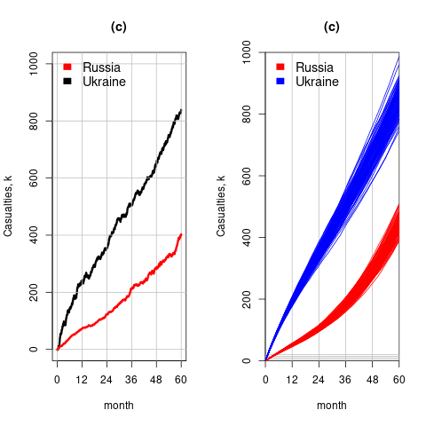
With a Poisson random component, the solutions don’t meander as much, and the variance is smaller than when a Gaussian is used. Technically, it is a more accurate model (if more variance is to be expected a Negative Binomial distribution could be used; see commented out code)
The latest (November) UK government estimate of Russian casualties is 300K, roughly three times larger than predicted by Turchin’s model. Changing the value for the ‘conversion rate of expended matériel to casualties’ from
 to
to  brings the casualty prediction inline with current estimates (we have been hearing a lot about the accuracy of the Ukrainian targetting; see code for details).
I have also reworked the code to add some structure, e.g., separating out solving the equations and setting the initial conditions.
Turchin used the traditional approach to solving differential equations, the one we are taught at school. Before seeing the code, I was half expecting to see a System dynamics approach. The advantage of a systems dynamic approach is flexibility (i.e., easier to add more components) and visualization (i.e., a chart showing what feeds into/out of what); an example. There is an R-based book: System Dynamics Modelling with R.
Analysis of when refactoring becomes cost-effective
In a cost/benefit analysis of deciding when to refactor code, which variables are needed to calculate a good enough result?
This analysis compares the excess time-code of future work against the time-cost of refactoring the code. Refactoring is cost-effective when the reduction in future work time is less than the time spent refactoring. The analysis finds a relationship between work/refactoring time-costs and number of future coding sessions.
Linear, or supra-linear case
Let’s assume that the time needed to write new code grows at a linear, or supra-linear rate, as the amount of code increases ( ):
):

where:  is the base time for writing new code on a freshly refactored code base,
  is the number of lines of code that have been written since the last refactoring, and
  and
and  are constants to be decided.
The total time spent writing code over sessions is:
^x}")
If the same number of new lines is added in every coding session,  , and is an integer constant, then the sum has a known closed form, e.g.:
x=1, ^1}={n(n+1)}/2L_s") ; x=2,
; x=2, ^2}={n(n+1)(2n+1)}/6{L_s}^2")
Let’s assume that the time taken to refactor the code written after sessions is:
^y")
where:  and are constants to be decided.
The reason for refactoring is to reduce the time-cost of subsequent work; if there are no subsequent coding sessions, there is no economic reason to refactor the code. If we assume that after refactoring, the time taken to write new code is reduced to the base cost, , and that we believe that coding will continue at the same rate for at least another  sessions, then refactoring existing code after sessions is cost-effective when:
^y < k_1sum{i=n+1}{n+f}{(iL_s)^x}")
assuming that is much smaller than , setting  , and rearranging we get:

after rearranging we obtain a lower limit on the number of future coding sessions, , that must be completed for refactoring to be cost-effective after session ::

It is expected that  ; the contribution of code size, at the end of every session, in the calculation of
  and is equal (i.e.,
 ^y") ), and the overhead of adding new code is very unlikely to be less than refactoring all the newly written code.
), and the overhead of adding new code is very unlikely to be less than refactoring all the newly written code.
With  ,
,  must be close to zero; otherwise, the likely relatively large value of (e.g., 100+) would produce surprisingly high values of .
Sublinear case
What if the time overhead of writing new code grows at a sublinear rate, as the amount of code increases?
Various attributes have been found to strongly correlate with the  of lines of code. In this case, the expressions for and become:

")
and the cost/benefit relationship becomes:
 < k_1sum{i=n+1}{n+f}{log(iL_s)}")
applying Stirling’s approximation and simplifying (see Exact equations for sums at end of post for details) we get:
 < k_1(f(log(n+f)-1)+f log{L_s})")
+log{L_s}-1} < f")
applying the series expansion (for  ):
):  , we get
 < f")
Discussion
What does this analysis of the cost/benefit relationship show that was not obvious (i.e., the relationship  is obviously true)?
What the analysis shows is that when real-world values are plugged into the full equations, all but two factors have a relatively small impact on the result.
A factor not included in the analysis is that source code has a half-life (i.e., code is deleted during development), and the amount of code existing after sessions is likely to be less than the  used in the analysis (see Agile analysis).
As a project nears completion, the likelihood of there being more coding sessions decreases; there is also the every present possibility that the project is shutdown.
The values of and encode information on the skill of the developer, the difficulty of writing code in the application domain, and other factors.
Exact equations for sums
The equations for the exact sums, for  , are:
")
+1)")
(2n(n+1)+2fn+f+f^2)")
-zeta(-0.5, f+n+1)") , where
, where  is the Hurwitz zeta function.
Sum of a log series: !}/{n!}}+f log{L_s}")
using Stirling’s approximation we get
!)}-log(n!) approx (n+f-0.5)log(n+f)-(n+f)-((n-0.5)log n-n)")
simplifying
!)}-log(n!) approx (n-0.5)log(1+f/n)+f log(n+f)-f")
and assuming that is much smaller than gives
!)}-log(n!) approx f(log(n+f)-1)")
Update
The analysis above assumes that the time contribution of the base rate, , is independent of the changes,  . The following analysis combines these two contributions into a single rate:
L)^b}")
where: , , , and are positive constants, with  , and
, and  .
.
The following is a very good approximation to this sum (thanks to Grok 4.1 beta; chat script):
L})")
where: L")
Recent Comments