Archive
A paper to forget about
Papers describing vacuous research results get published all the time. Sometimes they get accepted at premier conferences, such as ICSE, and sometimes they even win a distinguished paper award, such as this one appearing at ICSE 2024.
If the paper Breaking the Flow: A Study of Interruptions During Software Engineering Activities had been produced by a final year PhD student, my criticism of them would be scathing. However, it was written by an undergraduate student, Yimeng Ma, who has just started work on a Masters. This is an impressive piece of work from an undergraduate.
The main reasons I am impressed by this paper as the work of an undergraduate, but would be very derisive of it as a work of a final year PhD student are:
- effort: it takes a surprisingly large amount of time to organise and run an experiment. Undergraduates typically have a few months for their thesis project, while PhD students have a few years,
- figuring stuff out: designing an experiment to test a hypothesis using a relatively short amount of subject time, recruiting enough subjects, the mechanics of running an experiment, gathering the data and then analysing it. An effective experimental design looks very simply, but often takes a lot of trial and error to create; it’s a very specific skill set that takes time to acquire. Professors often use students who attend one of their classes, but undergraduates have no such luxury, they need to be resourceful and determined,
- data analysis: the data analysis uses the appropriate modern technique for analyzing this kind of experimental data, i.e., a random effects model. Nearly all academic researchers in software engineering fail to use this technique; most continue to follow the herd and use simplistic techniques. I imagine that Yimeng Ma simply looked up the appropriate technique on a statistics website and went with it, rather than experiencing social pressure to do what everybody else does,
- writing a paper: the paper is well written and the style looks correct (I’m not an expert on ICSE paper style). Every field converges on a common style for writing papers, and there are substyles for major conferences. Getting the style correct is an important component of getting a paper accepted at a particular conference. I suspect that the paper’s other two authors played a major role in getting the style correct; or, perhaps there is now a language model tuned to writing papers for the major software conferences.
Why was this paper accepted at ICSE?
The paper is well written, covers a subject of general interest, involves an experiment, and discusses the results numerically (and very positively, which every other paper does, irrespective of their values).
The paper leaves out many of the details needed to understand what is going on. Those who volunteer their time to review papers submitted to a conference are flooded with a lot of work that has to be completed relatively quickly, i.e., before the published paper acceptance date. Anybody who has not run experiments (probably a large percentage of reviewers), and doesn’t know how to analyse data using non-simplistic techniques (probably most reviewers) are not going to be able to get a handle on the (unsurprising) results in this paper.
The authors got lucky by not being assigned reviewers who noticed that it’s to be expected that more time will be needed for a 3-minute task when the subject experiences an on-screen interruption, and even more time when for an in-person interruption, or that the p-values in the last column of Table 3 (0.0053, 0.3522, 0.6747) highlight the meaningless of the ‘interesting’ numbers listed
In a year or two, Yimeng Ma will be embarrassed by the mistakes in this paper. Everybody makes mistakes when they are starting out, but few get to make them in a paper that wins an award at a major conference. Let’s forget this paper.
Those interested in task interruption might like to read (unfortunately, only a tiny fraction of the data is publicly available): Task Interruption in Software Development Projects: What Makes some Interruptions More Disruptive than Others?
Regression line fitted to noisy data? Ask to see confidence intervals
A little knowledge can be a dangerous thing. For instance, knowing how to fit a regression line to a set of points, but not knowing how to figure out whether the fitted line makes any sense. Fitting a regression line is trivial, with most modern data analysis packages; it’s difficult to find data that any of them fail to fit to a straight line (even randomly selected points usually contain enough bias on one direction, to enable the fitting algorithm to converge).
Two techniques for checking the goodness-of-fit, of a regression line, are plotting confidence intervals and listing the p-value. The confidence interval approach is a great way to visualize the goodness-of-fit, with the added advantage of not needing any technical knowledge. The p-value approach is great for blinding people with science, and a necessary technicality when dealing with multidimensional data (unless you happen to have a Tardis).
In 2016, the Nationwide Mutual Insurance Company won the IEEE Computer Society/Software Engineering Institute Watts S. Humphrey Software Process Achievement (SPA) Award, and there is a technical report, which reads like an infomercial, on the benefits Nationwide achieved from using SEI’s software improvement process. Thanks to Edward Weller for the link.
Figure 6 of the informercial technical report caught my eye. The fitted regression line shows delivered productivity going up over time, but the data looks very noisy. How good a fit is that regression line?
Thanks to WebPlotDigitizer, I quickly extracted the data (I’m a regular user, and WebPlotDigitizer just keeps getting better).
Below is the data plotted to look like Figure 6, with the fitted regression line in pink (code+data). The original did not include tick marks on the axis. For the x-axis I assumed each point was at a fixed 2-month interval (matching the axis labels), and for the y-axis I picked the point just below the zero to measure length (so my measurements may be off by a constant multiplier close to one; multiplying values by a constant will not have any influence on calculating goodness-of-fit).
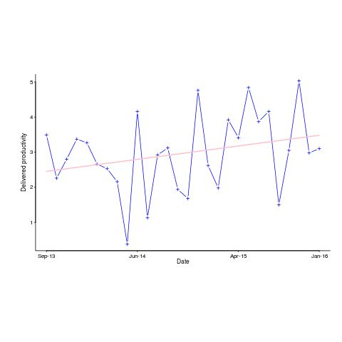
The p-value for the fitted line is 0.15; gee-wiz, you say. Plotting with confidence intervals (in red; the usual 95%) makes the situation clear:
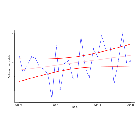
Ok, so the fitted model is fairly meaningless from a technical perspective; the line might actually go down, rather than up (there is too much noise in the data to tell). Think of the actual line likely appearing somewhere in the curved red tube.
Do Nationwide, IEEE or SEI care? The IEEE need a company to award the prize to, SEI want to promote their services, and Nationwide want to convince the rest of the world that their IT services are getting better.
Is there a company out there who feels hard done-by, because they did not receive the award? Perhaps there is, but are their numbers any better than Nationwide’s?
How much influence did the numbers in Figure 6 have on the award decision? Perhaps not a lot, the other plots look like they would tell a similar tail of wide confidence intervals on any fitted lines (readers might like to try their hand drawing confidence intervals for Figure 9). Perhaps Nationwide was the only company considered.
Who are the losers here? Other companies who decide to spend lots of money adopting the SEI software process? If evidence was available, perhaps something concrete could be figured out.
Recent Comments