Archive
Ways of obtaining empirical data in software engineering
For as long as I can remember I have been a collector of empirical data. Writing a book that involves analysis of empirical lots of data has added some focus to my previous scatter gun approach. I have been using three methods to obtain data relating to a recently read paper+one other approach:
- Download from researchers website,
- Emailing the author requesting a copy of the data,
- Reverse engineering numbers from the original paper (using tools like WebPlotDigitizer).
- Roll my sleeves up and do the experiment, write the extraction tool or convince a company to make its data available.
A sea change in attitudes to making data available seems to be underway. Until recently it was rare to find a researcher who provided a link for downloading data; in the last 12 months there has been a noticeable increase in the number of researchers making data, associated with a paper, available for download. I hope this increase continues and making data freely available becomes the accepted norm.
I regularly (once or twice a week) email the authors of a paper asking if I can have a copy of their data, typical responses include:
- Yes, here it is,
- Yes, but you cannot share it with anybody else (i.e., everybody has to get it from the original author). I have said “Thanks, but no thanks” in these cases since I make all the data I use freely available for download,
- I no longer have a copy of the data (changed jobs, lost in a computer crash, etc). In one case an established repository at a university lost funding and has gone dark.
- Data is confidential,
- Plan to write more papers based on the data, will release it when done (obtaining good data can be very time consuming and I can appreciate researchers wanting to maximize their return on investment),
- No response.
I have run a few experiments and have been luck enough to obtain data from one company.
When analysing data the most common ‘mistake’ I encounter is researchers failing to get the most out of the data they have. An example of this is two researchers who made some structural changes to the way a Java library worked and then ran a thorough before/after benchmark to investigate the impact; their statistical analysis consisted of reducing the extensive data down to mean+variance and comparing these across before/after (I built a regression model that makes a much stronger case for their claims).
Of course the usual incorrect use of statistical techniques does occur, but I have not spotted anything major. However, one study found: Willingness to Share Research Data Is Related to the Strength of the Evidence and the Quality of Reporting of Statistical Results, based on 49 papers published in two major psychology journals. Since I am concentrating on papers where the data is available I am probably painting an overly rosy picture of not getting things wrong.
As always, if anybody knows of ways of obtaining data that I have not mentioned (e.g., a twitter account to follow) do please let me know.
Empirical SE groups doing interesting work, 2013 version
Various people have asked me about who is currently doing interesting work in empirical software engineering and the following is an attempt to help answer this question. Interestingness is very subjective, in my case it is based on whether I think the work can contribute something towards my book on empirical software engineering.
To keep this list manageable I am restricting myself to groups of researchers (a group is two or more people) and giving priority to those who make their data publicly available.
Some background for those with no experience of academic research. Over a period of 4-5 years a group can go from having published nothing on a research topic to publishing some very interesting stuff to not publishing anything on the topic. Reasons for this include funding appearing/disappearing, the arrival/departure of very productive people (departure may be to other jobs or moving from research into management), or the researcher loosing interest and moving onto other things. A year from now any of the following groups may be disbanded or moved on to other research areas.
The conferences to check out are: Mining Software Repositories, Source Code Analysis and Manipulation, perhaps 1 in 2.5 of CREST Open Workshop and International Conference on Software Maintenance.
General sources of raw data include: promisedata and FLOSSmole is a firehose of bytes.
Who is the biggest group of researchers? In my mind it is the Canadians (to be exact the groups at Queen’s and Waterloo and the Ptidel project), now the empirical group at Microsoft would probably point out that they are not separated by several hundred miles and all work for the same company; this may be true but looking from Europe the Canadians look real close to each other on a map and all share a domain name ending in ca. In practice members of all three groups write papers together and spend time visiting/interning with each other. Given how rapidly things change I am not going to bother calculating an accurate number 1 for today.
Around the world (where there is no group page to link to I have used an individual’s page):
UK (theory in groups, practice by individuals; Brunel would warrant a link if they put some effort into maintaining a web presence and made their data available for download; come on guys)
USA (Devanbu, Grechanik, Kemerer, Menzies, SEMERU + TODO; Binkley for identifier semantics)
Some researchers leave a group to set up their own group and I know that some people in the above lists have done this. I wish them luck. If their group starts publishing interesting stuff they will be on any future version of this list.
Sitting here typing away I have probably missed out some obvious candidates. Pointers to obvious omissions welcome (remember this is about groups not individuals).
Update: Groups in 2021
Distribution of uptimes for high-performance computing systems
Computers break down every now and again and this is a serious problem when an application needs runs on thousands of individual computers (nodes) plugged together; lots more hardware creates lots more opportunity for a failure that renders any subsequent calculations by working nodes possible wrong. The solution is checkpointing; saving the state of each node every now and again, and rolling back to that point when a failure occurs. Picking the optimal interval between checkpoints requires knowledge the distribution of node uptimes, what is it?
Short answer: Node uptimes have a negative binomial distribution, or at least five systems at the Los Alamos National Laboratory do.
The longer answer is below as another draft section from my book Empirical software engineering with R. As always comments and pointers to more data welcome. R code and data here.
Distribution of uptimes for high-performance computing systems
Today’s high-performance computing systems are created by connecting together lots of cpus. There is a hierarchy to the connection in that many cpus may populate a single board, several boards may be fitted into a rack unit, several rack units into a cabinet, lots of cabinets lined up in a row within a room and more than one room in a facility. A common operating unit is the node, effectively a computer on which an operating system is running (the actual hardware involved may be a single or multi processor cpu). A high-performance system is built from thousands of nodes and an application program may run on compute nodes from more than one facility.
With so many components, failures occur on a regular basis and long running applications need to recover from such failures if they are to stand a reasonable chance of ever completing.
Applications running on the systems installed at the Los Alamos National Laboratory create checkpoints at regular intervals, writing data needed to do a full restore to storage. When a failure occurs an application is restarted from its most recent checkpoint, one node failure causes all nodes to be rolled back to their most recent checkpoint (all nodes create their checkpoints at the same time).
A tradeoff has to be made between frequently creating checkpoints, which takes resources away from completing execution of the application but reduces the amount of lost calculation, and infrequent checkpoints, which diverts less resources but incurs greater losses when a fault occurs. Calculating the optimum checkpoint interval requires knowing the distribution of node uptimes and the following analysis attempts to find this distribution.
Data
The data comes from 23 different systems installed at the Los Alamos National Laboratory (LANL) between 1996 and 2005. The total failure count for most of the systems is of the order of a few hundred; there are five systems (systems 2, 16, 18, 19 and 20) that each have several thousand failures and these are the ones analysed here.
The data consists of failure records for every node in a system. A failure record includes information such as system id, node number, failure time, restored to service time, various hardware characteristics and possible root causes for the failure. Schroeder and Gibson <book Schroeder_06> performed the first analysis of the dataset and provide more background details.
Is the data believable?
Failure records are created by operations staff when they are notified by the automated monitoring system that a failure has been detected. Given that several people are involved in the process <book LANL_data_06> it seems unlikely that failures will go unreported.
Some of the failure reports have start times before the given node was returned into service from the previous failure; across the five systems this varied between 0.4% and 2.5%. It is possible that these overlapping failures are caused by an incorrectly attempt to fix the first failure, or perhaps they are data entry errors. This error rate is comparable with human error rates for low stress/non-critical work
The failure reports do not include any information about the application software running on the node when it failed; the majority of the programs executed are large-scale scientific simulations, such as simulations of nuclear stockpile stability. Thus it is not possible to accurately calculate the node MTBF for an executing application. LANL say <book LANL_data_06> that the applications “… perform long periods (often months) of CPU computation, interrupted every few hours by a few minutes of I/O for check-pointing.”
Predictions made in advance
The purpose of this analysis is to find the distribution that best fits the node uptime data, i.e., the time interval between failures of the same node.
Your author is not aware of any empirically based theory that predicts the uptime of high performance computing systems. The Poisson and exponential distributions are both frequently encountered in the analysis of hardware failures and it is always comforting to fit in with existing expectations.
Applicable techniques
A [Cullen and Frey test] matches a dataset’s skew and kurtosis against known distributions (in the case of the descdist function in the fitdistrplus package this is a handful of commonly encountered distributions); the fitdist function in the same package can be used to fit the data to a specified distribution.
Results
The table below lists some basic properties of each of the systems analysed. The large difference in mean/median uptimes between some systems is caused by very fat tails in the uptime distribution of some systems, see [LANL-node-uptime-binned].
| System | Nodes | Failures | Mean | Median |
|---|---|---|---|---|
|
2
|
49
|
6997
|
133
|
377
|
|
16
|
16
|
2595
|
89
|
229
|
|
18
|
823
|
3014
|
2336
|
4147
|
|
19
|
738
|
2344
|
2376
|
4069
|
|
20
|
323
|
2063
|
653
|
2544
|
If there are any significant changes in failure rate over time or across different nodes in a given system it could have a significant impact on the distribution of uptime intervals. So we first check to large differences in failure rates.
Do systems experience any significant changes in failure rate over time?
The plot below shows the total number of failures, binned using 30-day periods, for the five systems. Two patterns that stand out are system 20 which experienced many failures during the first few months and then settled down, and system 2’s sudden spike in failures around month 23 before settling down again. This analysis is intended to be broad brush and does not get involved with details of specific systems, but these changes in failure frequency suggest that the exact form of any fitted distribution may change over time in turn potentially leading to a change of checkpoint interval.
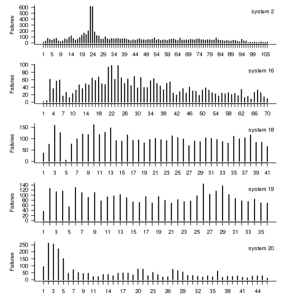
Figure 1. Total number of failures per 30-day interval for each LANL system.
Do some nodes failure more often than others?
The plot below shows the total number of failures for each node in the given system. Node 0 has many more failures than the other nodes (for node 0 of system 2 most of the failure data appears to be missing, so node 1 has the most failures). The distribution suggested by the analysis below is not changed if Node 0 is removed from the dataset.
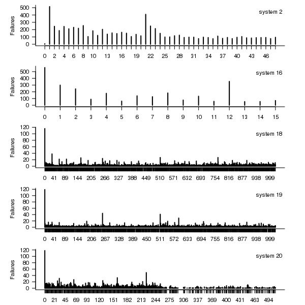
Figure 2. Total number of failures for each node in the given LANL system.
Fitting node uptimes
When plotted in units of 1 hour there is a lot of variability and so uptimes are binned into 10 hour units to help smooth the data. The number of uptimes in each 10-hour bin forms a discrete distribution and a [Cullen and Frey test] suggests that the negative binomial distribution might provide the best fit to the data; the Scroeder and Gibson analysis did not try the negative binomial distribution and of those they tried found the Weilbull distribution gave the best fit; the R functions were not able to fit this distribution to the data.
The plot below shows the 10-hour binned data fitted to a negative binomial distribution for systems 2 and 18. Visually the negative binomial distribution provides the better fit and the Akaiki Information Criterion values confirm this (see code for details and for the results on the other systems, which follow one of the two patterns seen in this plot).
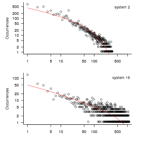
Figure 3. For systems 2 and 18, number of uptime intervals, binned into 10 hour interval, red line is fitted negative binomial distribution.
The negative binomial distribution is also the best fit for the uptime of the systems 16, 19 and 20.
The Poisson distribution often crops up in failure analysis. The quality of fit of a Poisson distribution to this dataset was an order of worse for all systems (as measured by AIC) than the negative binomial distribution.
Discussion
This analysis only compares how well commonly encountered distributions fit the data. The variability present in the datasets for all systems means that the quality of all fitted distributions will be poor and there is no theoretical justification for testing other, non-common, distributions. Given that the analysis is looking for the best fit from a chosen set of distributions no attempt was made to tune the fit (e.g., by forming a zero-truncated distribution).
Of the distributions fitted the negative binomial distribution has the lowest AIC and best fit visually.
As discussed in the section on [properties of distributions] the negative binomial distribution can be generated by a mixture of [Poisson distribution]s whose means have a [Gamma distribution]. Perhaps the many components in a node that can fail have a Poisson distribution and combined together the result is the negative binomial distribution seen in the uptime intervals.
The Weilbull distribution is often encountered with datasets involving some form of time between events but was not seen to be a good fit (for a continuous distribution) by a Cullen and Frey test and could not be fitted by the R functions used.
The characteristics of node uptime for two systems (i.e., 2 and 16) follows what might be thought of as a typical distribution of measurements, with some fattening in the tail, while two systems (i.e., 18 and 19) have very fat tails with indeed and system 20 sits between these two patterns. One system characteristic that matches this pattern is the number of nodes contained within it (with systems 2 and 16 having under 50, 18 and 19 having over 1,000 and 20 having around 500). The significantly difference in the size of the tails is reflected in the mean uptimes for the systems, given in the table above.
Summary of findings
The negative binomial distribution, of the commonly encountered distributions, gives the best fit to node uptime intervals for all systems.
There is over an order of magnitude variation in the mean uptime across some systems.
Why is Cobol still popular in Japan?
Rummaging around the web for empirical software engineering data, I found a survey of programming language usage in Japan. This survey (based on 505 projects in 24 companies) has Cobol in the number two slot for 2012, a bit higher than I would have expected (it very rarely appears at all in US/UK ‘popularity’ lists):
Language       Projects
Java             822  28.2%
COBOL            464  15.9%
VB               371  12.7%
C                326  11.2%
Other languages  208   7.1%
C++              189   6.5%
Visual Basic.NET 136   4.7%
Visual C++       105   3.6%
C#               101   3.5%
PL/SQL            57   2.0%
Pro*C             23   0.8%
Excel(VBA)        18   0.6%
Developer2000     17   0.6%
ABAP              15   0.5%
HTML              14   0.5%
Delphi            11   0.4%
PL/I              10   0.3%
Perl              10   0.3%
PowerBuilder       7   0.2%
Shell              7   0.2%
XML                6   0.2%
A quick overview of Cobol for those readers who have never encountered it.
Cobol is a domain specific language ideally suited for business data processing in the 1960/70/80/90s. During this period computer memory was often measured in kilobytes, data came in an unbelievably wide range of different formats, operations on data mostly involved sorting and basic arithmetic, and output data format was/is very important. By “unbelievably wide range” think of lots of point-of-sale vendors deciding how their devices would write data to punch cards/paper tape/magnetic tape, just handling the different encodings that have been used for the plus/minus sign can make the head spin; combine the requirement that programs handle different data formats with tiny computer memory capacity, and you get data structure overlays that make C programmers look like rank amateurs, all the real action in Cobol programs occurs in the DATA DIVISION.
So where are we today? Companies use computers to solve a wider range of problems don’t they (so even if Cobol usage stayed the same its percentage usage should be low)? If point-of-sale terminals still produce a wide range of weird and wonderful data formats, isn’t it easy enough to write the appropriate libraries to convert (and we have much more storage these days)?
Why might Cobol still be so popular in Japan (and perhaps elsewhere, if anybody over 25 was included in the survey)? Some ideas:
- Cobol is still the best language to use for business data processing,
- the sample is not representative of the Japanese software development industry. As a government body perhaps the Information-Technology Promotion Agency primarily deals with large well established companies; the data came from a relatively small number of companies (i.e., 24),
- the Japanese are known for being conservative and maintaining traditions. Change is almost considered a necessity here in the West, this has led to the use of way too many programming languages in industry (I have previously written about what a mistake it is to invent a new language).
Agreement between code readability ratings given by students
I have previously written about how we know nothing about code readability and questioned how the information content of expressions might be calculated. Buse and Weimer ran a very interesting experiment that asked subjects to rate short code snippets for readability (somebody please rerun this experiment using professional software developers).
I’m interested in measuring how well different students subjects agree with each other (I have briefly written about this before).
Short answer: Very little agreement between individual pairs, good agreement between rankings aggregated by year.
The longer answer is below as another draft section from my book Empirical software engineering with R book. As always comments welcome. R code and data here.
Readability
Source code is often said to have an attribute known as
A study by Buse and Weimer <book Buse_08> asked Computer Science students to rate short snippets of Java source code on a scale of 1 to 5. Buse and Weimer then searched for correlations between these ratings and various source code attributes they obtained by measuring the snippets.
Humans hold diverse opinions, have fragmented knowledge and beliefs about many topics and vary in their cognitive abilities. Any study involving human evaluation that uses an open ended problem on which subjects have had little experience is likely to see a wide range of responses.
Readability is a very nebulous term and students are unlikely to have had much experience working with source code. A wide range of responses is to be expected and the analysis performed here aims to check the degree of readability rating agreement between the subjects.
Data
The data made available by Buse and Weimer are the ratings, on a scale of 1 to 5, given by 121 students to 100 snippets of source code. The student subjects were drawn from those taking first, second and third/fourth year Computer Science degree courses and postgraduates at the researchers’ University (17, 65, 31 and 8 subjects respectively).
The postgraduate data was not used in this analysis because of the small number of subjects.
The source of the code snippets is also available but not used in this analysis.
Is the data believable?
The subjects were not given any instructions on how to rate the code snippets for readability. Also we don’t know what outcome they were trying to achieve when rating, e.g., where they rating on the basis of how readable they personally found the snippets to be, or rating on the basis of the answer they would expect to give if they were being tested in an exam.
The subjects were students who are learning about software development and many of them are unlikely to have had any significant development experience outside of the teaching environment. Experience shows that students vary significantly in their ability to read and write source code and a non-trivial percentage do not go on to become software developers.
Because the subjects are at an early stage of learning about code it is to be expected that their opinions about readability will change while they are rating the 100 snippets. The study did not include multiple copies of some snippets, this would have enabled the consistency of individual subject responses to be estimated.
The results of many studies <book Annett_02> has shown that most subject ratings are based on an ordinal scale (i.e., there is no fixed relationship between the difference between a rating of 2 and 3 and a rating of 3 and 4), that some subjects are be overly generous or miserly in their rating and that without strict rating guidelines different subjects apply different criteria when making their judgements (which can result a subject providing a list of ratings that is inconsistent with every other subject).
Readability is one of those terms that developers use without having much idea what they and others are really referring to. The data from this study can at most be regarded as treating readability to be whatever each subject judges it to be.
Predictions made in advance
Is the readability rating given to code snippets consistent between different students on a computer science course?
The hypothesis is that the between student consistency of the readability rating given to code snippets improves as students progress through the years of attending computer science courses.
Applicable techniques
There are a variety of techniques for estimating rater agreement. <Krippendorff’s alpha> can be applied to ordinal ratings given by two or more raters and is used here.
Subjects do not have to give the same rating to share some degree of consistent response. Two subjects may share a similar pattern of increasing/decreasing/stay the same ratings across snippets. The <Spearman rank correlation> coefficient can be used to measure the correlation between the rank (i.e., relative value within sequence) of two sequences.
Results
When creating the snippets the researchers had no method of estimating what rating subjects would give to them and so there is no reason to expect a uniform distribution of rating values or any other kind of distribution of rating values.
The figure below is a boxplot of the rating of the first 50 code snippets rated by second year students and suggests that many subject ratings are within ±1 of each other.
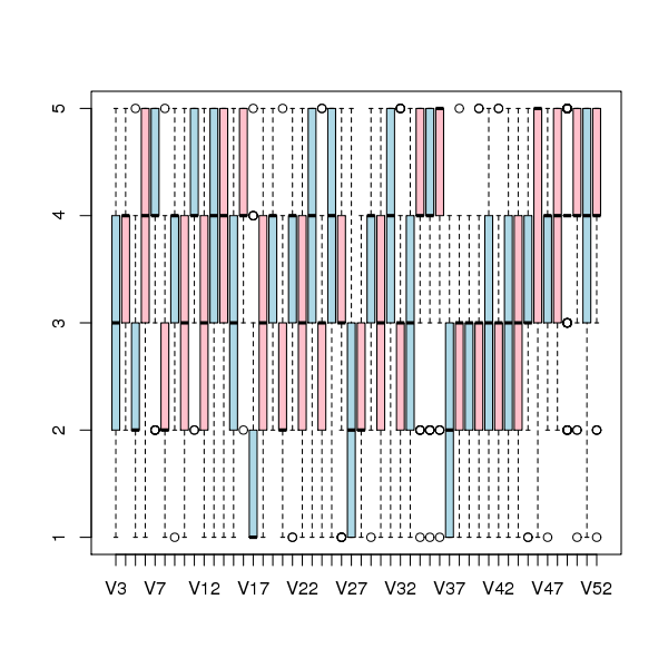
Figure 1. Boxplot of ratings given to snippets 1 to 50 by second year students (colors used to help distinguish boxplots for each snippet).
Between subject rating agreement
The Krippendorff alpha and mean Spearman rank correlation coefficient (the coefficient is calculated for every pair of subjects and the mean value taken) was obtained using the kripp.alpha and meanrho functions from the irr package (a <Jackknife> was used to obtain the following 95% confidence bounds):
Krippendorff's alpha cs1: 0.1225897 0.1483692 cs2: 0.2768906 0.2865904 cs4: 0.3245399 0.3405599 mean Spearman's rho cs1: 0.1844359 0.2167592 cs2: 0.3305273 0.3406769 cs4: 0.3651752 0.3813630 |
Taken as a whole there is a little of agreement. Perhaps there is greater consensus on the readability rating for a subset of the snippets. Recalculating using only using those snippets whose rated readability across all subjects, by year, has a standard deviation less than 1 (around 22, 51 and 62% of snippets respectively) shows some improvement in agreement:
Krippendorff's alpha cs1: 0.2139179 0.2493418 cs2: 0.3706919 0.3826060 cs4: 0.4386240 0.4542783 mean Spearman's rho cs1: 0.3033275 0.3485862 cs2: 0.4312944 0.4443740 cs4: 0.4868830 0.5034737 |
Between years comparison of ratings
The ratings from individual subjects is only available for one of their years at University. Aggregating the answers from all subjects in each year is one method of obtaining readability information that can be used to compare the opinions of students in different years.
How can subject ratings be aggregated to rank the 100 code snippets in order of what a combined group consider to be readability? The relatively large variation in mean value of the snippet ratings across subjects would result in wide confidence bounds for an aggregate based on ratings. Mapping each subject’s rating to a ranking removes the uncertainty caused by differences in mean subject ratings.
With 100 snippets assigned a rating between 1 and 5 by each subject there are going to be a lot of tied rankings. If, say, a subject gave 10 snippets a rating of 5 the procedure used is to assign them all the rank that is the mean of the ranks the 10 of them would have occupied if their ratings had been very slightly different, i.e., (1+2+3+4+5+6+7+8+9+10)/10 = 5.5. This process maps each students readability ratings to readability rankings, the next step is to aggregate these individual rankings.
The R_package[RankAggreg] package contains a variety of functions for aggregating a collection rankings to obtain a group ranking. However, these functions use the relative order of items in a vector to denote rank, and this form of data representations prevents them supporting ranked lists containing items having the same rank.
For this analysis a simple aggregate ranking algorithm using Borda’s method <book lin_10> was implemented. Borda’s method for creating an aggregate ranking operates on one item at a time, combining all of the subject ranks for that item into a single rank. Methods for combining ranks include taking their mean, their geometric mean and the square-root of the sum of their squares; the mean value was used for this analysis.
An aggregate ranking was created for subjects in years one, two and four and the plot below compares the ranking between 1st/2nd year students (left) and 2nd/4th year students (right). The order of the second year student snippet rankings have been sorted and the other year rankings for the snippets mapped to the corresponding position.
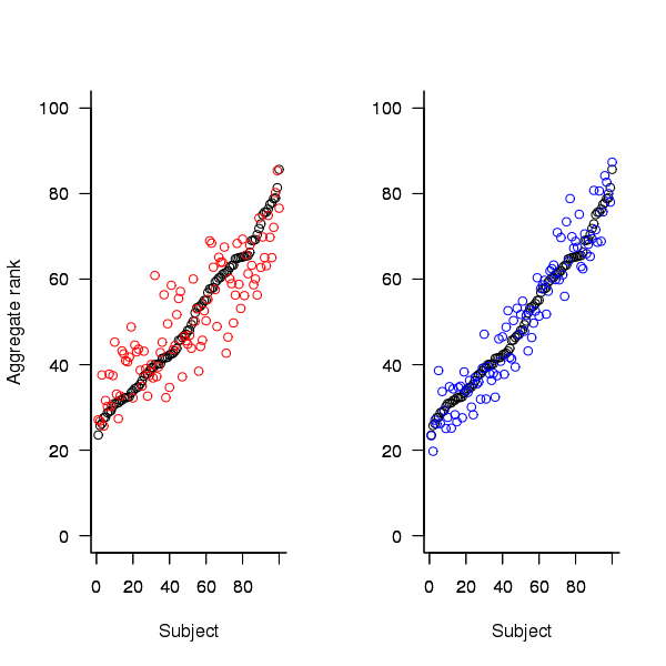
Figure 2. Aggregated ranking of snippets by subjects in years 1 and 2 (red and black) and years 2 and 4 (black and blue). Snippets have been sorted by year 2 ranking.
The above plot seems to show that at the aggregated year level there is much greater agreement between the 2nd/4th years than any other year pairing and measuring the correlation between each of the years using <Kendall’s tau>:
cs1.tau cs2.tau cs3.tau 0.6627602 0.6337914 0.8199636 |
confirms the greater agreement between this aggregate year pair.
Individual subject correlation to year aggregate ranking
To what extend to subject ratings correlate with their corresponding year aggregate? The following plot gives the correlation, using Kendall’s tau, between each subject and their corresponding year aggregate ranking.
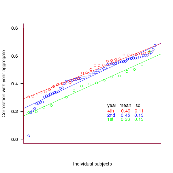
Figure 3. Correlation, using Kendall’s tau, between each subject and their corresponding year aggregate ranking.
The least squares fit shows that the variation in correlation across subjects in any year is very similar (removal of outliers in year 2 would make the lines almost parallel); the mean again shows a correlation that increases with year.
Discussion
The extent to which this study’s calculated values of rater agreement and correlation are considered worthy of further attention depends on the use to which the results will be put.
- From the perspective of trained raters the subject agreement in this study is very low and the rating have no further use.
- From the research perspective the results show that the concept of readability in the computer science student population has some non-zero substance to it that might be worth further study.
- From an overall perspective this study provides empirical evidence for a general lack of consensus on what constitutes readability.
It is not surprising that there is little agreement between student subjects on their readability rating, they are unlikely to have had much experience reading code and have not had any training in rating code for readability.
Professional developers will have spent years working with code and this experience is likely to have resulted in the creation of stable opinions on code readability. While developers usually work with code that is much longer than the few lines contained in the snippets used by Buse and Weimer, this experiment format is easy to administer and supports a fine level of control, i.e., allows a small set of source attributes of interest to be presented while excluding those not of interest. Repeating this study using such people as subjects would show whether this experience results in convergence to general agreement on the readability rating of code.
Summary of findings
The agreement between students readability ratings, for short snippets of code, improves as the students progress through course years 1 to 4 of a computer science degree.
While there is very good aggregated group agreement on the relative ranking of the readability of code snippets there is very little agreement between pairs of individuals.
- Two students chosen at random from within a year will have a low Spearman rank correlation coefficient for their rating of code snippet readability.
- Taken as a yearly aggregate there is a high degree of agreement between years two and four and less, but still good agreement between year 1 and other years.
- There is a broad range of correlations, from poor to good, between year aggregates and student subjects in the corresponding year.
Descriptive statistics of some Agile feature characteristics
The purpose of software engineering research is to figure out how software development works so that the software industry can improve its quality/timeliness (i.e., lower costs and improved customer satisfaction). Research is hampered by the fact that companies are not usually willing to make public good quality data about the details of their software development processes.
In mid July a post on the ACCU general mailing list caught my eye and I followed a link to a very interesting report, went to visit 7digital a few weeks later, told them about my empirical software engineering with R book and how I wanted to make all the data I used available to readers and they agreed to make the data public! The data arrived at the start of August and I spent the rest of the month analyzing it (the R code I used to analyse it).
Below is a draft of what will eventually appear in the book. As always comments welcome, particularly if you can extract more information from the 7digital data (the mapping of material to WordPress blog format might still be flaky in places).
Agile feature characteristics
Traditionally software development projects work towards releasing product updates on prespecified dates, often with a release cycle of between once or twice a year and with many updates included in each release. In contrast to this approach development groups following an Agile method <book ???> make frequent releases with each containing a small incremental update (Agile is an umbrella term applied to a variety of iterative and incremental software development methodologies).
Rationale for the Agile approach includes getting rapid feedback from customers on the direction of developments and maximizing return on software investment by getting newly implemented features into customers hand almost immediately.
The large number of releases (compared to other approaches) has the potential to provide enough data for meaningful statistical analysis of questions such as how often new features are released and the number of features under development at any time.
7digital<book 7Digital_12> is a digital media delivery company that operates an international on-line digital music store (www.7digital.com) and provides business to business digital media services via an open API platform. At 7digital software development is done using an Agile process and since April 2009 various items of information have been recorded <book Bowley_12>; 7digital are open about there process and have made this information publicly available and it is analysed here.
Data
The data consists of information on the 3,238 features implemented by the 7digital team between April 2009 and July 2012; this information consists of three dates (Prioritised/Start Development/Done), a classification of the feature as one of nine possible internal types (i.e.,
During the recording period the number of developers grew from 14 to 35.
The start/done dates represent an elapsed time period, a wide variety of factors can cause work on the implementation of a feature to be stalled for a period of time, i.e., the time difference need not represent total development time.
The Agile process gives a great deal of flexibility to developers about which projects they chose to work on. Information on the number of developers working on the implementation of individual features was not recorded.
Is the data believable?
As discussed elsewhere [checking data quality] measurements involving people are likely to be subject more external influences than measurements of inanimate objects such as source code, they are also more difficult to replicate and are open to those being measured influencing the results in their favor.
The following is what is known about the 7digital measurement process.
The data recording was done by whoever ran the Agile stand-up session at the start of the day.
What unit of time measurement is appropriate for analysing an Agile process? While fine grained measurements are the ideal they have the potential to require nontrivial effort from those reporting the values, are open to individual interpretation (e.g., when exactly did work start/stop on this feature?) and subject to human error (e.g., forgetting to note the event when it happened and having to recall it later). The day was chosen as the basic unit of time measurement; in light of the time needed to implement most features this may seem too large, but this choice has the advantage of being the natural unit of measurement in that developers meet together every morning to discuss progress and that days work and being so broad makes it more likely that start/end times will be consistently applied as well as less prone to inaccurate recall later.
Goodhart’s law (it is really an observation of human behavior rather than a law) says “Any observed statistical regularity will tend to collapse once pressure is placed on it for control purposes.” If the measurements collected were actively used to control or evaluate the development team then the developers would be motivated to move the measurements in the direction that was favorable to them. 7digital do not attempt to use the measurements for control or evaluation or developers and developers have no motive change their behavior based on being measured.
I find the data believable in that the measurement process is not so expensive or cumbersome that developers are unwilling to attempt to report accurate data and not being directly effected by the results means they have no motive for changing their behavior to influence the measurements.
Believable data does not mean the data is error free. The following is a count of the days of the week on which feature implementations were recorded as being Done. Monday is day 0 and the counts for Saturday/Sunday should be zero; assuming that Friday/Monday had been intended the non-zero values suggest a 2-4% error rate, comparable with human error rates for low stress/non-critical work.
> table(Done.day[(Done.day <= 650)] %% 7) 0 1 2 3 4 5 6 227 225 214 243 177 8 7 > table(Done.day[(Done.day > 650)] %% 7) 0 1 2 3 4 5 6 443 483 455 473 270 4 9 |
Predictions made in advance
Your author is not aware of any empirically based theory of Agile feature development capable of making predictions about development time related questions.
The analysis described here is purely descriptive; there is no attempt to build predictive models or compare the data against any existing theory.
The results from this data analysis (and all analysis in this book) are to provide information that will help software developers do a better job. What information can be extracted that would be useful to 7digital? This has proved to be a something of a chicken-and-egg question because people are interested in seeing the results before deciding whether they are useful. The following issues are of general interest:
- characteristics of the time taken to implement new features,
- variations in the number of different kinds of features (e.g., bug/non-bug) over time,
Applicable techniques
Overview of data
The data consists of start/finish times for the implementations of features and the overview information that springs to mind is average number of features implementation starts per time interval and average time taken to implement a feature. The figure below is a good enough approximation to this information to get a rough idea of its characteristics (e.g., the effect of weekends and holidays have not been taken into account and a 30 day rolling mean has been applied to smooth out daily fluctuations).
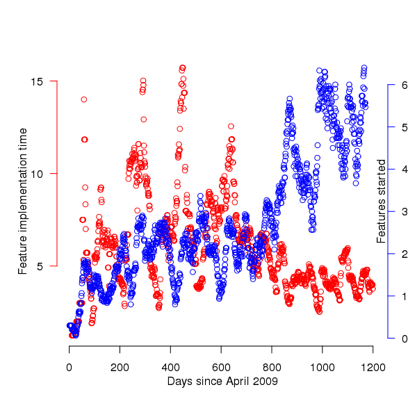
Figure 1. Average number of feature implementations started (blue) and their average duration (red); a 30 day rolling mean has been applied to both. Data courtesy of 7digital.
The plot appears to have two parts, before and after day 650 (or thereabouts). After day 650 the oscillations in feature implementation time die down substantially and the rate at which new feature implementations are started steadily increases. Possible reasons for the larger variations in the first 650 days include less expertise in organizing features into smaller work items and larger features being needed during the earlier stages of product development.
Obviously shorter implementation times make it possible to start work on more new features, however new feature starts continues to increase while implementation time stabilises around a lower value. Possible causes for the continuing increase in new feature starts include an increase in the number of developers and/or existing developers becoming more skilled in breaking work down into smaller features (i.e., feature implementation time stays about the same because fewer developers are working on each feature, making developers available to start on new features).
Software product development is a complicated business and a wide variety of different events and processes are likely to have contributed to the patterns of behavior seen in the data. While developers write the software it is customers who report most of the bugs and one of the goals of following an Agile methodology is rapid response to customer feedback (e.g., deciding which features need to be implemented and which left out). Customer information is not present in the dataset.
Are the same processes generating the apparent two phase behavior?
Any pattern of behavior is generated by a set of processes and when a pattern of behavior changes it is worthwhile asking how the processes driving the behavior changed.
Fitting a statistical distribution to a dataset is useful in that many distributions are known to be generated by processes having specified behaviors. Being able to fit the same distribution to both the pre and post 650 day datasets suggests that the phase change seen was not a fundamental change but akin to turning the volume knob of the distribution parameters one way or the other. If the datasets are best fitted by different distributions then the processes generating the two patterns of behavior are potentially very different.
Of the two characteristics plotted the feature implementation time appears to undergo the largest change of behavior and so the distribution of implementation times for the two phases is analysed here.
| Moment | Initial 650 days | After 650 days |
|---|---|---|
|
Median
|
3
|
3
|
|
Mean
|
7.6
|
4.6
|
|
Variance
|
116.4
|
35.0
|
|
Skewness
|
3.3
|
4.9
|
|
Kurtosis
|
19.2
|
30.4
|
A quick look at the data shows that many features are implemented in a single day and only a few take more than a week, one distribution having this pattern of behavior is the power-law. The table above shows that the variance is much larger than the mean and the distribution has a large positive skew, properties shared by the [negative binomial distribution]. The figure below is a plot of the number of features requiring a given number of elapsed working days for their implementation (top first 650 days, all features finished after 650 days), along with two power-law and a negative binomial distribution fit to the data.
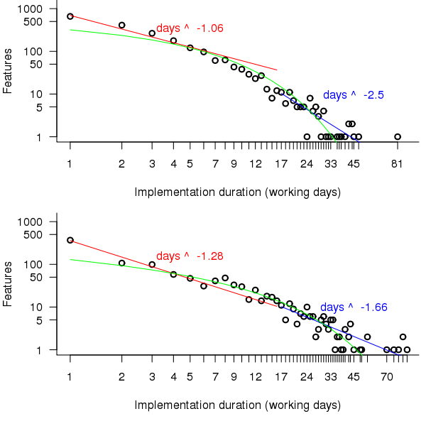
Figure 2. Number of features whose implementation took a given number of elapsed workdays. Top first 650 days, bottom after 650 days. Green line is the fitted negative binomial distribution. Data courtesy of 7digital.
The power-law fits were obtained by splitting the data into two parts, shorter/longer than 16 days (after noticing that visually the combined dataset seemed to have this form, less noticeable in the two subsets) and performing nonlinear regression using nls to find good fits for the parameters a and b (whose initial starting values converged without needing manual tuning).
pow_equ=nls(num.features ~ a*days^b, start=list(a=1200, b =-2)) y=predict(pow_equ, days) lines(days, y) |
While the power-law fits are not very good overall one of them does provide an easy to remember seat of the pants method for approximating the probability of a project taking a small number of days to complete (e.g., for  it is
it is 
[sum(1/(1:16)) is 3.38]). The approximation is also a reasonable fit for subsets of the features (e.g., different kinds of bugs).
The R package fitdistrplus contains functions for matching and fitting a dataset against known commonly occurring distribution. The Cullen and Frey graph produced by a call to descdist suggests that a negative binomial distribution is the best fitting of those tested (agreeing with the ad-hoc conclusion jumped to above).
descdist(p\$Cycle.Time, discrete=TRUE, boot=100) |
The function fitdist returns values for the parameters providing the appropriate fit to the specified dataset and distribution.
fd=fitdist(p\$Cycle.Time, "nbinom", method="mle") # Fit to a negative binomial distribution size.ct=fd\$estimate[1] mu.ct=fd\$estimate[2] # Plot distribution using fitted parameters plot(dnbinom(1:93, size=size.ct, mu=mu.ct)*length(p\$Cycle.Time), xlim=c(1,90), ylim=c(1,1200), log="xy") |
The figure above shows that the negative binomial distribution could be a reasonable fit if the percentage of single day features was not so high. Two possibilities spring to mind:
- the data does not include any counts for zero days which is one of the possible values supported by the negative binomial distribution (obviously feature implementations cannot take zero days),
- measurement quantization introduces significant uncertainty for shorter implementations, if the minimum unit of measurement were less than 1 day the fit might be much better because some feature implementations take half-a-day while others take a whole day.
It is possible to adjust the negative binomial equation to move the lower bound from zero to one. The package gamlss supports what is known as zero-truncation and the figure below shows the zero-truncated negative binomial distribution fitted to the pre/post 650 day counts.
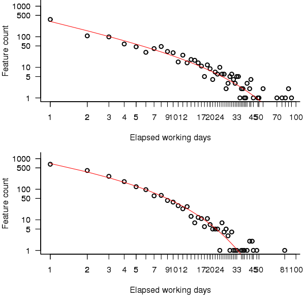
Figure 3. A zero-truncated negative binomial distribution fitted to the number of features whose implementation took a given number of elapsed workdays; top first 650 days, bottom after 650 days. Data courtesy of 7digital.
The quality of fit is much better for the pre 650 day data compared to the post 650 data.
> qual.pre650 AIC log.likelihood 6109.225 -3052.612 > qual.post650 AIC log.likelihood 9923.509 -4959.754 |
Modifying the negative binomial distribution to handle a dataset not containing zeroes improves the fit, can the fit be further improved by adjusting for measurement quantization?
One possibility is to simulate measuring feature implementation in units smaller than a day; the following code multiplies the implementation time by two and randomly decides whether to subtract one, i.e., maps measurements made in days to a possible set of measurements made in half days.
num.features=length(cycle.time) dither=as.integer(runif(num.features, 0, 1) > 0.33) return(2*cycle.time-dither) |
Fitting 1,000 randomly modified half-day measurements and averaging over all results shows that the fit is slightly worse than the original data (as measured by various goodness of fit criteria):
> fit.quality(p\$Cycle.Time[Done.day < 650]) loglikelihood AIC BIC -3438.284 6880.567 6890.575 > rowMeans(replicate(1000, fit.quality(sub.divide(p\$Cycle.Time[Done.day < 650])))) loglikelihood AIC BIC -4072.721 8149.442 8159.450 |
As discussed in the section on [properties of distributions] the negative binomial distribution can be generated by a mixture of [Poisson distribution]s whose means have a [Gamma distribution]. There are other distributions that can be generated through a mixture of Poisson distributions, are any of them a better fit of the data? The Delaporte distribution <book ???> sometimes fits very slightly better and sometimes slightly worse (see chapter source code for details); the difference is not large enough to warrant switching from a relatively well known distribution to one that is rarely covered in text books or supported in software; if data from other projects is best fitted by a Delaporte distribution then a switch may well be worthwhile.
The data subset corresponding to p$Type == "Production Bug" fits significantly better than the complete dataset (i.e., AIC = 3729) while the fit for the subset p$Type == "MMF" is comparable to the complete dataset (i.e., AIC of 7251).
Both datsets appear to follow the same distribution, the negative binomial distribution (with zero-truncation), with the initial 650 days having a greater mean and variance than post 650 days. The Poisson distribution is often encountered in processes involving events in time and one can imagine it applying to the various processes involved in the implementation of a feature; why the means of these Poisson distributions might follow a Gamma distribution is harder to fathom and is left for another day (it implies that both the Poisson means are decreasing and that the variance of the means is decreasing)
Do any other equations fit the data? Given enough optional parameters it is always possible to find an equation that is a good fit to the data. The following call to nls shows that the equation  fits the complete dataset rather well.
exp_mod=nls(num.features ~ a*exp(b*days^c), start=list(a=10000, b=-2.0, c=0.4)) |
This equation is unappealing because of its lack of similarity with equations seen in many other areas of research, an exponential whose exponent has the form of  raised to a fractional power is rarely encountered. There is a great deal of uncertainty when analysing data for the first time and being able to fit a form of equation used by other researchers provides a big comfort factor.
How many new feature implementations are started on each day?
The table below give the probability of a given number of new feature implementations starting on any day. There are sufficient multi-day implementations that on almost 20% of days no new feature implementations are started. An exponential equation is the commonly encountered form that provides an approximate fit to these values (i.e.,  ).
).
| 0 | 1 | 2 | 3 | 4 | 5 | 6 | 7 | 8 | 9 |
|---|---|---|---|---|---|---|---|---|---|
|
0.18
|
0.12
|
0.15
|
0.1
|
0.099
|
0.081
|
0.076
|
0.043
|
0.033
|
0.029
|
Time dependent patterns in the data
7digital is a growing company and we would expect that the rate of creation of features would increase over time, also as the size of the code base and the customer base increases the rate at which bugs are accepted for fixing is likely to increase.
The number of features developments started per day is one way of comparing different types of features. Plotting this information (see top left) shows that there is a great deal of variation over very short periods of time. This variation can be smoothed using a [rolling mean] to bring out the trends (the rollmean function in package zoo); the other plots show 20, 50 and 120 day rolling means for bugs (red) and non-bugs (blue) and the non-bug/bug feature ratio (black).
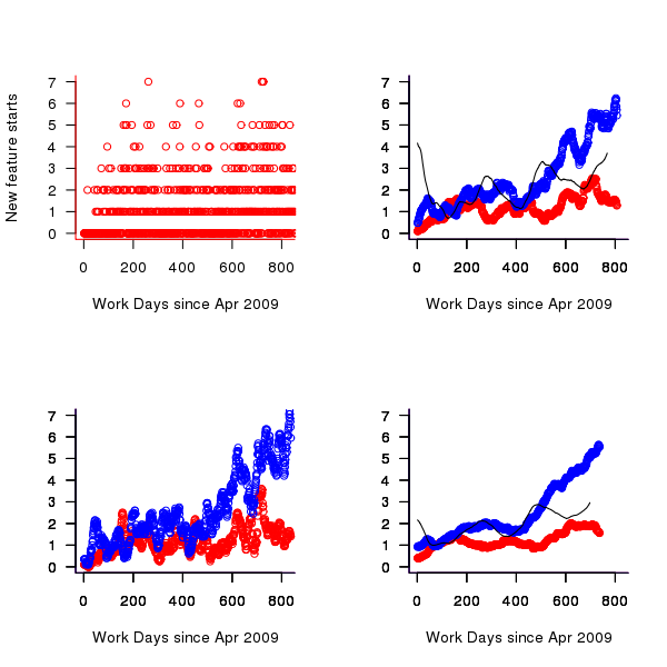
Figure 4. Number of feature developments started on a given work day (red bug fixes, blue non-bug work, black ratio of two values; 20 day rolling mean bottom left, 50 day top right, 120 day bottom right).
Both the number of bugs and non-bug features has trended upwards, as has the ratio between them. While it is tempting to suggest that this increase has been generated by the significant increase in number of developers over the time period, it is also possible the group has become better at dividing work into smaller feature work items or that having implemented the basic core of the products less work is now needed to create new features. The information present in the data is not sufficient to attempt to provide believable explanations for the upward trend.
Time series analysis
A preliminary data analysis technique for time data is to plot the current values against their lagged values for various lags. The output from the R function lag.plot for the number of in-progress features is shown below; apart from clustering the plots do not show any noticeable relationships in the data.
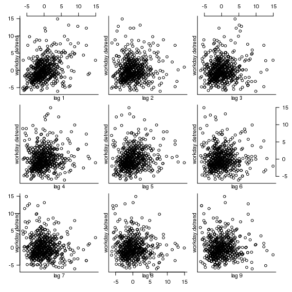
Figure 5. Scatterplot of number of features currently in-progress against various time lags (in working days).
Over longer timescales do the number of in-progress feature implementations have noticeable seasonal variations (e.g., greater in summer and Christmas/year year when developers are likely to be away)?
[Autocorrelation] is the cross-correlation of a time varying signal with itself, i.e., the correlation between a measurement occurring at time  and another one occurring at time
  ; changes in correlation as
  increases can be used to infer information about periodic changes over time.
The number of in-progress features appears to be increasing over time (top left of figure below) and this trend away from zero needs to be adjusted for before an autocorrelation is calculated. The feature implementation recording process did not happen over night and took a while before it covered all work performed; comparing a linear fit of all data (pink line of top left of figure below) and all data from January 2010 (red line) shows that this startup period does not significantly bias the growth trend. However, it is possible that patterns of behavior present in the total set of work items over a period are not reflected in the first 250 days of recording (roughly 180 working days) and so these are excluded from this particular analysis. From feature duration measurements we know that over 70% of features take longer than a day to implement, so the data contains a lot of serial dependence which may affect the accuracy of the results.
trend=lm(day.totals ~ time(day.totals)) plot(day.totals, xlab="Days since Apr 2009", ylab="Features in-progress") abline(trend) day.detrend=day.totals - predict(trend) # Subtract out any global trend |
The bottom left of the figure below shows the variation of in-progress features about the trend line. The top right shows the autocorrelation function for this plot, the regular spikes are caused by weekends (when no work took place). Removing weekends from the analysis results in the autocorrelation shown in the bottom right.
Apart from some correlation having a one day lag the autocorrelation drops to zero almost immediately followed by what appear to be small random spikes. These small spikes do not look important enough to follow up. A very similar pattern is seen in the autocorrelation of the two 650-day phases (the initial 650 days has a larger correlation for lags of 2-5 days). It is possible that a seasonal oscillation in feature work exists but is not seen because the data is so noisy (i.e., contains significant variation between adjacent days).
Summing daily values to create weekly totals, which of provides some smoothing, and performing the above analysis again produces essentially the same results.
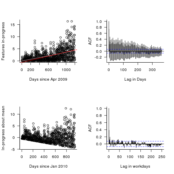
Figure 6. The number of features currently in-production on a given day since April 2009 (top left, pink line is a linear fit of all data, red line a linear fit of the data after day 250), the variation in this number about a linear trend line, excluding the first 250 days (bottom left), the autocorrelation function (top right) and the autocorrelation function with weekends removed from the data (bottom right).
Do reported bugs correlate with new feature releases?
When a feature is released the probability of a new bug being reported increases. Whether different bug probabilities should be assigned to bugfix releases and non-bugfix releases is discussed below. Based on this expectation we would expect to see a [cross correlation] between releases and number of bugs accepted for fixing. The more code a feature contains the more likely it is to contain a bug; however, no information on feature code size is provided so number of implementation work days is used as a measure of feature size.
The data does not specify which bugs belong to which features. It is to be expected that over time the probability of a bug being reported against a feature will decrease, reasons for this behavior include bugfixing, customers no longer using a feature and features being superseded by newer ones.
The figure below is the cross correlation between the ‘size’ of all features recorded as Done on a given day and all bugs recorded as Prioritised on a given date; the top plot is for all non-bugfix feature releases while the bottom plot is for all feature releases.
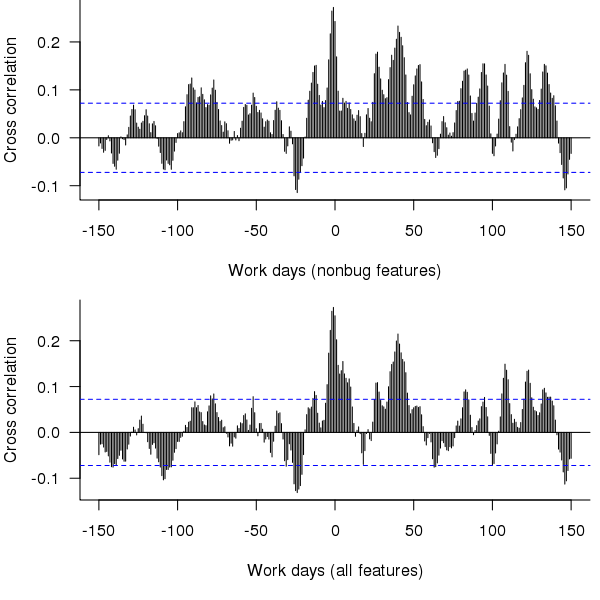
Figure 7. Cross correlation of feature release ‘size’ (top non-bugfix releases, bottom all releases) and date when bugs are prioritised.
The feature/bug cross correlation in the figure above should be zero for negative lags (i.e., no bugs can be reported for features that have not yet been released). One way of interpreting the pattern of correlation is that there some bugs are reported immediately after the release (perhaps by early adopters) followed by more bugs some 20 to 50 working days after release; other interpretations include there being a small amount of signal just visible behind lots of noise in the data or that the approximation used to estimate feature size is too crude.
Using weekly totals produces essentially the same result.
Summary of findings
The distribution of feature implementation times appears to follow a negative binomial distribution (with zero-truncation), with the values for the initial 650 days having a greater mean and variability (i.e., variance) than the following days.
There appears to be too much noise in the data for any time series signal involving mean values or a relationship between releases and bugs to be reliably extracted.
Acknowledgements
Thanks to 7digital for making the data available and being willing to make it public and to Rob Bowley for helping me to understand 7digital’s development environment.
Impact of hardware characteristics on detectable fault behavior
Preface. This is the first of what I hope will be many posts analysing experimental data, that will eventually end up in my empirical software engineering with R book (this experiment was chosen because it happens to be the one I am currently working on; having just switched to using Asciidoc I have a backlog of editing to do on previously written analysis, also I have to figure out a way to fix [bracketed words]).
Don’t worry if you don’t know anything about the statistics used. I am aiming to provide information to meet the needs of two audiences (whether or not I fail on both counts remains to be seen):
- Those who want to some idea of what facts are known about a particular software engineering topic. Hopefully reading the introduction+conclusion will enable these readers to form an opinion about the current state of knowledge (taking my statistical analysis on trust).
- Those who are looking for ideas that can be used to analyse a problem they are trying to solve. Hopefully, somewhere among my many analyses will be something that looks like it could be applied to the reader’s problem and motivates them to go off and learn something about the statistics (if they are not already familiar with it; once written the book will obviously help out here).
Forward. The following analysis produces a negative result, something that happens a lot in experiments in all fields of research. It has been included to illustrate the importance of checking the statistical power of an experiment, i.e., how likely the experiment will detect an effect if one is present; it is very easy to fall into the trap of thinking that because lots of tests were done any effect that exists will be detected.
The authors ran an interesting experiment which as far as I know is the only published empirical analysis of intermittent software faults (please let me know if you are aware of other work) and made some mistakes in their statistical analysis. I have made plenty of mistakes in experiments I have run, some of which have found there way into the published write up. The key attribute of an experimentalist is to learn and move on.
A fault does not always noticeably change the behavior of a program when it is executed, apparently correct program execution can occur in the presence of serious faults.
A study by Syed, Robinson and Williams <book Syed_10> investigated how the number of noticeable failures caused by known faults in Mozilla’s Firefox browser varied with processor speed, system memory, hard disc size and system load. A total of 11 known faults causing intermittent failure were selected and nine different hardware configurations were selected. The conditions required to exhibit each fault were replicated and Firefox was executed 10 times for each of hardware configuration, counting the number of noticeable program failures; the seven faults and nine hardware configurations listed in the table below generated a total of 10*7*9 = 630 different executions (four faults either always or never resulted in an observed failure during the 10 runs).
Data
The following table contains the observed number of failures of Firefox for the given fault number when run on the specified hardware configuration.
| Mhz-Mb-Gb | 124750 | 380417 | 410075 | 396863 | 494116 | 264562 | 332330 |
|---|---|---|---|---|---|---|---|
|
667-128-2.5 |
4 |
10 |
6 |
5 |
2 |
3 |
5 |
|
667-256-10 |
4 |
8 |
8 |
6 |
4 |
3 |
8 |
|
667-1000-2.5 |
4 |
7 |
3 |
4 |
3 |
1 |
8 |
|
1000-128-10 |
3 |
10 |
3 |
6 |
0 |
1 |
1 |
|
1000-256-2.5 |
3 |
9 |
0 |
6 |
0 |
1 |
2 |
|
1000-1000-10 |
2 |
9 |
4 |
5 |
0 |
0 |
1 |
|
2000-128-2.5 |
0 |
10 |
5 |
6 |
0 |
0 |
0 |
|
2000-256-10 |
2 |
8 |
5 |
7 |
0 |
0 |
0 |
|
2000-1000-10 |
1 |
7 |
3 |
5 |
0 |
0 |
0 |
Predictions made in advance
There is no prior theory suggesting how the selected hardware characteristics might influence the outcome from this experiment. The analysis is based on searching for a pattern in the results and so the significance level needs to be adjusted to take account of the number of possible patterns that could exist (e.g., using the [Bonferroni correction]).
If we simplify the failure counts by labelling them as one of Low/Medium/High, then there are two arrangements of the failure counts (i.e., low/medium/high and high/medium/low) that would result in a strong correlation for cpu_speed, two arrangements for memory and two for disc size; a total of 6 combinations that would result in a strong correlation being found.
The [Bonferroni correction] adjusts the significance level by dividing by the number of tests, in this case 0.05/6 = 0.0083.
If the failure counts occurred in a random order what is the probability of a strong correlation between failure count and one of the hardware attributes being found? Based on the Low/Medium/High labelling scheme there are 9!/(3! 3! 3!) = 1680 combinations of these counts over 9 slots, giving a 1 in 1680/6 = 280 chance of purely random behavior producing a strong correlation.
The experiment investigated the characteristics of 11 faults. If there is a 1 in 280 chance of finding a strong correlation when analyzing one fault there is approximately a 1 in 24 chance of finding at least one strong correlation when analysing 11 different faults.
Response variable
The response variable takes the form of a proportion whose value varies between 0 and 1, the number of failures out of 10 executions.
Applicable techniques
The following techniques might be used to analyse this data:
- [Factorial design]. This is a way of organizing experiment configurations that is designed to extract the most information for the total number of program runs made. It would be inefficient not to use the results from some hardware configurations just because they are not needed in the factorial design and no results are available for some configurations required by a factorial design (or a [Plackett-Burman] design).
-
Fitting the data using a linear model. A standard linear model, created using R’s lm function, would not be appropriate because of the following two problems:
- this kind of model is likely to make predictions that fall outside the range 0 to 1, something that cannot happen for proportional data,
- this approach assumes that the variance is constant across measurements and unless the proportions involved are very close to each other this requirement will not be met ([proportional data] from a [binomial distribution] has variance p(1-p)).
However, a generalised linear model would not suffer from these problems. There are several [link functions] that could be used:
- the Poisson distribution, is widely used for modelling faults but requires that the mean and variance have the same value, a property that does not apply to proportional data.
- the Binomial distribution, can handle data having the characteristics present here.
The proportional data is specified in the call to the glm function by having the response variable contain two columns, one containing the number of failures (that is what is being predicted in this case) and the other the number of non-failures. The code looks something like the following (see complete example and data):
y=cbind(fail_count, 10-fail_count) glm(y ~ cpu_speed+memory+disk_size, data=ff_data, family=binomial) |
In this kind of GLM it is assumed that the [residual deviance] is the same as the [residual degrees of freedom]. If the residual deviance is greater than the residual degrees of freedom then [overdispersion] has occurred, which happens for fault 380417. To handle overdispersion the family needs to be changed from binomial to quasibinomial, which in the case of fault 380417 changes the p-value of the fit from 0.0348 to 0.0749.
The analysis of each fault finds that only one of them, 332330, has a significance level within the specified acceptable bounds; this has a negative correlation with CPU speed (i.e., observed failures decrease with clock speed).
With only one faults found to have any significant hardware configuration effects we have to ask about the probability of this experiment finding an effect if one was present.
An analysis of the [statistical power] of an experiment investigating the difference between proportions for two hardware configurations (i.e., the percentage of observed failures) needs to know the value of those proportions, the number of runs (10 in this case) and the desired p-value (0.05); to simplify things the plot below is based on using the value of the lowest proportion and the difference between it and the higher proportion. The left plot shows the power achieved (y-axis) there does exist a given difference in proportions (x-axis), the three lowest proportions of 0.05, 0.25 and 0.5 are shown (the result is symmetric about 0.5 and so the plot for 0.75 and 0.95 would be the same as 0.25 and 0.05 respectively), and where there were 10 and 50 runs involving the same fault case.
It can be seen that unless a change in the hardware configuration causes a large change in the number of visible failures then the chance of a difference being detected in results from 10 runs is well below 0.5 (i.e., less than a 50% chance of detecting a difference at a p-value of 0.05 or better).
The right plot in the figure gives the number of runs that need to be made to have a 80% chance of detecting, between two different hardware configurations, the difference in proportion listed on the x-axis, at a significance of 0.05.
It can be seen that if hardware charactersitics account for only 10% of the difference in failure rate over 100 runs would be needed to detect it.
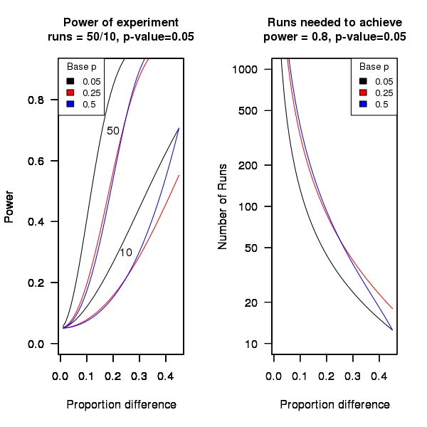
Conclusion
Faults in Firefox that caused intermittent failures were investigated looking for a correlation with system cpu speed, memory or disc size. One fault showed a strong correlation with cpu speed (there is a 1 in 24 chance that one of the investigated faults would have some kind of strong correlation). This experiment may not have found a significant correlation between observed failure rate and hardware configuration because the number of separate runs for each fault (i.e., 10) had [low power].
Background to my book project “Empirical Software Engineering with R”
This post provides background information that can be referenced by future posts.
For the last 18 months I have been working in fits and starts on a book that has the working title “Empirical Software Engineering with R”. The idea is to provide broad coverage of software engineering issues from an empirical perspective (i.e., the discussion is driven by the analysis of measurements obtained from experiments); R was chosen for the statistical analysis because it is becoming the de-facto language of choice in a wide range of disciplines and lots of existing books provide example analysis using R, so I am going with the crowd.
While my last book took five years to write I had a fixed target, a template to work to and a reasonably firm grasp of the subject. Empirical software engineering has only really just started, the time interval between new and interesting results appearing is quiet short and nobody really knows what statistical techniques are broadly applicable to software engineering problems (while the normal distribution is the mainstay of the social sciences a quick scan of software engineering data finds few occurrences of this distribution).
The book is being driven by the empirical software engineering rather than the statistics, that is I take a topic in software engineering and analyse the results of an experiment investigating that topic, providing pointers to where readers can find out more about the statistical techniques used (once I know which techniques crop up a lot I will write my own general introduction to them).
I’m assuming that readers have a reasonable degree of numeric literacy, are happy dealing with probabilities and have a rough idea about statistical ideas. I’m hoping to come up with a workable check-list that readers can use to figure out what statistical techniques are applicable to their problem; we will see how well this pans out after I have analysed lots of diverse data sets.
Rather than wait a few more years before I can make a complete draft available for review I have decided to switch to making available individual parts as they are written, i.e., after writing a draft discussion and analysis of each experiment I will published it on this blog (along with the raw data and R code used in the analyse). My reasons for doing this are:
- Reader feedback (I hope I get some) will help me get a better understanding of what people are after from a book covering empirical software engineering from a statistical analysis of data perspective.
- Suggestions for topics to cover. I am being very strict and only covering topics for which I have empirical data and can make that data available to readers. So if you want me to cover a topic please point me to some data. I will publish a list of important topics for which I currently don’t have any data, hopefully somebody will point me at the data that can be used.
- Posting here will help me stay focused on getting this thing done.
Links to book related posts
Distribution of uptimes for high-performance computing systems
Break even ratios for development investment decisions
Agreement between code readability ratings given by students
Changes in optimization performance of gcc over time
Descriptive statistics of some Agile feature characteristics
Impact of hardware characteristics on detectable fault behavior
Prioritizing project stakeholders using social network metrics
Preferential attachment applied to frequency of accessing a variable
Amount of end-user usage of code in Firefox
How many ways of programming the same specification?
Ways of obtaining empirical data in software engineering
What is the error rate for published mathematical proofs?
Changes in the API/non-API method call ratio with program size
Honking the horn for go faster memory (over go faster cpus)
How to avoid being a victim of Brooks’ law
Evidence for the benefits of strong typing, where is it?
Hardware variability may be greater than algorithmic improvement
Extracting the original data from a heatmap image
Entropy: Software researchers go to topic when they have no idea what else to talk about
An academic programming language paper about R
The R language has passed another milestone, a paper aimed at the academic programming language community (or at least one section of this community) has been written about it, Evaluating the Design of the R Language by Morandat, Hill, Osvald and Vitek. Hardly earth shattering news, but it may have some impact on how R is viewed by nonusers of the language (the many R users in finance probably don’t care that R seems to have been labeled as the language for doing statistics). The paper is well written and contains some very interesting information as well as a few mistakes, although it will probably read like gobbledygook to anybody not familiar with academic programming language research. What follows has something of the form of an R users guide to reading this paper, plus some commentary.
The paper has roughly three parts, the first gives an overview of R, the second is a formal definition of a subset and the third an initial report of an analysis of R usage. For me and I imagine you dear reader the really interesting stuff is in the third section.
When giving a language overview to people who know other computer languages it makes sense to leverage that knowledge, this is why the discussion has a world view from the perspective of languages rarely associated with R: Scheme, Haskell and CLOS. I found some of the discussion of R constructs to be much more informative and less confusing than that in nearly all R books/tutorials I have read, but then they are written from a detailed operational programming language perspective. One criticism of this overview is that it does not give any hint as to why R has such a large following (saying that users found it more useful than these languages would send the wrong kind of signal ;-).
What is a formal description of a subset of R (i.e., done purely using mathematics) doing in the second part? Well, until recently very little academic software engineering was empirically based and was populated by people I would classify as failed mathematicians without the common sense needed to be engineers. Things are starting to change but research that measures things, particularly people, is still regarded as not being respectable in some quarters. In this case the formal definition is playing the role of a virility symbol showing that the authors are obviously regular guys who happen to be indulging in a bit of empirical research.
A surprising number of papers measuring the usage of real software contain formal definitions of a subset of the language being measured. Subsets are used because handling the complete language is a big project that usually involves one or more people getting a PhD out of the work. The subset chosen have to look plausible to readers who understand the mathematics but not the programming language, broadly handle all the major constructs but not get involved with all the fiddly details that need years of work and many pages to describe.
The third part contains the real research, which is really about one implementation of R and the characteristics of R source in the CRAN and Bioconductor repositories, and contains lots of interesting information. Note: the authors are incorrect to aim nearly all of the criticisms in this subsection at R, these really apply to the current implementation of R and might not apply to a different implementation.
In a previous post I suggested some possibilities for speeding up the execution of R programs that depended on R usage characteristics. The Morandat paper goes a long way towards providing numbers for some of these usage characteristics (e.g., 37% of function parameters are assigned to and 36% of vectors contain a single value).
What do we learn from this first batch of measurements? R users rarely use many of the more complicated features (e.g., object oriented constructs {and this paper has been accepted at the European Conference on Object-Oriented Programming}), a result usually seen for other languages. I was a bit surprised that R programs were only 40% smaller than equivalent C programs. I think part of the reason is that some of the problems used for benchmarking are not the kind that would usually be solved using R and I did not see any ‘typical’ R programs being coded up in C for comparison, another possibility is that the authors were not thinking in R when writing the code.
One big measurement topic the authors missed is comparing their general findings with usage measurements of other languages. I think they will find lots of similar patterns of usage.
The complaint that R has been defined by the successive releases of its only implementation, rather than a written specification, applies to all widely used languages, at least in their early days. Back in the day a major reason for creating language standards for Pascal and then C was so that other implementations could be created; the handful of major languages whose specification was written before the first implementation (e.g., PL/1, Ada) have/are dieing out. Are multiple implementations needed in an Open Source world? The answer seems to be no for Perl and yes for PHP, Ruby etc. The effort needed to create a written specification for the R language might be better invested improving the efficiency of the current implementation so that a better alternative is not needed.
Needless to say the authors suggested committing the fatal programming language research mistake.
The authors have created an interesting set of tools for static and dynamic analysis of R and I look forward to reading more about their findings in future papers.
Empirical software engineering is five years old
Science and engineering are built on theoretical models that are tested against measurements of ‘reality’. Until around 10 years ago there was very little software engineering ‘reality’ publicly available; companies rarely made source available and were generally unforthcoming about any bugs that had been discovered. What happened around 10 years ago was the creation of public software repositories such as SourceForge and public fault databases such as Bugzilla. At last researchers had access to what could be claimed to be real world data.
Over the last five years there has been an explosion of papers using SourceForge/Bugzilla kinds of data looking for a connection between everything+kitchen sink and faults. The traditional measures such as Halstead and McCabe have not stood up well against this onslaught of data, hardly surprising given they were more or less conjured out of thin air. Some researchers are trying to extract information about developer characteristics from mailing lists; given that software is written by developers there is obviously a real need for the characteristics of major project contributors to play a significant role in any theory of software faults.
Software engineering data includes a lot more than what can be extracted from source code, bug lists and email lists. A growing number of repositories have been set up to hold measurement and experimental data, e.g., hardware failures, effort prediction (while some of this data is pre-2000 it tends to be low volume or poor quality), and file system related.
At the individual level a small number of researchers have made data available on their own web site, a few more will send a copy if asked and sadly there are many cases where the raw data has been lost. In two recent cases researchers have responded to my request for raw data by telling me they are working on additional papers and don’t want to make the data public yet. I can understand that obtaining interesting data requires a lot of work and researchers want to extract maximum benefit; I look forward to see the new papers and the eventual availability of the data.
My interest in all this data is that I have started work on a book covering empirical software engineering using R. Five years ago such book would have contained lots of equations, plenty of hand waving and if data sets were available they would probably have been small enough to print on one page. Today there are still plenty of equations (mostly relating to statistical this that and the other), no hand waving (well, none planned), data sets for everything covered (some in the gigabytes and a few that can still fit on a page) and pretty pictures (color graphs, as least for the pdf version).
When historians trace back the history of empirical software engineering I think they will say that it started for real sometime around 2005. Before then, any theories that were based on observation tended to have small, single study, data sets with little statistical significance or power.
Recent Comments