Patterns of regular expression usage: duplicate regexs
Regular expressions are widely used, but until recently they were rarely studied empirically (i.e., just theory research).
This week I discovered two groups studying regular expression usage in source code. The VTSBULeeLab has various papers analysing 500K distinct regular expressions, from programs written in eight languages and StackOverflow; Carl Chapman and Peipei Wang have been looking at testing of regular expressions, and also ran an interesting experiment (I will write about this when I have decoded the data).
Regular expressions are interesting, in that their use is likely to be purely driven by an application requirement; the use of an integer literals may be driven by internal housekeeping requirements. The number of times the same regular expression appears in source code provides an insight (I claim) into the number of times different programs are having to solve the same application problem.
The data made available by the VTSBULeeLab group provides lots of information about each distinct regular expression, but not a count of occurrences in source. My email request for count data received a reply from James Davis within the hour 🙂
The plot below (code+data; crates.io has not been included because the number of regexs extracted is much smaller than the other repos) shows the number of unique patterns (y-axis) against the number of identical occurrences of each unique pattern (x-axis), e.g., far left shows number of distinct patterns that occurred once, then the number of distinct patterns that each occur twice, etc; colors show the repositories (language) from which the source was obtained (to extract the regexs), and lines are fitted regression models of the form:  , where:
  is driven by the total amount of source processed and the frequency of occurrence of regexs in source, and
  is the rate at which duplicates occur.
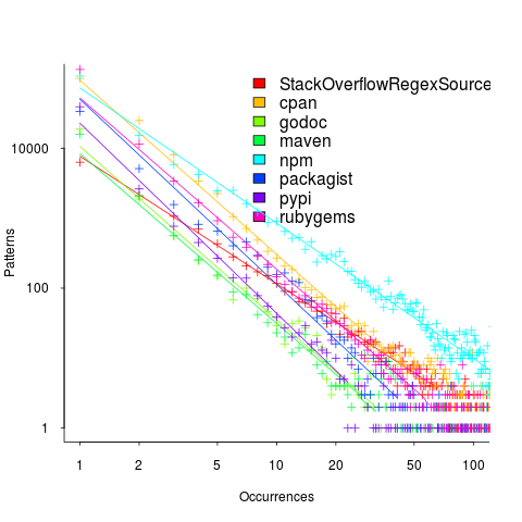
So most patterns occur once, and a few patterns occur lots of times (there is a long tail off to the unplotted right).
The following table shows values of for the various repositories (languages):
StackOverflow   cpan    godoc    maven    npm  packagist   pypi   rubygems
-1.8 -2.5 -2.5 -2.4 -1.9 -2.6 -2.7 -2.4 |
The lower (i.e., closer to zero) the value of , the more often the same regex will appear.
The values are in the region of -2.5, with two exceptions; why might StackOverflow and npm be different? I can imagine lots of duplicates on StackOverflow, but npm (I’m not really familiar with this package ecosystem).
I am pleased to see such good regression fits, and close power law exponents (I would have been happy with an exponential fit, or any other equation; I am interested in a consistent pattern across languages, not the pattern itself).
Some of the code is likely to be cloned, i.e., cut-and-pasted from a function in another package/program. Copy rates as high as 70% have been found. In this case, I don’t think cloned code matters. If a particular regex is needed, what difference does it make whether the code was cloned or written from scratch?
If the same regex appears in source because of the same application requirement, the number of reuses should be correlated across languages (unless different languages are being used to solve different kinds of problems). The plot below shows the correlation between number of occurrences of distinct regexs, for each pair of languages (or rather repos for particular languages; top left is StackOverflow).
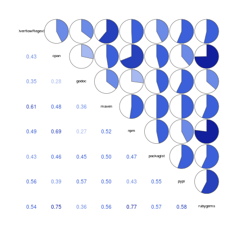
Why is there a mix of strong and weakly correlated pairs? Is it because similar application problems tend to be solved using different languages? Or perhaps there are different habits for cut-and-pasted source for developers using different repositories (which will cause some patterns to occur more often, but not others, and have an impact on correlation but not the regression fit).
There are a lot of other interesting things that can be done with this data, when connected to the results of the analysis of distinct regexs, but these look like hard work, and I have a book to finish.
Source code has a brief and lonely existence
The majority of source code has a short lifespan (i.e., a few years), and is only ever modified by one person (i.e., 60%).
Literate programming is all well and good for code written to appear in a book that the author hopes will be read for many years, but this is a tiny sliver of the source code ecosystem. The majority of code is never modified, once written, and does not hang around for very long; an investment is source code futures will make a loss unless the returns are spectacular.
What evidence do I have for these claims?
There is lots of evidence for the code having a short lifespan, and not so much for the number of people modifying it (and none for the number of people reading it).
The lifespan evidence is derived from data in my evidence-based software engineering book, and blog posts on software system lifespans, and survival times of Linux distributions. Lifespan in short because Packages are updated, and third-parties change/delete APIs (things may settle down in the future).
People who think source code has a long lifespan are suffering from survivorship bias, i.e., there are a small percentage of programs that are actively used for many years.
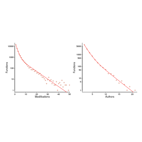
Around 60% of functions are only ever modified by one author; based on a study of the change history of functions in Evolution (114,485 changes to functions over 10 years), and Apache (14,072 changes over 12 years); a study investigating the number of people modifying files in Eclipse. Pointers to other studies that have welcome.
One consequence of the short life expectancy of source code is that, any investment made with the expectation of saving on future maintenance costs needs to return many multiples of the original investment. When many programs don’t live long enough to be maintained, those with a long lifespan have to pay the original investments made in all the source that quickly disappeared.
One benefit of short life expectancy is that most coding mistakes don’t live long enough to trigger a fault experience; the code containing the mistake is deleted or replaced before anybody notices the mistake.
Update: a few days later
I was remiss in not posting some plots for people to look at (code+data).
The plot below shows number of function, in Evolution, modified a given number of times (left), and functions modified by a given number of authors (right). The lines are a bi-exponential fit.
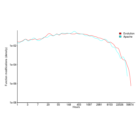
What is the interval (in hours) between between modifications of a function? The plot below has a logarithmic x-axis, and is sort-of flat over most of the range (you need to squint a bit). This is roughly saying that the probability of modification in hours 1-3 is the same as in hours 3-7, and hours, 7-15, etc (i.e., keep doubling the hour interval). At round 10,000 hours function modification probability drops like a stone.
How are C functions different from Java methods?
According to the right plot below, most of the code in a C program resides in functions containing between 5-25 lines, while most of the code in Java programs resides in methods containing one line (code+data; data kindly supplied by Davy Landman):
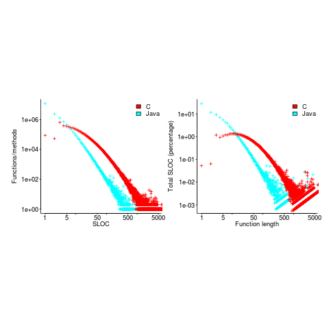
The left plot shows the number of functions/methods containing a given number of lines, the right plot shows the total number of lines (as a percentage of all lines measured) contained in functions/methods of a given length (6.3 million functions and 17.6 million methods).
Perhaps all those 1-line Java methods are really complicated. In C, most lines contain a few tokens, as seen below (code+data):
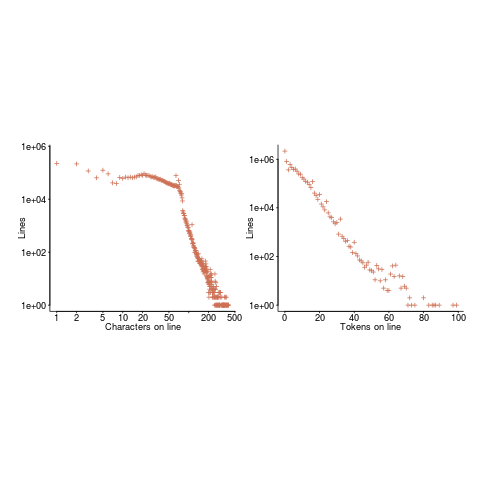
I don’t have any characters/tokens per line data for Java.
Is Java code mostly getters and setters?
I wonder what pattern C++ will follow, i.e., C-like, Java-like, or something else? If you have data for other languages, please send me a copy.
How useful are automatically generated compiler tests?
Over the last decade, testing compilers using automatically generated source code has been a popular research topic (for those working in the compiler field; Csmith kicked off this interest). Compilers are large complicated programs, and they will always contain mistakes that lead to faults being experienced. Previous posts of mine have raised two issues on the use of automatically generated tests: a financial issue (i.e., fixing reported faults costs money {most of the work on gcc and llvm is done by people working for large companies}, and is intended to benefit users not researchers seeking bragging rights for their latest paper), and applicability issue (i.e., human written code has particular characteristics and unless automatically generated code has very similar characteristics the mistakes it finds are unlikely to commonly occur in practice).
My claim that mistakes in compilers found by automatically generated code are unlikely to be the kind of mistakes that often lead to a fault in the compilation of human written code is based on the observations (I don’t have any experimental evidence): the characteristics of automatically generated source is very different from human written code (I know this from measurements of lots of code), and this difference results in parts of the compiler that are infrequently executed by human written code being more frequently executed (increasing the likelihood of a mistake being uncovered; an observation based on my years working on compilers).
An interesting new paper, Compiler Fuzzing: How Much Does It Matter?, investigated the extent to which fault experiences produced by automatically generated source are representative of fault experiences produced by human written code. The first author of the paper, Michaël Marcozzi, gave a talk about this work at the Papers We Love workshop last Sunday (videos available).
The question was attacked head on. The researchers instrumented the code in the LLVM compiler that was modified to fix 45 reported faults (27 from four fuzzing tools, 10 from human written code, and 8 from a formal verifier); the following is an example of instrumented code:
warn ("Fixing patch reached"); if (Not.isPowerOf2()) { if (!(C-> getValue().isPowerOf2() // Check needed to fix fault && Not != C->getValue())) { warn("Fault possibly triggered"); } else { /* CODE TRANSFORMATION */ } } // Original, unfixed code |
The instrumented compiler was used to build 309 Debian packages (around 10 million lines of C/C++). The output from the builds were (possibly miscompiled) built versions of the packages, and log files (from which information could be extracted on the number of times the fixing patches were reached, and the number of cases where the check needed to fix the fault was triggered).
Each built package was then checked using its respective test suite; a package built from miscompiled code may successfully pass its test suite.
A bitwise compare was run on the program executables generated by the unfixed and fixed compilers.
The following (taken from Marcozzi’s slides) shows the percentage of packages where the fixing patch was reached during the build, the percentages of packages where code added to fix a fault was triggered, the percentage where a different binary was generated, and the percentages of packages where a failure was detected when running each package’s tests (0.01% is one failure):
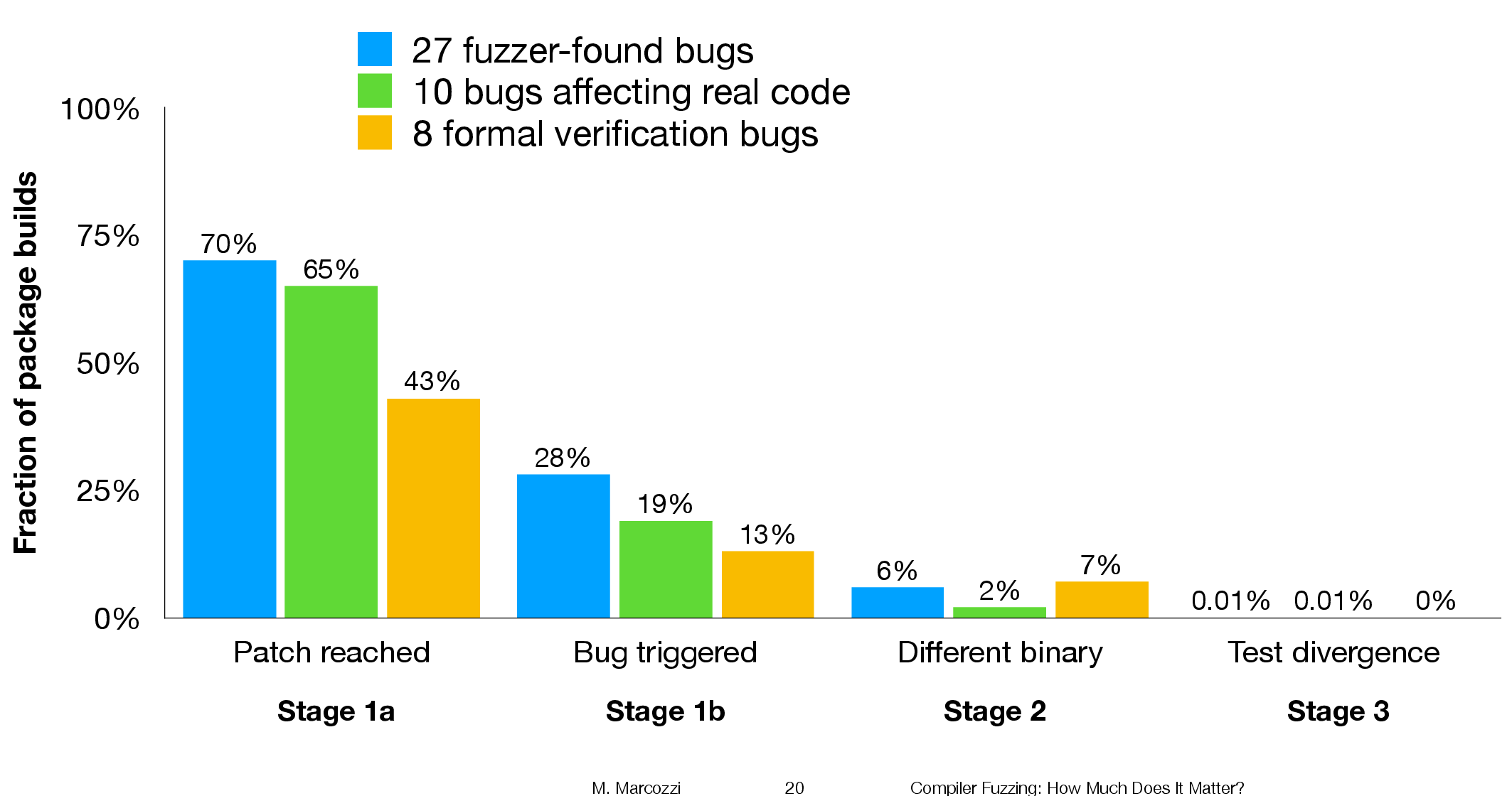
The takeaway from the above figure is that many packages are affected by the coding mistakes that have been fixed, but that most package test suites are not affected by the miscompilations.
To find out whether there is a difference, in terms of impact on Debian packages, between faults reported in human and automatically generated code, we need to compare the number of occurrences of “Fault possibly triggered”. The table below shows the break-down by the detector of the coding mistake (i.e., Human and each of the automated tools used), and the number of fixed faults they contributed to the analysis.
Human, Csmith and EMI each contributed 10-faults to the analysis. The fixes for the 10-fault reports in human generated code were triggered 593 times when building the 309 Debian packages, while each of the 10 Csmith and EMI fixes were triggered 1,043 and 948 times respectively; a lot more than the Human triggers :-O. There are also a lot more bitwise compare differences for the non-Human fault-fixes.
Detector Faults Reached Triggered Bitwise-diff Tests failed Human 10 1,990 593 56 1 Csmith 10 2,482 1,043 318 0 EMI 10 2,424 948 151 1 Orange 5 293 35 8 0 yarpgen 2 608 257 0 0 Alive 8 1,059 327 172 0 |
Is the difference due to a few packages being very different from the rest?
The table below breaks things down by each of the 10-reported faults from the three Detectors.
Ok, two Human fault-fix locations are never reached when compiling the Debian packages (which is a bit odd), but when the locations are reached they are just not triggering the fault conditions as often as the automatic cases.
Detector   Reached    Triggered
Human
              300       278
              301         0
              305         0
                0         0
                0         0
              133        44
              286       231
              229         0
              259        40
               77         0
Csmith
              306         2
              301       118
              297       291
              284         1
              143         6
              291       286
              125       125
              245         3
              285        16
              205       205
EMI
              130         0
              307       221
              302       195
              281        32
              175         5
              122         0
              300       295
              297       215
              306       191
287 10 |
It looks like I am not only wrong, but that fault experiences from automatically generated source are more (not less) likely to occur in human written code (than fault experiences produced by human written code).
This is odd. At best, I would expect fault experiences from human and automatically generated code to have the same characteristics.
Ideas and suggestions welcome.
Update: the morning after
I have untangled my thoughts on how to statistically compare the three sets of data.
The bootstrap is based on the idea of exchangeability; which items being measured might we consider to be exchangeable, i.e., being able to treat the measurement of one as being the equivalent to measuring the other.
In this experiment, the coding mistakes are not exchangeable, i.e., different mistakes can have different outcomes.
But we might claim that the detection of mistakes is exchangeable; that is, a coding mistake is just as likely to be detected by source code produced by an automatic tool as source written by a Human.
The bootstrap needs to be applied without replacement, i.e., each coding mistake is treated as being unique. The results show that for the sum of the Triggered counts (code+data):
- treating Human and Csmith as being equally likely to detect the same coding mistake, there is a 18% change of the Human results being lower than 593.
- treating Human and EMI as being equally likely to detect the same coding mistake, there is a 12% change of the Human results being lower than 593.
So the likelihood of the lower value, 593, of Human Triggered events is expected to occur quite often (i.e., 12% and 18%). Automatically generated code is not more likely to detect coding mistakes than human written code (at least based on this small sample set).
for-loop usage at different nesting levels
When reading code, starting at the first line of a function/method, the probability of the next statement read being a for-loop is around 1.5% (at least in C, I don’t have decent data on other languages). Let’s say you have been reading the code a line at a time, and you are now reading lines nested within various if/while/for statements, you are at nesting depth  . What is the probability of the statement on the next line being a
 for-loop?
Does the probability of encountering a for-loop remain unchanged with nesting depth (i.e., developer habits are not affected by nesting depth), or does it decrease (aren’t developers supposed to using functions/methods rather than nesting; I have never heard anybody suggest that it increases)?
If you think the for-loop use probability is not affected by nesting depth, you are going to argue for the plot on the left (below, showing number of loops whose compound-statement contains appearing in C source at various nesting depths), with the regression model fitting really well after 3-levels of nesting. If you think the probability decreases with nesting depth, you are likely to argue for the plot on the right, with the model fitting really well down to around 10-levels of nesting (code+data).
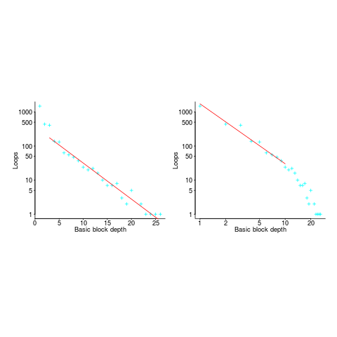
Both plots use the same data, but different scales are used for the x-axis.
If probability of use is independent of nesting depth, an exponential equation should fit the data (i.e., the left plot), decreasing probability is supported by a power-law (i.e, the right plot; plus other forms of equation, but let’s keep things simple).
The two cases are very wrong over different ranges of the data. What is your explanation for reality failing to follow your beliefs in for-loop occurrence probability?
Is the mismatch between belief and reality caused by the small size of the data set (a few million lines were measured, which was once considered to be a lot), or perhaps your beliefs are based on other languages which will behave as claimed (appropriate measurements on other languages most welcome).
The nesting depth dependent use probability plot shows a sudden change in the rate of decrease in for-loop probability; perhaps this is caused by the maximum number of characters that can appear on a typical editor line (within a window). The left plot (below) shows the number of lines (of C source) containing a given number of characters; the right plot counts tokens per line and the length effect is much less pronounced (perhaps developers use shorter identifiers in nested code). Note: different scales used for the x-axis (code+data).
I don’t have any believable ideas for why the exponential fit only works if the first few nesting depths are ignored. What could be so special about early nesting depths?
What about fitting the data with other equations?
A bi-exponential springs to mind, with one exponential driven by application requirements and the other by algorithm selection; but reality is not on-board with this idea.
Ideas, suggestions, and data for other languages, most welcome.
The dark-age of software engineering research: some evidence
Looking back, the 1970s appear to be a golden age of software engineering research, with the following decades being the dark ages (i.e., vanity research promoted by ego and bluster), from which we are slowly emerging (a rough timeline).
Lots of evidence-based software engineering research was done in the 1970s, relative to the number of papers published, and I have previously written about the quantity of research done at Rome and the rise of ego and bluster after its fall (Air Force officers studying for a Master’s degree publish as much software engineering data as software engineering academics combined during the 1970s and the next two decades).
What is the evidence for a software engineering research dark ages, starting in the 1980s?
One indicator is the extent to which ancient books are still venerated, and the wisdom of the ancients is still regularly cited.
I claim that my evidence-based software engineering book contains all the useful publicly available software engineering data. The plot below shows the number of papers cited (green) and data available (red), per year; with fitted exponential regression models, and a piecewise regression fit to the data (blue) (code+data).
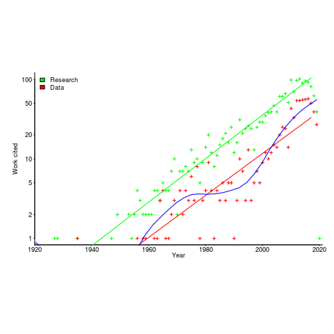
The citations+date include works that are not written by people involved in software engineering research, e.g., psychology, economics and ecology. For the time being I’m assuming that these non-software engineering researchers contribute a fixed percentage per year (the BibTeX file is available if anybody wants to do the break-down)
The two straight line fits are roughly parallel, and show an exponential growth over the years.
The piecewise regression (blue, loess was used) shows that the rate of growth in research data leveled-off in the late 1970s and only started to pick up again in the 1990s.
The dip in counts during the last few years is likely to be the result of me not having yet located all the recent empirical research.
Performance variation in 2,386 ‘identical’ processors
Every microprocessor is different, random variations in the manufacturing process result in transistors, and the connections between them, being fabricated with more/less atoms. An atom here and there makes very little difference when components are built from millions, or even thousands, of atoms. The width of the connections between transistors in modern devices might only be a dozen or so atoms, and an atom here and there can have a noticeable impact.
How does an atom here and there affect performance? Don’t all processors, of the same product, clocked at the same frequency deliver the same performance?
Yes they do, an atom here or there does not cause a processor to execute more/less instructions at a given frequency. But an atom here and there changes the thermal characteristics of processors, i.e., causes them to heat up faster/slower. High performance processors will reduce their operating frequency, or voltage, to prevent self-destruction (by overheating).
Processors operating within the same maximum power budget (say 65 Watts) may execute more/less instructions per second because they have slowed themselves down.
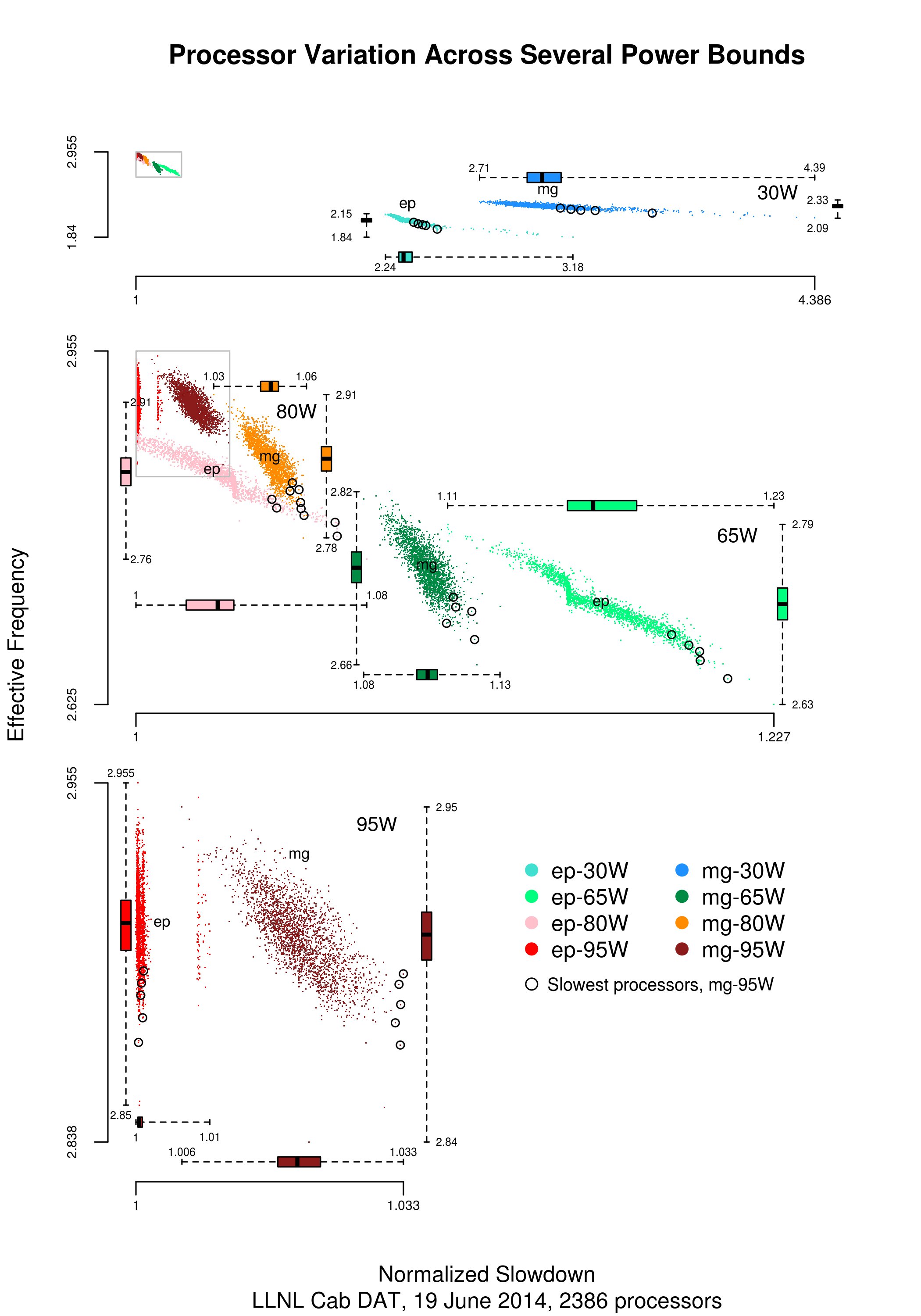
Some years ago I spotted a great example of ‘identical’ processor performance variation, and the author of the example, Barry Rountree, kindly sent me the data. In the weeks before Christmas I finally got around to including the data in my evidence-based software engineering book. Unfortunately I could not figure out what was what in the data (relearning an important lesson: make sure to understand the data as soon as it arrives), thankfully Barry came to the rescue and spent some time doing software archeology to figure out the data.
The original plots showed frequency/time data of 2,386 Intel Sandy Bridge XEON processors (in a high performance computer at the Lawrence Livermore National Laboratory) executing the EP benchmark (the data also includes measurements from the MG benchmark, part of the NAS Parallel benchmark) at various maximum power limits (see plot at end of post, which is normalised based on performance at 115 Watts). The plot below shows frequency/time for a maximum power of 65 Watts, along with violin plots showing the spread of processors running at a given frequency and taking a given number of seconds (my code, code+data on Barry’s github repo):
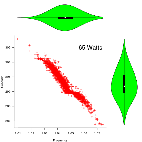
The expected frequency/time behavior is for processors to lie along a straight line running from top left to bottom right, which is roughly what happens here. I imagine (waving my software arms about) the variation in behavior comes from interactions with the other hardware devices each processor is connected to (e.g., memory, which presumably have their own temperature characteristics). Memory performance can have a big impact on benchmark performance. Some of the other maximum power limits, and benchmark, measurements have very different characteristics (see below).
More details and analysis in the paper: An empirical survey of performance and energy efficiency variation on Intel processors.
Intel’s Sandy Bridge is now around seven years old, and the number of atoms used to fabricate transistors and their connectors has shrunk and shrunk. An atom here and there is likely to produce even more variation in the performance of today’s processors.
A previous post discussed the impact of a variety of random variations on program performance.
Update start
A number of people have pointed out that I have not said anything about the impact of differences in heat dissipation (e.g., faster/slower warmer/cooler air-flow past processors).
There is some data from studies where multiple processors have been plugged, one at a time, into the same motherboard (i.e., low budget PhD research). The variation appears to be about the same as that seen here, but the sample sizes are more than two orders of magnitude smaller.
There has been some work looking at the impact of processor location (e.g., top/bottom of cabinet). No location effect was found, but this might be due to location effects not being consistent enough to show up in the stats.
Update end
Below is a png version of the original plot I saw:
Reliability chapter of ‘evidence-based software engineering’ updated
The Reliability chapter of my evidence-based software engineering book has been updated (draft pdf).
Unlike the earlier chapters, there were no major changes to the initial version from over 18-months ago; we just don’t know much about software reliability, and there is not much public data.
There are lots of papers published claiming to be about software reliability, but they are mostly smoke-and-mirror shows derived from work down one of several popular rabbit holes:
- Machine learning is a popular technique for fault prediction, and I have written about what a train wreck this research is, along with the incomplete and very noisy data that makes nearly every attempt at fault prediction a waste of time.
- Mutation testing sounds like a technique that would be useful (and it is for pumping out papers), but it has the fatal flaw of telling people what they already know (i.e., that their test suites are not very good), and targeting coding mistakes that represent around 5% of known fault experiences (around 5% of all fixes to reported faults involve changing one line; most mutation testing works by modifying a single line of code).
- Other researchers are busily adding more epicycles to models based on the nonhomogeneous Poisson process.
The growth in research on Fuzzing is the only good news (especially with the availability of practical introductory material).
There is one source of fault experience data that looks like it might be very useful, but it’s hard to get hold of; NASA has kept detailed about what happened using space missions. I have had several people promise to send me data, but none has arrived yet :-(.
Updating the reliability chapter did not take too much time, so I updated earlier chapters with data that has arrived since they were last released.
As always, if you know of any interesting software engineering data, please tell me.
Next, the Source code chapter.
The Renzo Pomodoro dataset
Estimating how long it will take to complete a task is hard work, and the most common motivation for this work comes from external factors, e.g., the boss, or a potential client asks for an estimate to do a job.
People also make estimates for their own use, e.g., when planning work for the day. Various processes and techniques have been created to help structure the estimation process; for developers there is the Personal Software Process, and specifically for time estimation (but not developer specific), there is the Pomodoro Technique.
I met Renzo Borgatti at the first talk I gave on the SiP dataset (Renzo is the organizer of the Papers We Love meetup). After the talk, Renzo told me about his use of the Pomodoro Technique, and how he had 10-years worth of task estimates; wow, I was very interested. What happened next, and a work-in-progress analysis (plus data and R scripts) of the data can be found in the Renzo Pomodoro dataset repo.
The analysis progressed in fits and starts; like me Renzo is working on a book, and is very busy. The work-in-progress pdf is reasonably consistent.
I had never seen a dataset of estimates made for personal use, and had not read about the analysis of such data. When estimates are made for consumption by others, the motives involved in making the estimate can have a big impact on the values chosen, e.g., underestimating to win a bid, or overestimating to impress the boss by completing a task under budget. Is a personal estimate motive free? The following plot led me to ask Renzo if he was superstitious (in not liking odd numbers).
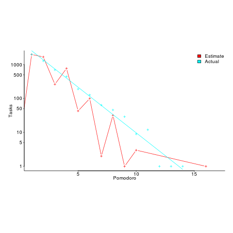
The plot shows the number of tasks for which there are a given number of estimates and actuals (measured in Pomodoros, i.e., units of 25 minutes). Most tasks are estimated to require one Pomodoro, and actually require this amount of effort.
Renzo educated me about the details of the Pomodoro technique, e.g., there is a 15-30 minute break after every four Pomodoros. Did this mean that estimates of three Pomodoros were less common because the need for a break was causing Renzo to subconsciously select an estimate of two or four Pomodoro? I am not brave enough to venture an opinion about what is going on in Renzo’s head.
Each estimated task has an associated tag name (sometimes two), which classifies the work involved, e.g., @planning. In the task information these tags have the form @word; I refer to them as at-words. The following plot is very interesting; it shows the date of use of each at-word, over time (ordered by first use of the at-word).
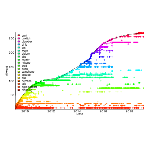
The first and third black lines are fitted regression models of the form  , where:
  is a constant and
  is the number of days since the start of the interval fitted. The second (middle) black line is a fitted straight line.
The slow down in the growth of new at-words suggests (at least to me) a period of time working in the same application domain (which involves a fixed number of distinct activities, that are ‘discovered’ by Renzo over time). More discussion with Renzo is needed to see if we can tie this down to what he was working on at the time.
I have looked for various other patterns and associations, involving at-words, but have not found any (but I did learn some new sequence analysis techniques, and associated R packages).
The data is now out there. What patterns and associations can you find?
Renzo tells me that there is a community of people using the Pomodoro technique. I’m hoping that others users of this technique, involved in software development, have recorded their tasks over a long period (I don’t think I could keep it up for longer than a week).
Perhaps there are PSP followers out there with data…
I offer to do a free analysis of software engineering data, provided I can make data public (in anonymized form). Do get in touch.
Calculating statement execution likelihood
In the following code, how often will the variable b be incremented, compared to a?
If we assume that the variables x and y have values drawn from the same distribution, then the condition (x < y) will be true 50% of the time (ignoring the situation where both values are equal), i.e., b will be incremented half as often as a.
a++; if (x < y) { b++; if (x < z) { c++; } } |
If the value of z is drawn from the same distribution as x and y, how often will c be incremented compared to a?
The test (x < y) reduces the possible values that x can take, which means that in the comparison (x < z), the value of x is no longer drawn from the same distribution as z.
Since we are assuming that z and y are drawn from the same distribution, there is a 50% chance that (z < y).
If we assume that (z < y), then the values of x and z are drawn from the same distribution, and in this case there is a 50% change that (x < z) is true.
Combining these two cases, we deduce that, given the statement a++; is executed, there is a 25% probability that the statement c++; is executed.
If the condition (x < z) is replaced by (x > z), the expected probability remains unchanged.
If the values of x, y, and z are not drawn from the same distribution, things get complicated.
Let's assume that the probability of particular values of x and y occurring are  and
and  , respectively. The constants
  and
and  are needed to ensure that both probabilities sum to one; the exponents
  and
and  control the distribution of values. What is the probability that
 (x < y) is true?
Probability theory tells us that  = int{-infty}{+infty} f_B(x) F_A(x) dx") , where:
, where:  is the probability distribution function for
  (in this case:
  ), and
  the cumulative probability distribution for
  (in this case:
 ") ).
).
Doing the maths gives the probability of (x < y) being true as:  .
.
The (x < z) case can be similarly derived, and combining everything is just a matter of getting the algebra right; it is left as an exercise to the reader :-)
Recent Comments