Archive
CPU frequency not relevant to SPEC benchmark performance
Despite the end of Dennard scaling around 2005-7 computer performance, as measured by the SPEC cpu benchmarks, continues to improve. What is driving this ongoing increase in performance, given that cpu clock rates have stopped increasing?
The plot below shows 9,161 results from the SPEC CPU integer benchmark, plus the fitted regression line  (code+data):
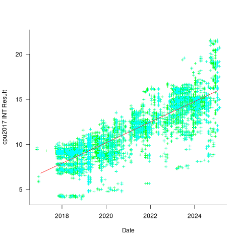
There is a scattering of benchmark results because manufacturers offer systems having a range of performance.
Possible factors driving the ongoing increases in system performance include increased DRAM-memory bandwidth, and cpu improvements such as larger caches and more accurate branch prediction. While Moore’s law (i.e., rate of growth of the number of transistors on a chip) has slowed down a lot, the number of transistors in a processor chip has continued to increase (many of these transistors have been used to build chips that contain multiple cpu cores).
The SPEC benchmark result data includes a lot of information about the system that ran the benchmarks, including: processor family/model, number of cpu cores, clock frequency, amount of memory installed and its type.
Results from SPEC CPU2017, the current version of the benchmark, are available from the start of 2017 to now. The following analysis uses these results. Results from the SPEC CPU2006 benchmark are also available, and a regression model fitted to the results from the 780 systems that ran both benchmarks, gives the mapping from CPU INT 2006 to CPU INT 2017 as:  .
.
The processor information in the results file usually specifies family name plus model number/name. The model information usually correlates with clock frequency, perhaps cache size, or gpu support; some examples below.
    AMD EPYC 4464P                AMD EPYC 4564P
    AMD Ryzen 9 7950X             AMD Ryzen 7 5800X
    Intel Xeon Platinum 8490H     Intel Xeon Gold 6438N
Intel Xeon E3-1220 v3 Intel Xeon E5-2697 v3 |
The family name is sufficient for an initial analysis. Details of any cache size differences between models can always be included in a later analysis. The following table shows the number of processor x86 based families present in the 2017 INT results (total 9,161):
           AMD EPYC           AMD Ryzen               Intel
               1475                   7                   1
      Intel Celeron       Intel Core i3       Intel Core i5
                 16                  31                   2
      Intel Core i7       Intel Pentium          Intel Xeon
                  1                  30                 605
  Intel Xeon Bronze        Intel Xeon D       Intel Xeon E3
                167                  12                  16
      Intel Xeon E5       Intel Xeon E7     Intel Xeon Gold
                  3                   2                3994
Intel Xeon Platinum   Intel Xeon Silver        Intel Xeon W
1822 969 8 |
The memory information usually includes total bytes, number of memory sticks and interface standard (e.g., DDR2/3/4/5); some examples below.
    64 GB (2 x 32 GB 2Rx4 PC5-5600B-R, running at 5200)
    64 GB (2 x 32 GB 2Rx8 PC4-3200AA-E)
    256 GB (8*1GB DDR2-400 DIMMS per 4 core module)
    192 GB (4 x 12 x 4 GB DDR3-1333R, ECC, CL9)
    32 GB (8 x 4 GB Dual-rank PC2-6400 CL5-5-5 FB-DIMMs)
24 GB (6 x 4 GB DDR3-1333 downclocked to 1066 MHz) |
The memory bandwidth can be calculated from the interface standard used. The names of modern DRAM interface standards start with either DDR or PC, and a number, a hyphen and then another number. The values appearing in the SPEC results don’t always follow the naming rules listed in the standard (e.g., last number of a PC name using the corresponding DDR number), and in a few cases a digit was dropped from the last number. Where possible the ‘obvious’ edits were made (sometimes values were just wrong), see code for details. The following table shows the number of interface standards represented in the 2017 CPU INT results (total 9,161; in the 2006 results DDR names predominated):
PC4-2400  PC4-2666  PC4-2933  PC4-3200  PC4-4800 PC5-11200 PC5-12800
      26      2248      2163      2080         6         2         3
PC5-4800  PC5-5200  PC5-5600  PC5-6400     PC5-8  PC5-8800
1735 5 653 233 2 5 |
Once the memory is identified, its bandwidth can be looked up (bespoke memory stick clock rates were ignored). Fitting a regression model to the data, with the CPU INT (cpu integer benchmark) result as the outcome, we get (using a multiplicative model allows each factor to have a percentage impact; code+data):

where:  is the memory bandwidth in megabytes per second,
  is cpu frequency in MHz, and
  is the fitted constant for each processor family.
The cpu frequency varies between 1.7 and 4.7 GHz (a ratio of 1:2.8), the memory bandwidth between 19,200 and 51,200 MB/s (a ratio of 1:2.7), and processor family performance impact ratio was 1:2.2. Given the fitted power laws, this range of cpu frequencies could impact performance by around 22%, while the range of memory bandwidth could impact performance by a factor of two.
This fitted model implies that cpu frequency changes, over the range supported by systems since 2017, have almost no impact on the performance of integer-based programs, i.e., no floating point.
I thought there might be a correlation between memory bandwidth and cpu frequency (because vendors would use faster memory in systems with faster cpus). The plot below shows CPU frequency against memory bandwidth (both axis use linear scales), plus a fitted regression line in red (code+data):
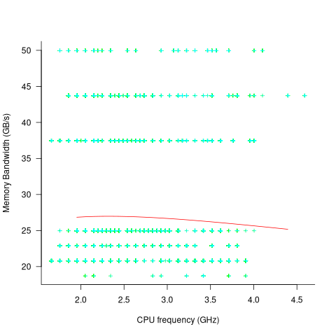
I was wrong. There does not appear to be any connection between a system’s cpu frequency and its memory bandwidth.
These days, most x86 chips include multiple processors, with each processor taking a share of memory bandwidth. Increasing memory bandwidth is essential, if all cores are to be kept busy.
The SPEC CPU benchmark measures the performance of a single processor. If only one of the cpu cores available on a system is being used, that core has the benefit of memory bandwidth that usually has to be shared.
To what extent is a single core benchmark relevant today? I suspect that most programs run on a single core, but developers sometimes attempt to spread cpu intensive programs over multiple cores. As always, data is needed.
The SPEC benchmark is useful for cpu designers (the original target market) and compiler writers wanting to measure the impact of fancy new optimizations.
Example of an initial analysis of some new NASA data
For the last 20 years, the bug report databases of Open source projects have been almost the exclusive supplier of fault reports to the research community. Which, if any, of the research results are applicable to commercial projects (given the volunteer nature of most Open source projects and that anybody can submit a report)?
The only way to find out if Open source patterns are present in closed source projects is to analyse fault reports from closed source projects.
The recent paper Software Defect Discovery and Resolution Modeling incorporating Severity by Nafreen, Shi and Fiondella caught my attention for several reasons. It does non-trivial statistical analysis (most software engineering research uses simplistic techniques), it is a recent dataset (i.e., might still be available), and the data is from a NASA project (I have long assumed that NASA is more likely than most to reliable track reported issues). Lance Fiondella kindly sent me a copy of the data (paper giving more details about the data)!
Over the years, researchers have emailed me several hundred datasets. This NASA data arrived at the start of the week, and this post is an example of the kind of initial analysis I do before emailing any questions to the authors (Lance offered to answer questions, and even included two former students in his email).
It’s only worth emailing for data when there looks to be a reasonable amount (tiny samples are rarely interesting) of a kind of data that I don’t already have lots of.
This data is fault reports on software produced by NASA, a very rare sample. The 1,934 reports were created during the development and testing of software for a space mission (which launched some time before 2016).
For Open source projects, it’s long been known that many (40%) reported faults are actually requests for enhancements. Is this a consequence of allowing anybody to submit a fault report? It appears not. In this NASA dataset, 63% of the fault reports are change requests.
This data does not include any information on the amount of runtime usage of the software, so it is not possible to estimate the reliability of the software.
Software development practices vary a lot between organizations, and organizational information is often embedded in the data. Ideally, somebody familiar with the work processes that produced the data is available to answer questions, e.g., the SiP estimation dataset.
Dates form the bulk of this data, i.e., the date on which the report entered a given phase (expressed in days since a nominal start date). Experienced developers could probably guess from the column names the work performed in each phase; see list below:
    Date Created
    Date Assigned
    Date Build Integration
    Date Canceled
    Date Closed
    Date Closed With Defect
    Date In Test
    Date In Work
    Date on Hold
    Date Ready For Closure
    Date Ready For Test
    Date Test Completed
Date Work Completed |
There are probably lots of details that somebody familiar with the process would know.
What might this date information tell us? The paper cited had fitted a Cox proportional hazard model to predict fault fix time. I might try to fit a multi-state survival model.
In a priority queue, task waiting times follow a power law, while randomly selecting an item from a non-prioritized queue produces exponential waiting times. The plot below shows the number of reports taking a given amount of time (days elapsed rounded to weeks) from being assigned to build-integration, for reports at three severity levels, with fitted exponential regression lines (code+data):
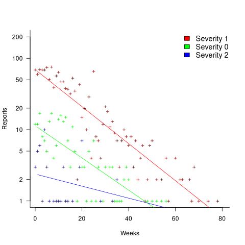
Fitting an exponential, rather than a power law, suggests that the report to handle next is effectively selected at random, i.e., reports are not in a priority queue. The number of severity 2 reports is not large enough for there to be a significant regression fit.
I now have some familiarity with the data and have spotted a pattern that may be of interest (or those involved are already aware of the random selection process).
As always, reader suggestions welcome.
Recent Comments