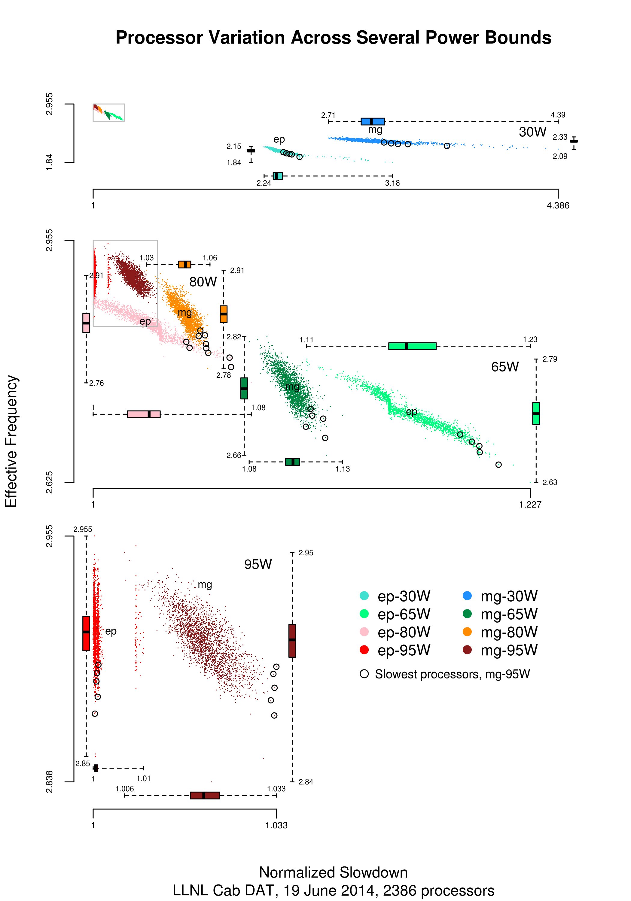
Performance variation in 2,386 ‘identical’ processors
Every microprocessor is different, random variations in the manufacturing process result in transistors, and the connections between them, being fabricated with more/less atoms. An atom here and there makes very little difference when components are built from millions, or even thousands, of atoms. The width of the connections between transistors in modern devices might only be a dozen or so atoms, and an atom here and there can have a noticeable impact.
How does an atom here and there affect performance? Don’t all processors, of the same product, clocked at the same frequency deliver the same performance?
Yes they do, an atom here or there does not cause a processor to execute more/less instructions at a given frequency. But an atom here and there changes the thermal characteristics of processors, i.e., causes them to heat up faster/slower. High performance processors will reduce their operating frequency, or voltage, to prevent self-destruction (by overheating).
Processors operating within the same maximum power budget (say 65 Watts) may execute more/less instructions per second because they have slowed themselves down.
Some years ago I spotted a great example of ‘identical’ processor performance variation, and the author of the example, Barry Rountree, kindly sent me the data. In the weeks before Christmas I finally got around to including the data in my evidence-based software engineering book. Unfortunately I could not figure out what was what in the data (relearning an important lesson: make sure to understand the data as soon as it arrives), thankfully Barry came to the rescue and spent some time doing software archeology to figure out the data.
The original plots showed frequency/time data of 2,386 Intel Sandy Bridge XEON processors (in a high performance computer at the Lawrence Livermore National Laboratory) executing the EP benchmark (the data also includes measurements from the MG benchmark, part of the NAS Parallel benchmark) at various maximum power limits (see plot at end of post, which is normalised based on performance at 115 Watts). The plot below shows frequency/time for a maximum power of 65 Watts, along with violin plots showing the spread of processors running at a given frequency and taking a given number of seconds (my code, code+data on Barry’s github repo):

The expected frequency/time behavior is for processors to lie along a straight line running from top left to bottom right, which is roughly what happens here. I imagine (waving my software arms about) the variation in behavior comes from interactions with the other hardware devices each processor is connected to (e.g., memory, which presumably have their own temperature characteristics). Memory performance can have a big impact on benchmark performance. Some of the other maximum power limits, and benchmark, measurements have very different characteristics (see below).
More details and analysis in the paper: An empirical survey of performance and energy efficiency variation on Intel processors.
Intel’s Sandy Bridge is now around seven years old, and the number of atoms used to fabricate transistors and their connectors has shrunk and shrunk. An atom here and there is likely to produce even more variation in the performance of today’s processors.
A previous post discussed the impact of a variety of random variations on program performance.
Update start
A number of people have pointed out that I have not said anything about the impact of differences in heat dissipation (e.g., faster/slower warmer/cooler air-flow past processors).
There is some data from studies where multiple processors have been plugged, one at a time, into the same motherboard (i.e., low budget PhD research). The variation appears to be about the same as that seen here, but the sample sizes are more than two orders of magnitude smaller.
There has been some work looking at the impact of processor location (e.g., top/bottom of cabinet). No location effect was found, but this might be due to location effects not being consistent enough to show up in the stats.
Update end
Below is a png version of the original plot I saw:

That’s really interesting. Can I get a copy of the original data? The GitHub link is no longer available.
@KW
Repo situation being addressed. Barry Rountree suggests you contact him directly if you want the data sooner (it’s over a gig).