Archive
Histogram using log scale creates a visual artifact
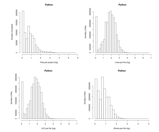
The following plot appears in the paper Stack Overflow in Github: Any Snippets There?

Don’t those twin peaks in the top-left/bottom-right plots reach out and grab your attention? I immediately thought of fitting a mixture of two Poisson distributions; No, No, No, something wrong here. The first question of data analysis is: Do I believe the data?
The possibility of fake data does not get asked until more likely possibilities have been examined first.
The y-axis is a count of things and the x-axis shows the things being counted; source files per project and functions per file, in this case.
All the measurements I know of show a decreasing trend for these things, e.g., lots of projects have a few files and a few projects have lots of files. Twin peaks is very unexpected.
I have serious problems believing this data, because it does not conform to my prior experience. What have the authors done wrong?
My first thought was that a measuring mistake had been made; for some reason values over a certain range were being incorrectly miscounted.
Then I saw the problem. The plot was of a histogram and the x-axis had a logarithmic scale. A logarithmic axis compresses the range in a non-linear fashion, which means that variable width bins have to be used for histograms and the y-axis represents density (not a count).
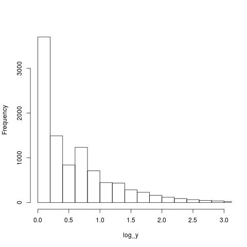
Taking logs and using the result to plot a histogram usually produces a curve having a distorted shape, not twin peaks. I think the twin peaks occur here because integer data are involved and the bin width just happened to have the ‘right’ value.
Looking at the plot below, the first bin contains values for x=1 (on an un-logged scale), the second bin for x=2, the third bin for x=3, but the fourth bin contains values for x=c(4, 5, 6). The nonlinear logarithmic compression, mapped to integers, means that the contents of three values are added to a single bin, creating a total that is larger than the third bin.

The R code that generated the above plot:
x=1:1e6 y=trunc(1e6/x^1.5) log_y=log10(y) hist(log_y, n=40, main="", xlim=c(0, 3)) |
I tried to mimic the pattern seen in the first histogram by trying various exponents of a power law (a common candidate for this kind of measurement), but couldn’t get anything to work.
Change the bin width can make the second peak disappear, or rather get smeared out. Still a useful pattern to look out for in the future.
Recent Comments