Archive
Cost ratio for bespoke hardware+software
What percentage of the budget for a bespoke hardware/software system is spent on software, compared to hardware?
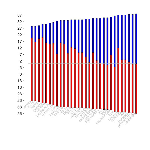
The plot below has become synonymous with this question (without the red line, which highlights 1973), and is often used to claim that software costs are many times more than hardware costs.

The paper containing this plot was published in 1973 (the original source is a Rome period report), and is an extrapolation of data I assume was available in 1973, into what was then the future. The software and hardware costs are for bespoke command and control systems delivered to the U.S. Air Force, not commercial off-the-shelf solutions or even bespoke commercial systems.
Does bespoke software cost many times more than the hardware it runs on?
I don’t have any data that might be used to answer this questions, to any worthwhile degree of accuracy. I know of situations where I believe the bespoke software did cost a lot more than the hardware, and I know of some where the hardware cost more (I have never been privy to exact numbers on large projects).
Where did the pre-1973 data come from?
The USAF funded the creation of lots of source code, and the reports cite hardware and software figures from 1972.
To summarise: the above plot is for USAF spending on bespoke command and control hardware and software, and is extrapolated from 1973 into the future.
How will C code in 2045 look different from today?
What constructs will be in such common use in C source code written by developers in 2045 that people looking at C written in 2015 will know it comes from a much earlier era (a previous post looked back at C written in 1986)?
C is a high level language that allows developers to get close to the hardware, so to get some idea of what everyday C might be like in 2045 we have to ask what everyday hardware will be like 10-20 years from now (the C standard committee waits for hardware feature to become established before adding features to support them).
I think the following hardware trends will have a big impact on the future appearance of C source code:
Power consumption: Runtime performance is an integral part of the design of C. In the past performance has been about program execution time and/or memory usage; the spread of mobile computing has created a third strand: electrical power consumption. A variety of techniques have been proposed for reducing program power consumption, including: type specifiers that enable developers to tell the compiler accuracy can be traded off against power in calculations involving a given variable and scaling cpu voltage/frequency in non-time critical code (researchers are currently trying to do this without developer involvement, but a storage/type specifier like register or inline would provide useful information to the compiler),
Unreliable hardware: running hardware at lower voltages (to reduce power consumption) increases the probability of noise having an effect on program output, as does use of smaller line widths in cpu fabrication (more chips per die increases manufacturer profits). Proposed solutions include adding type specifiers to variables that can tolerate holding approximate values or more making probabilistic assertions.
Non-volatile memory: Like most languages C has an implicit model of programs sitting on a slow storage device, e.g., hard disk, and being loaded into very fast storage for execution. Non-volatile storage could have a very dramatic impact on this view of the world. For years gaming consoles have stored code+data as a memory image in ROM for rapid loading, but being able to write to storage that is only an order of magnitude slower than main memory opens up all sorts of interesting opportunities. The concept of named address spaces defined in Programming languages – C – Extensions to support embedded processors is waiting to expand out of its current niche of C on embedded processors.
There is at least one language construct that is likely to be rarely seen by developers working in 2045: inline. The reason that today’s developers have been given the ability to define functions inline is that compilers are not yet good enough to reliably make good function inlining decisions, rather like they were not good enough to reliability make good register allocation decisions 30 years ago (ok, register can still be useful for developers using weird and wonderful processor architectures or brain dead compilers).
I have not yet said anything about parallel processing or multiprocessor hardware. The C11 Standard updated C99 to provide generic support (i.e., _Atomic plus associated sequence point wording updates and the threads library) for this kind of hardware. Support for a specific parallel/multiprocessor model will happen if a specific model becomes the industry standard (rather like IEEE floating-point not being anointed by C90 because it was not yet what every hardware vendor used; other formats were on their last legs and by C99 could be treated as dead).
Hardware variability may be greater than algorithmic improvement
I’m giving a talk at COW 39 this week and it is more user friendly to include links in this summary than link to a pdf of the slides (which actually looks horrible).
Microelectronic fabrication has now reached the point where it etches and deposits handfuls of atoms (around 20 or so). One consequence of working with such a small number of atoms is that variations in the fabrication process (e.g., plus or minus a few atoms here and there) can have a significant impact on component characteristics, e.g., a transistor consumes more/less power or can be switched faster/slower. It might be argued that things will average out over the few hundred+ million components inside a device and that all devices will be essentially the same; measurements show that in practice there is a lot of variation across the devices.
Short version: Some properties of supposedly identical microelectronic devices now vary by around 10% and this variability is likely to get larger in the future.
Nearly all published papers involving computer system power measurement are based on measuring a single system. Many of the claimed algorithmic improvements are less than 10%, i.e., less than the expected variation in power consumption across supposedly identical devices/systems. These days any empirical paper involving power consumption has to include measurements from many devices/systems if any credibility is to be given to the findings.
The following measurement data has been found while researching for a book (code and data used for talk); a beta version of the pdf will be available for download real soon now.
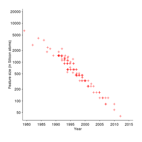
The following plot shows feature size, in Silicon atoms, of released microprocessors. Data from Danowitz et al.
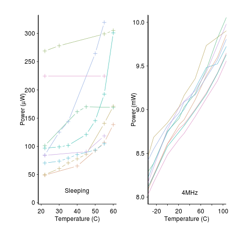
A study by Wanner, Apte, Balani, Gupta and Srivastava measured the power consumed by 10 separate Amtel SAM3U microcontrollers at various temperatures (embedded processors get used in a wide range of environments). The following plot shows how power consumption varied between processors at different temperatures when idling and executing. The relationship between the power characteristics of different processors changes with temperature; a large amount when idling and a little bit when executing.
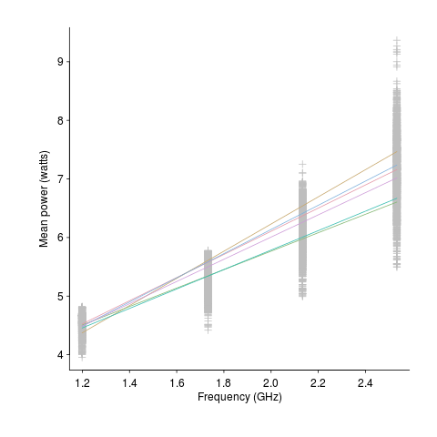
A study by Balaji, McCullough, Gupta and Agarwal measured the power consumption of six different Intel Core i5-540M processors, running at various frequencies, executing the SPEC2000 benchmark. The lines in the following plot were fitted to the data (grey crosses) using linear regression. The relationship between the power characteristics of different processors changes with clock frequency.
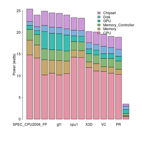
A study by Bircher measured power consumption of various system components, of an Intel server containing four Pentium 4 Xeons, when executing the SPEC CPU2006 benchmark. The power distribution for mobile devices would show the screen being the largest user of power, but I don’t have that data).
A study by Bircher measured memory (blue) and cpu (red) power consumption, in watts, executing the SPEC CPU2006 benchmarks. No point optimizig cpu power if over half the total power is consumed by memory.
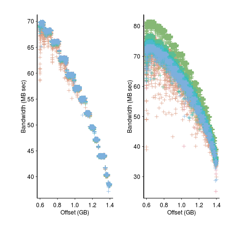
A study by Krevat, Tucek and Ganger measured the performance of then modern disk drives originally sold in 2002 (left) and 2006 (right). Different colors showing through on the right indicates that some discs have different performance characteristics than the others (faster performance -> less time -> less power, i.e., I don’t have power data for disk differences)
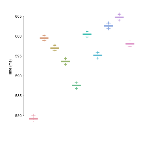
A study by Kalibera et al executed a benchmark 2,048 times followed by system reboot, repeated 10 times. Performance is consistent within a particular reboot, but not across them.
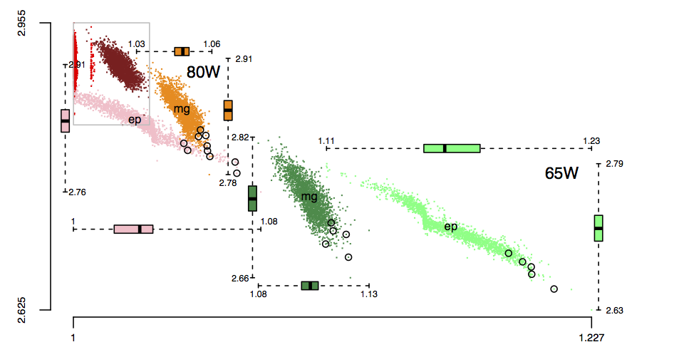
The following plot is in the slide deck and is included here as a teaser (i.e., more later). It shows data for 2,386 processors (x-axis is slowdown, y-axis clock frequency, top right legends max power), which thanks to Barry is now publicly available (or at least will be once some web details are sorted out).
VHDL, Visual-Basic and VDM
V is for VHDL, Visual-Basic and VDM.
VHDL and Verilog are the leading hardware description languages. My only real hands on experience with digital hardware is soldering together my first computer (buying it in kit+component form saved me a month’s salary), but given the amount of dataflow programming involved I appreciate that programming hardware is likely to be very hard (but not as hard as programming Quantum computers).
The problem with general purpose cpus is that they never seem to have just the right instructions needed to generate really fast compact code for a particular application. The ideal solution is for the compiler to automatically figure out what instructions are the best fit for a given application and then to include the appropriate processor specification in the generated executable (program initialization starts with configuring the host cpu with the appropriate architecture+instructions to execute the generated code). Hardware is available to make this a reality, but the necessary software support is still being worked on (there is also the tiresome economic issue of mass produced cpus almost always being cheaper). At the moment application specific processors tend to be built into application specific computers.
Anyway, real programmers don’t write programs that make LEDs flash on a Raspberry Pi, real programmers use single-board computers that support personalization of the instruction set. If this future has arrived for you, please let me know how I can be included in the distribution.
Visual-Basic shares half of its name and use of the keyword Dim with BASIC. It was clever marketing to give a new language a name that contained the name of a language with a reputation for being easy to learn and use. I bet the developers involved hated this association.
VDM was for many years THE formal method; complete definitions of industrial strength languages (e.g., PL/1, Modula-2 and CHILL) were written using it. These days it seems to be supporting a small community by helping people model industrial systems, however it has fallen out of fashion in the programming language world.
Back in the day there was lots of talk of tools using the available VDM language specifications to check source code (my interest was in checking the consistency of the specifications). In practice tooling did not get much further than typesetting the printed VDM.
Back when I thought that formal methods had a future, I was more of a fan of denotational semantics than VDM. The CHILL VDM specification has at least one reported fault (I cannot tell you where it is because I cannot find my copy); mine was the first reported and I never heard if anybody else ever reported a fault.
Things to read
Computer Architecture: A Quantitative Approach (second edition) by John L. Hennessy and David A. Patterson. Later editions become more narrowly focused on current hardware.
The Denotational Description of Programming Languages by Michael J. C. Gordon is a good short introduction, while Denotational Semantics by David A. Schmidt is longer.
Unreliable cpus and memory: The end result of Moore’s law?
Where is the evolution of commodity cpu and memory chips going to take its customers? I think the answer is cheap and unreliable products (just like many household appliances are priced low and have a short expected lifetime).
We have had the manufacturer-customer win-win phase of Moore’s law and I think we are now entering the win-loose phase.
The reason chip manufacturers, such as Intel, invest so heavily on continually shrinking dies is the same reason all companies invest, they expect to get a good return on their investment. The cost of processing the wafer from which individual chips are cut is more or less constant, reducing the size of a chip enables more to fitted on the same wafer, giving more product to sell for more or less the same wafer processing cost.
The fact that dies with smaller feature sizes have reduce power consumption and can run at faster clock speeds (up until around 10 years ago) is a secondary benefit to manufacturers (it created a reason for customers to replace what they already owned with a newer product); chip manufacturers would still have gone down the die shrink path if these secondary benefits had not existed, but perhaps at a slower rate. Customers saw, or were marketed, this strinkage story as one of product improvement for their benefit rather than as one of unit cost reduction for Intel’s benefit (Intel is the end-customer facing company that pumped billions into marketing).
Until recently both manufacturer and customer have benefited from die shrinks through faster cpus/lower power consumption and lower unit cost.
A problem that was rarely encountered outside of science fiction a few decades ago is now regularly encountered by all owners of modern computers, cosmic rays (plus more local source of ‘rays’) altering the behavior of running programs (4 GB of RAM is likely to experience a single bit-flip once every 33 hours of operation). As die shrink continues this problem will get worse. Another problem with ever smaller transistors is their decreasing mean time to failure (very technical details); we have seen expected chip lifetimes drop from 10 years to 7 and now less and decreasing.
Decreasing chip lifetimes is actually good for the manufacturer, it creates a reason for customers to buy a new product. Buying a new computer every 2-3 years has been accepted practice for many years (because the new ones were much better). Are we, the customer, in danger of being led to continue with this ‘accepted practice’ (because computers reliability is poor)?
Surely it is to the customer’s advantage to not buy devices that contain chips with even smaller features? Is it only the manufacturer that will obtain a worthwhile benefit from future die shrinks?
Distribution of uptimes for high-performance computing systems
Computers break down every now and again and this is a serious problem when an application needs runs on thousands of individual computers (nodes) plugged together; lots more hardware creates lots more opportunity for a failure that renders any subsequent calculations by working nodes possible wrong. The solution is checkpointing; saving the state of each node every now and again, and rolling back to that point when a failure occurs. Picking the optimal interval between checkpoints requires knowledge the distribution of node uptimes, what is it?
Short answer: Node uptimes have a negative binomial distribution, or at least five systems at the Los Alamos National Laboratory do.
The longer answer is below as another draft section from my book Empirical software engineering with R. As always comments and pointers to more data welcome. R code and data here.
Distribution of uptimes for high-performance computing systems
Today’s high-performance computing systems are created by connecting together lots of cpus. There is a hierarchy to the connection in that many cpus may populate a single board, several boards may be fitted into a rack unit, several rack units into a cabinet, lots of cabinets lined up in a row within a room and more than one room in a facility. A common operating unit is the node, effectively a computer on which an operating system is running (the actual hardware involved may be a single or multi processor cpu). A high-performance system is built from thousands of nodes and an application program may run on compute nodes from more than one facility.
With so many components, failures occur on a regular basis and long running applications need to recover from such failures if they are to stand a reasonable chance of ever completing.
Applications running on the systems installed at the Los Alamos National Laboratory create checkpoints at regular intervals, writing data needed to do a full restore to storage. When a failure occurs an application is restarted from its most recent checkpoint, one node failure causes all nodes to be rolled back to their most recent checkpoint (all nodes create their checkpoints at the same time).
A tradeoff has to be made between frequently creating checkpoints, which takes resources away from completing execution of the application but reduces the amount of lost calculation, and infrequent checkpoints, which diverts less resources but incurs greater losses when a fault occurs. Calculating the optimum checkpoint interval requires knowing the distribution of node uptimes and the following analysis attempts to find this distribution.
Data
The data comes from 23 different systems installed at the Los Alamos National Laboratory (LANL) between 1996 and 2005. The total failure count for most of the systems is of the order of a few hundred; there are five systems (systems 2, 16, 18, 19 and 20) that each have several thousand failures and these are the ones analysed here.
The data consists of failure records for every node in a system. A failure record includes information such as system id, node number, failure time, restored to service time, various hardware characteristics and possible root causes for the failure. Schroeder and Gibson <book Schroeder_06> performed the first analysis of the dataset and provide more background details.
Is the data believable?
Failure records are created by operations staff when they are notified by the automated monitoring system that a failure has been detected. Given that several people are involved in the process <book LANL_data_06> it seems unlikely that failures will go unreported.
Some of the failure reports have start times before the given node was returned into service from the previous failure; across the five systems this varied between 0.4% and 2.5%. It is possible that these overlapping failures are caused by an incorrectly attempt to fix the first failure, or perhaps they are data entry errors. This error rate is comparable with human error rates for low stress/non-critical work
The failure reports do not include any information about the application software running on the node when it failed; the majority of the programs executed are large-scale scientific simulations, such as simulations of nuclear stockpile stability. Thus it is not possible to accurately calculate the node MTBF for an executing application. LANL say <book LANL_data_06> that the applications “… perform long periods (often months) of CPU computation, interrupted every few hours by a few minutes of I/O for check-pointing.”
Predictions made in advance
The purpose of this analysis is to find the distribution that best fits the node uptime data, i.e., the time interval between failures of the same node.
Your author is not aware of any empirically based theory that predicts the uptime of high performance computing systems. The Poisson and exponential distributions are both frequently encountered in the analysis of hardware failures and it is always comforting to fit in with existing expectations.
Applicable techniques
A [Cullen and Frey test] matches a dataset’s skew and kurtosis against known distributions (in the case of the descdist function in the fitdistrplus package this is a handful of commonly encountered distributions); the fitdist function in the same package can be used to fit the data to a specified distribution.
Results
The table below lists some basic properties of each of the systems analysed. The large difference in mean/median uptimes between some systems is caused by very fat tails in the uptime distribution of some systems, see [LANL-node-uptime-binned].
| System | Nodes | Failures | Mean | Median |
|---|---|---|---|---|
|
2
|
49
|
6997
|
133
|
377
|
|
16
|
16
|
2595
|
89
|
229
|
|
18
|
823
|
3014
|
2336
|
4147
|
|
19
|
738
|
2344
|
2376
|
4069
|
|
20
|
323
|
2063
|
653
|
2544
|
If there are any significant changes in failure rate over time or across different nodes in a given system it could have a significant impact on the distribution of uptime intervals. So we first check to large differences in failure rates.
Do systems experience any significant changes in failure rate over time?
The plot below shows the total number of failures, binned using 30-day periods, for the five systems. Two patterns that stand out are system 20 which experienced many failures during the first few months and then settled down, and system 2’s sudden spike in failures around month 23 before settling down again. This analysis is intended to be broad brush and does not get involved with details of specific systems, but these changes in failure frequency suggest that the exact form of any fitted distribution may change over time in turn potentially leading to a change of checkpoint interval.
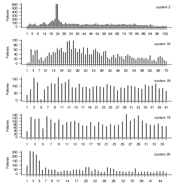
Figure 1. Total number of failures per 30-day interval for each LANL system.
Do some nodes failure more often than others?
The plot below shows the total number of failures for each node in the given system. Node 0 has many more failures than the other nodes (for node 0 of system 2 most of the failure data appears to be missing, so node 1 has the most failures). The distribution suggested by the analysis below is not changed if Node 0 is removed from the dataset.
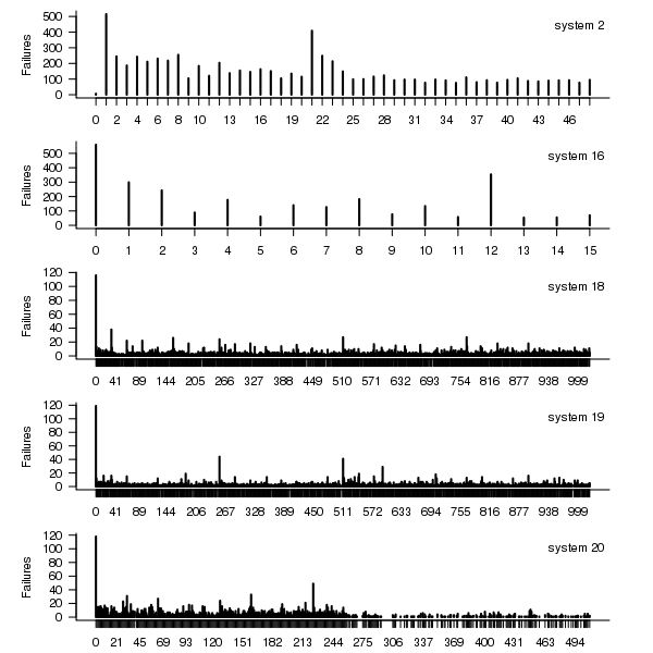
Figure 2. Total number of failures for each node in the given LANL system.
Fitting node uptimes
When plotted in units of 1 hour there is a lot of variability and so uptimes are binned into 10 hour units to help smooth the data. The number of uptimes in each 10-hour bin forms a discrete distribution and a [Cullen and Frey test] suggests that the negative binomial distribution might provide the best fit to the data; the Scroeder and Gibson analysis did not try the negative binomial distribution and of those they tried found the Weilbull distribution gave the best fit; the R functions were not able to fit this distribution to the data.
The plot below shows the 10-hour binned data fitted to a negative binomial distribution for systems 2 and 18. Visually the negative binomial distribution provides the better fit and the Akaiki Information Criterion values confirm this (see code for details and for the results on the other systems, which follow one of the two patterns seen in this plot).
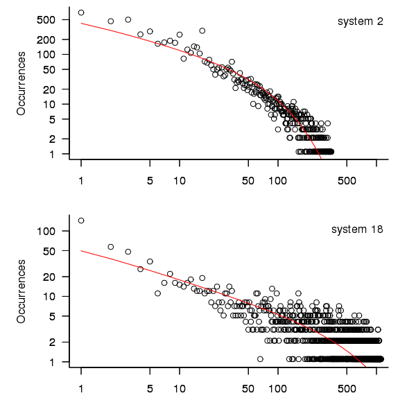
Figure 3. For systems 2 and 18, number of uptime intervals, binned into 10 hour interval, red line is fitted negative binomial distribution.
The negative binomial distribution is also the best fit for the uptime of the systems 16, 19 and 20.
The Poisson distribution often crops up in failure analysis. The quality of fit of a Poisson distribution to this dataset was an order of worse for all systems (as measured by AIC) than the negative binomial distribution.
Discussion
This analysis only compares how well commonly encountered distributions fit the data. The variability present in the datasets for all systems means that the quality of all fitted distributions will be poor and there is no theoretical justification for testing other, non-common, distributions. Given that the analysis is looking for the best fit from a chosen set of distributions no attempt was made to tune the fit (e.g., by forming a zero-truncated distribution).
Of the distributions fitted the negative binomial distribution has the lowest AIC and best fit visually.
As discussed in the section on [properties of distributions] the negative binomial distribution can be generated by a mixture of [Poisson distribution]s whose means have a [Gamma distribution]. Perhaps the many components in a node that can fail have a Poisson distribution and combined together the result is the negative binomial distribution seen in the uptime intervals.
The Weilbull distribution is often encountered with datasets involving some form of time between events but was not seen to be a good fit (for a continuous distribution) by a Cullen and Frey test and could not be fitted by the R functions used.
The characteristics of node uptime for two systems (i.e., 2 and 16) follows what might be thought of as a typical distribution of measurements, with some fattening in the tail, while two systems (i.e., 18 and 19) have very fat tails with indeed and system 20 sits between these two patterns. One system characteristic that matches this pattern is the number of nodes contained within it (with systems 2 and 16 having under 50, 18 and 19 having over 1,000 and 20 having around 500). The significantly difference in the size of the tails is reflected in the mean uptimes for the systems, given in the table above.
Summary of findings
The negative binomial distribution, of the commonly encountered distributions, gives the best fit to node uptime intervals for all systems.
There is over an order of magnitude variation in the mean uptime across some systems.
Recent Comments