Grammar checking in 2018
I am a big fan of using tools to find problems quickly. Polishing the draft material for my evidence-based software engineering book, I have been finding an annoying number of grammatical mistakes :-(.
LanguageTool is what I use to check my grammar; it is the best tool of its kind that I know, and supports lots of different languages.
I also have an awk script that looks for new instances of previous mistakes I have made. It rarely flags anything, I seem to be in a continual state of making new grammatical mistakes.
Stung by a recent series is blatant mistakes, I have been searching for a better tool. What did I find:
- The 2014 Conference on Computational Natural Language Learning shared task was grammatical error correction,
- a bibliography of papers on grammatical error correction,
- LMGEC-Lite: the latest research tool (I will download the Billion Word Benchmark dataset, to build the 4G training dataset, from which the 10G language model is created, another day),
- a machine translation approach that automates grammatical error correction, i.e., rewrites what has been written. Perhaps I should use this tool on some of the software engineering papers I read, it could not make them any worse.
So, lots of interesting stuff, but nothing better that is usable.
I keep looking at the interesting things that spaCY can do (if you are looking to integrate language processing in your app, spaCY is currently the best language processing library). Does anybody know of grammar checking work being done using spaCY (LanguageTool is based around a parsing engine that is rather long in the tooth now)?
Anybody interested in organizing a grammar checking tool hack day in London?
Experimental Psychology by Robert S. Woodworth
I have just discovered “Experimental Psychology” by Robert S. Woodworth; first published in 1938, I have a reprinted in Great Britain copy from 1951. The Internet Archive has a copy of the 1954 revised edition; it’s a very useful pdf, but it does not have the atmospheric musty smell of an old book.
The Archives of Psychology was edited by Woodworth and contain reports of what look like ground breaking studies done in the 1930s.
The book is surprisingly modern, in that the topics covered are all of active interest today, in fields related to cognitive psychology. There are lots of experimental results (which always biases me towards really liking a book) and the coverage is extensive.
The history of cognitive psychology, as I understood it until this week, was early researchers asking questions, doing introspection and sometimes running experiments in the late 1800s and early 1900s (e.g., Wundt and Ebbinghaus), behaviorism dominants the field, behaviorism is eviscerated by Chomsky in the 1960s and cognitive psychology as we know it today takes off.
Now I know that lots of interesting and relevant experiments were being done in the 1920s and 1930s.
What is missing from this book? The most obvious omission is equations; lots of data points plotted on graph paper, but no attempt to fit an equation to anything, e.g., an exponential curve to the rate of learning.
A more subtle omission is the world view; digital computers had not been invented yet and Shannon’s information theory was almost 20 years in the future. Researchers tend to be heavily influenced by the tools they use and the zeitgeist. Computers as calculators and information processors could not be used as the basis for models of the human mind; they had not been invented yet.
Impact of team size on planning, when sitting around a table
A recent blog post by Allan Kelly caught my attention; on Monday Allan sent me some comments on the draft of my book and I got to ask for a copy of his data (you don’t need your own software engineering data before sending me comments).
During an Agile training course he gives, Allan runs an exercise based on an extended version of the XP game. The basic points are: people form into teams, a task is announced, teams have to estimate how long it will take them to complete the task and then to plan the task implementation. Allan recorded information on team size, time spent estimating and time spent planning (no information on the tasks, which were straightforward, e.g., fold a paper airplane).
In a recent post I gave a brief analysis of team size on productivity. What does this XP game data have to say about the impact of team size on performance?
We don’t have task information, but we do have two timing measurements for each team. With a bit of suck-it-and-see analysis, I found that the following equation explained 50% of the variance (code+data):

where:  is the number of people on a team,
  is the time in minutes the team spent estimating and
  is time in minutes the team spent planning the task implementation.
There was some flexibility in the numbers, depending on the method used to build the regression model.
The introduction of each new team member incurs a fixed overhead. Given that everybody is sitting together around a table, this is not surprising; or, perhaps the problem was so simply that nobody felt the need to give a personal response to everything said by everybody else; or, perhaps the exercise was run just before lunch and people were hungry.
I am not aware of any connection between time spent estimating and time spent planning, but then I know almost nothing about this kind of XP game exercise. That square-root looks interesting (an exponent of 0.4 or 0.6 was a slightly less good fit). Thoughts and experiences anybody?
Update: I forgot to mention that including the date of the workshop in the above model increases the variance explained to 90%. The date here is a proxy for the task being solved. A model that uses just the date explains 75% of the variance.
2018 in the programming language standards’ world
I am sitting in the room, at the British Standards Institution, where today’s meeting of IST/5, the committee responsible for programming languages, has just adjourned (it’s close to where I have to be in a few hours).
BSI have downsized us, they no longer provide a committee secretary to take minutes and provide a point of contact. Somebody from a service pool responds (or not) to emails. I did not blink first to our chair’s request for somebody to take the minutes 🙂
What interesting things came up?
It transpires that reports of the death of Cobol standards work may be premature. There are a few people working on ‘new’ features, e.g., support for JSON. This work is happening at the ISO level, rather than the national level in the US (where the real work on the Cobol standard used to be done, before being handed on to the ISO). Is this just a couple of people pushing a few pet ideas or will it turn into something more substantial? We will have to wait and see.
The Unicode consortium (a vendor consortium) are continuing to propose new pile of poo emoji and WG20 (an ISO committee) were doing what they can to stay sane.
Work on the Prolog standard, now seems to be concentrated in Austria. Prolog was the language to be associated with, if you were on the 1980s AI bandwagon (and the Japanese were going to take over the world unless we did something about it, e.g., spend money); this time around, it’s machine learning. With one dominant open source implementation and one commercial vendor (cannot think of any others), standards work is a relic of past glories.
In pre-internet times there was an incentive to kill off committees that were past their sell-by date; it cost money to send out mailings and document storage occupied shelf space. In an electronic world there is no incentive to spend time killing off such committees, might as well wait until those involved retire or die.
WG23 (programming language vulnerabilities) reported lots of interest in their work from people involved in the C++ standard, and for some reason the C++ committee people in the room started glancing at me. I was a good boy, and did not mention bored consultants.
It looks like ISO/IEC 23360-1:2006, the ISO version of the Linux Base Standard is going to be updated to reflect LBS 5.0; something that was not certain few years ago.
Maximum team size before progress begins to stall
On multi-person projects people have to talk to each other, which reduces the amount of time available for directly working on writing software. How many people can be added to a project before the extra communications overhead is such that the total amount of code, per unit time, produced by the team decreases?
A rarely cited paper by Robert Tausworthe provides a simple, but effective analysis.
The plot below shows team productivity rate for a given number of team sizes, based on the examples discussed below.
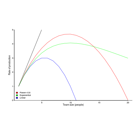
Activities are split between communicating and producing code.
If we assume the communications overhead is give by: ") , where
, where  is the percentage of one person’s time spent communicating in a two-person team,
  the number of developers and
  a constant greater than zero (I’m using Tausworthe’s notation).
The maximum team size, before adding people reduces total output, is given by: t_0})^{1/{alpha}}") .
.
If  (i.e., everybody on the project has the same communications overhead), then
  , which for small is approximately
  . For example, if everybody on a team spends 10% of their time communicating with every other team member:
  .
.
In this team of five, 50% of each persons time will be spent communicating.
If  , then we have
 *0.1})^{1/0.8}approx 10") .
.
What if the percentage of time a person spends communicating with other team members has an exponential distribution? That is, they spend most of their time communicating with a few people and very little with the rest; the (normalised) communications overhead is: t_1}") , where
, where  is a constant found by fitting data from the two-person team (before any more people are added to the team).
The maximum team size is now given by:  , and if
  , then:
  .
.
In this team of ten, 63% of each persons time will be spent communicating (team size can be bigger, but each member will spend more time communicating compared to the linear overhead case).
Having done this analysis, what is now needed is some data on the distribution of individual communications overhead. Is the distribution linear, square-root, exponential? I am not aware of any such data (there is a chance I have encountered something close and not appreciated its importance).
I have only every worked on relatively small teams, and am inclined towards the distribution of time spent communicating not being constant. Was it exponential or a power-law? I would not like to say.
Could a communications time distribution be reverse engineered from email logs? The cc’ing of people who might have an interest in a topic complicates the data analysis; time spent in meetings are another complication.
Pointers to data most welcome and as is any alternative analysis using data likely to have a higher signal/noise ratio.
StatsModels: the first nail in R’s coffin
In 2012, when I decided to write a book on evidence-based software engineering, R was the obvious system to use for data analysis. At the time, lots of new books had “using R” or “with R” added at the end of their titles; I chose “using R”.
When developers tell me they need to do some statistical analysis, and ask whether they should use Python or R, I tell them to use Python if statistics is a small part of the program, otherwise use R.
If I started work on the book today, I would till choose R. If I were starting five-years from now, I could be choosing Python.
To understand why I think Python will eventually take over the niche currently occupied by R, we need to understand the unique selling points of both systems.
R’s strengths are that it supports a way of thinking that is a good fit for doing data analysis and has an extensive collection of packages that simplify the task of applying a wide variety of analysis techniques to data.
Python also has packages supporting the commonly used data analysis techniques. But nearly all the Python packages provide a developer-mentality interface (i.e., they provide an API like any other package), R provides data-analysis-mentality interfaces. R supports a way of thinking that data analysts can identify with.
Python’s strengths, over R, are a much larger base of developers and language support for writing large programs (R is really a scripting language). Yes, Python has a package ecosystem supporting the full spectrum of application domains, this is not relevant for analysing a successful invasion of R’s niche market (but it is relevant for enticing new developers who are still making up their mind).
StatsModels is a Python package based around R’s data-analysis-mentality interface. When I discovered this package a few months ago, I realised the first nail had been hammered into R’s coffin.
Yes, today R has nearly all the best statistical analysis packages and a large chunk of the leading edge stuff. But packages can be reimplemented (C code can be copy-pasted, the R code mapped to Python); there is no magic involved. Leading edge has a short shelf life, and what proves to be useful can be duplicated; the market for leading edge code in a mature market (e.g., data analysis) is tiny.
A bunch of bright young academics looking to make a name for themselves will see the major trees in the R forest have been felled. The trees in the Python data-analysis-mentality forest are still standing; all it takes is a few people wanting to be known as the person who implemented the Python package that everybody uses for XYZ analysis.
A collection of packages supporting the commonly (and eventually not so commonly) used data analysis techniques, with a data-analysis-mentality interface, removes a major selling point for using R. Python is a bigger developer market with support for many other application domains.
The flow of developers starting out with R will slow down, casual R users will have nothing to lose from trying out another language when the right project comes along (another language on the CV looks good and Python is a bigger market). There will be groups where everybody uses R and will continue to use R because that is what everybody else in the group uses. Ten-Twenty years from now R, developers could be working in a ghost town.
What statistical techniques are useful for software engineering data?
What statistical techniques are of general usefulness for analyzing software engineering data?
The answer depends on the kinds of data likely to be encountered, in software engineering, and the questions likely to be asked.
When I started working on a book, aiming to cover all worthwhile publicly available software engineering data, I was hoping to refer readers to a book (or two) that they ought to read to learn the appropriate techniques. Kabacoff’s “R in Action” comes closest to the book I had in mind as a basic introduction, but there was nothing covering a wider range of topics; so I ended up writing something; I found Crawley’s “The R book”, to be the best book on the subject.
My answer to the kinds of data likely to be available was to work with all the software engineering data I could get obtain (around 600 data sets to date).
What questions should be asked about the data? My selection of questions was driven by whether the data was used in the software engineering half of the book, or the statistical analysis techniques half.
The software engineering material consists of the chapters: Introduction, Human cognitive characteristics, Cognitive capitalism, Ecosystems, Projects, Reliability and Source code. The data appeared in one of these chapters if it could be used to make (what I thought was) a practical point about the topic being discussed.
Data appeared in the statistical analysis techniques chapters, if it could be used to illustrate the technique under discussion.
What happened in practice was the software engineering material was worked on for a year or two, on realizing that bespoke statistical analysis material was needed the existing data was plundered to create the necessary chapters; after this was released, work switched back to the software engineering material (using unplundered and newly acquired data), and of course the earlier chapters plundered data from the yet to be worked on chapters.
This seems to have worked surprisingly well, at least from my perspective of keeping the production line going.
Now most if the data has been analyzed, it’s time to take a global overview and where necessary shuffle things around. I may find that everything is a complete mess; we shall see.
What techniques have I found to be useful?
The number 1, most useful data analysis technique is building a regression model. The one thing I have been consistently able to do, when analyzing other people’s data, is extract more information from it than they did (unless they also built a regression model); at times it has been embarrassing.
At number 2, is bootstrapping. Many widely used techniques only give accurate answers if the data has a normal/gaussian distribution and use of these techniques can involve a lot of arm waving involving claims about the data having a good-enough gaussian-like distribution. This arm waving was necessary before computers became available, because the practical manual techniques required a gaussian distribution. Now we have computers and techniques that don’t require any particular distribution can be used, and which in some cases are more powerful techniques than those designed for manual implementation.
Sitting here, I cannot think of a number 3; there might be one.
What techniques are not generally useful? The various tests containing some combination of the names Wilcoxon, Mann and Whitney are well past their sell-by date. Searching the source of the book I see these names still appear in one or two places; this is a hangover from the early versions from many years ago (when I was following the clueless herd) and will soon be gone.
I thought that extreme value theory might apply to some data, but have only found one data-set to which it might be applied (so not generally useful).
I spent a lot of time watching out for zero-inflated data (data containing more zero values than expected by the common probability distributions). I saw four/five papers containing plots of data that looked zero-inflated and emailed the authors asking for the data (who kindly sent it to me). None of the data turned out to be zero-inflated (I’m not sure what the authors thought about being asked for data that somebody thought was zero-inflated). This does not mean that software engineering data is not zero-inflated, only that it is not common.
My zero-inflated search was motivated by the occasional appearance of zero-truncated data (data with that does not contain zero values). Zero-truncated data occurs when counting starts at one, rather than zero (I have one data-set that is 0/1 truncated; the counting starts at 2).
I was surprised that time-series did not turn out to be widely useful.
Sometimes we are all clueless button pushers, so machine learning gets a few pages. Anybody who knows what they are doing builds regression models.
I will eventually get around to counting how many times each technique is used on the data I have (watch this blog, but don’t hold your breath).
Source code chapter added to “Evidence-based software engineering using R”
The Source Code chapter of my evidence-based software engineering book has been added to the draft pdf (download here).
This chapter has suffered from coming last and there is still lots of work to be done. Almost all the source code related data has been plundered to fill up earlier chapters. Some data did not make the cut-off for release of the draft; a global review will probably result in some data migrating back to this chapter.
When talking to developers about the book I am constantly being asked ‘what is empirical software engineering?’ My explanation uses the phrase ‘evidence-based’, which everybody seems to immediately understand. It is counterproductive having a title that has to be explained, so I have changed the title to “Evidence-based Software Engineering using R”.
What is the purpose of a chapter discussing source code in a book on evidence-based software engineering? Source code is obviously an essential component of the topics discussed in the other chapters, but what is so particular to source code that it could not be said elsewhere? Having spent most of my professional life studying source code, first as a compiler writer and then involved with static analysis, am I just being driven by an attachment to the subject?
My view of source code is very different from most other developers: when developers talk about code, they spend most of the time talking about how they do things, when I talk about code I spend most of the time talking about how other developers do things (I’m a mongrel writer of code). Developers’ blinkered view of code prevents them seeing bigger pictures. I take a Gricean view of code and refrain from using meaningless marketing terms such as maintainability, readability and testability.
I have lots of source code data of interest to compiler writers (who are not the target audience) and I have lots of data related to static analysis (tool developers are not the audience). The target audience is professional software developers and hopefully what has been written is of interest to that readership.
I have been promised all sorts of data. Hopefully some of it will arrive. If somebody tells you they promised to send me data, please encourage them to take some time to sort out the data and send it.
As always, if you know of any interesting software engineering data, please tell me.
Finalizing the statistical analysis material in the second half of the book (released almost two years ago) next.
Perl’s failure to grow and Python takes over
Perl, once the most widely used scripting language, has been in decline for many years; the decline now looks terminal (many decades from now, when its die-hard users have died), what happened?
Python is what happened. Why was this? Did Perl have a major fail, did Python acquire pixie dust that could not be replicated, or something else?
Some commentators point to the failure to produce a timely release of Perl 6; a major reworking of the language announced in 2000 with a stumbling release made available around 2015.
I think the real issue is a failure for Perl to take off outside its core use as a systems language. Perl is famous for its one-liners, but not for writing large programs (yes, it can be done, but would many developers would really want to?); a glance of the categories in its module library shows; those 174,970 modules (at the time of writing) are not widely spread over application domains (i.e., not catering to a wide audience).
Perl 5 was failing to grow outside its base before Perl 6 began its protracted failure to launch.
Language use is a winner take-all game, developers create more packages, support tools, and new users who combine to attract more developers. Continuing support for minority languages comes from die-hard users, existing software that is worth somebody paying to maintain and niche advantages.
These days, language success is founded on the associated package ecosystem (Go and Rust have minuscule package ecosystems, which is why they are living on borrowed time, other languages will eventually take away their sheen of trendiness). Developers use languages to build stuff, the days of writing the code for almost everything are long gone; interesting software is created by taking advantage of packages written by others. Python was in the right place, at the right time to acquire a wide variety of commercial grade packages.
It’s difficult to see Python being displaced as the lingua franca of software development. Its language features are almost irrelevant, its package ecosystem is everything. The winner will eventually take all.
I’m sure the cycle of languages becoming popular for a few years, before disappearing, will continue. There have always been, and will always be, fashionable languages.
Evolutionary pressures on C++, Java and Python
The future evolution of C++, Java and Python is being driven by very different interested parties, and it’s going to be interesting watching events unfold over the next 5-10 years.
I have previously written about how the C++ Standard’s committee is past its sell-by date, has taken off its ball and chain and is now in the hands of bored consultants.
Bjarne Stroustrup was once effectively treated as C++’s Benevolent Dictator For Life (during the production of the first C++ Standard some people were labeled as Bjarne groupees); things have moved on since then, but the ‘old-guard’ are trying to make a comeback. Suggesting that people ought to base their thinking on a book published almost 25-years ago (Stroustrup’s “The Design and Evolution of C++”; a very interesting book that is well worth reading) creates a rather backward looking image. Bored consultants are looking to work on exciting new ideas. The old-guard need to appear modern to attract followers (even if the ideas are old ideas with a fresh coat of paint).
The threat to C++ is from bored consultants, each adding their own pet idea to the language standard; a situation that Stroustrup thinks is starting to happen.
Java, the language, is owned by Oracle, the company (let’s not get too involved in exactly what they own, have copyright on, etc). Oracle are not shy about asking people for licensing fees. Java is now on a 6-month release cycle (at least the Oracle version, there are Open Source implementations) and the free support only applies to the current release; paying a license fee buys support for versions older than 6-months. In the short term, the cheapest solution is for companies to pay for support.
Oracle are always happy to send in the lawyers and if too many customers switch to non-Oracle implementations, I’m sure something can be found to introduce enough uncertainty to discourage work/distribution involving Open Source Java implementations.
Will Java survive Oracle’s licensing? It is not in their interest for Java to die; Oracle will adjust their terms to keep the money flowing in, but over the longer term I think willing Java developers are going to be hard to find.
Guido van Rossum recently removed himself from the post of Python’s Benevolent Dictator For Life. One of the jobs of a benevolent dictator is maintaining some degree of language coherence, which involves preventing people’s pet ideas from being added to the language. Does this mean that Python is slowly going to be become more and more bloated? Perhaps, but I think a more likely problem is a language fork, multiple implementations of slightly different (at first) languages all claiming to be Python.
These days, the strength of Python is its large collection of very useful, commercial grade, packages, and future language details may turn out to be irrelevant. There is a lot to learn from the Python 2/3 transition, but true believers like to think that things will turn out differently for them.
Recent Comments