Is this fitted line believable? A visual answer
The only information contained in the statement that a straight line has been fitted to the data, is that the data contains two or more points; modern tools will find a fit to anything that is thrown at them, without raising a sweat; a quadratic equation requires three or more points and so on.
How believable is an equation that has been fitted to data?
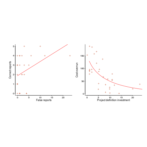
There are various technical ways of answering this question, but as a first pass I prefer a simple visual approach. How believable do the lines in the plots below appear to you (code+data)?

Now I could fire p-values at you, or show you various regression diagnostic plots. Would you be any the wiser? If you were it’s because you know some technical details and switched your brain on to use them. People hate having to switch their brain’s on; a technique that works with the brain switched off is much more practical.
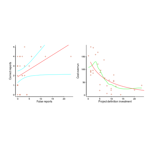
Adding confidence intervals to a plot is one technique (below left uses the default 95% interval) and another is to draw the line of a LOESS fit (below right uses R’s loess function):

The confidence intervals (in blue) are showing us that there is huge uncertainty in the fitted equation; no technical details needed.
The Local in LOESS means that some local set of points are used to fit each part of the line. That green line is telling us that the mean value of the data does not continue to increase, but levels off (the data is from a NASA presentation that showed an ever-increasing fitted line; which is the view the speaker wanted people to believe).
If somebody shows you a line that has been fitted to the data, ask to see the confidence intervals and the loess from a fit. The willingness of the person to show you these, or their ability to do so, will tell you a lot.
Recent Comments