Archive
Projects chapter added to “Empirical software engineering using R”
The Projects chapter of my Empirical software engineering book has been added to the draft pdf (download here).
This material turned out to be harder to bring together than I had expected.
Building software projects is a bit like making sausages in that you don’t want to know the details, or in this case those involved are not overly keen to reveal the data.
There are lots of papers on requirements, but remarkably little data (Soo Ling Lim’s work being the main exception).
There are lots of papers on effort prediction, but they tend to rehash the same data and the quality of research is poor (i.e., tweaking equations to get a better fit; no explanation of why the tweaks might have any connection to reality). I had not realised that Norden did all the heavy lifting on what is sometimes called the Putnam model; Putnam was essentially an evangelist. The Parr curve is a better model (sorry, no pdf), but lacked an evangelist.
Accurate estimates are unrealistic: lots of variation between different people and development groups, the client keeps changing the requirements and developer turnover is high.
I did turn up a few interesting data-sets and Rome came to the rescue in places.
I have been promised more data and am optimistic some will arrive.
As always, if you know of any interesting software engineering data, please tell me.
I’m looking to rerun the workshop on analyzing software engineering data. If anybody has a venue in central London, that holds 30 or so people+projector, and is willing to make it available at no charge for a series of free workshops over several Saturdays, please get in touch.
Reliability chapter next.
Is this fitted line believable? A visual answer
The only information contained in the statement that a straight line has been fitted to the data, is that the data contains two or more points; modern tools will find a fit to anything that is thrown at them, without raising a sweat; a quadratic equation requires three or more points and so on.
How believable is an equation that has been fitted to data?
There are various technical ways of answering this question, but as a first pass I prefer a simple visual approach. How believable do the lines in the plots below appear to you (code+data)?
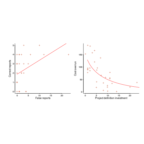
Now I could fire p-values at you, or show you various regression diagnostic plots. Would you be any the wiser? If you were it’s because you know some technical details and switched your brain on to use them. People hate having to switch their brain’s on; a technique that works with the brain switched off is much more practical.
Adding confidence intervals to a plot is one technique (below left uses the default 95% interval) and another is to draw the line of a LOESS fit (below right uses R’s loess function):
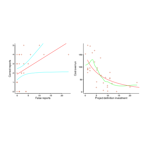
The confidence intervals (in blue) are showing us that there is huge uncertainty in the fitted equation; no technical details needed.
The Local in LOESS means that some local set of points are used to fit each part of the line. That green line is telling us that the mean value of the data does not continue to increase, but levels off (the data is from a NASA presentation that showed an ever-increasing fitted line; which is the view the speaker wanted people to believe).
If somebody shows you a line that has been fitted to the data, ask to see the confidence intervals and the loess from a fit. The willingness of the person to show you these, or their ability to do so, will tell you a lot.
Data analysis with a manual mindset
A lot of software engineering data continues to be analysed using techniques designed for manual implementation (i.e., executed without a computer). Yes, these days computers are being used to do the calculation, but they are being used to replicate the manual steps.
Statistical techniques are often available that are more powerful than the ‘manual’ techniques. They were not used during the manual-era because they are too computationally expensive to be done manually, or had not been invented yet; the bootstrap springs to mind.
What is the advantage of these needs-a-computer techniques?
The main advantage is not requiring that the data have a Normal distribution. While data having a Normal, or normal-like, distribution is common is the social sciences (a big consumer of statistical analysis), it is less common in software engineering. Software engineering data is often skewed (at least the data I have analysed) and what appear to be outliers are common.
It seems like every empirical paper I read uses a Mann-Whitney test or Wilcoxon signed-rank test to compare two samples, sometimes preceded by a statement that the data is close to being Normal, more often being silent on this topic, and occasionally putting some effort into showing the data is Normal or removing outliers to bring it closer to being Normally distributed.
Why not use a bootstrap technique and not have to bother about what distribution the data has?
I’m not sure whether the reason is lack of knowledge about the bootstrap or lack of confidence in not following the herd (i.e., what will everybody say if my paper does not use the techniques that everybody else uses?)
If you are living on a desert island and don’t have a computer, then you will want to use the manual techniques. But then you probably won’t be interested in analyzing software engineering data.
Histogram using log scale creates a visual artifact
The following plot appears in the paper Stack Overflow in Github: Any Snippets There?
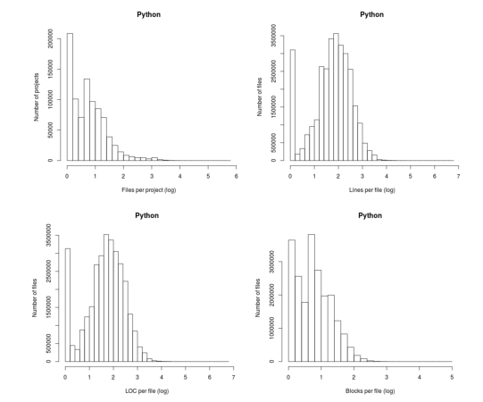
Don’t those twin peaks in the top-left/bottom-right plots reach out and grab your attention? I immediately thought of fitting a mixture of two Poisson distributions; No, No, No, something wrong here. The first question of data analysis is: Do I believe the data?
The possibility of fake data does not get asked until more likely possibilities have been examined first.
The y-axis is a count of things and the x-axis shows the things being counted; source files per project and functions per file, in this case.
All the measurements I know of show a decreasing trend for these things, e.g., lots of projects have a few files and a few projects have lots of files. Twin peaks is very unexpected.
I have serious problems believing this data, because it does not conform to my prior experience. What have the authors done wrong?
My first thought was that a measuring mistake had been made; for some reason values over a certain range were being incorrectly miscounted.
Then I saw the problem. The plot was of a histogram and the x-axis had a logarithmic scale. A logarithmic axis compresses the range in a non-linear fashion, which means that variable width bins have to be used for histograms and the y-axis represents density (not a count).
Taking logs and using the result to plot a histogram usually produces a curve having a distorted shape, not twin peaks. I think the twin peaks occur here because integer data are involved and the bin width just happened to have the ‘right’ value.
Looking at the plot below, the first bin contains values for x=1 (on an un-logged scale), the second bin for x=2, the third bin for x=3, but the fourth bin contains values for x=c(4, 5, 6). The nonlinear logarithmic compression, mapped to integers, means that the contents of three values are added to a single bin, creating a total that is larger than the third bin.
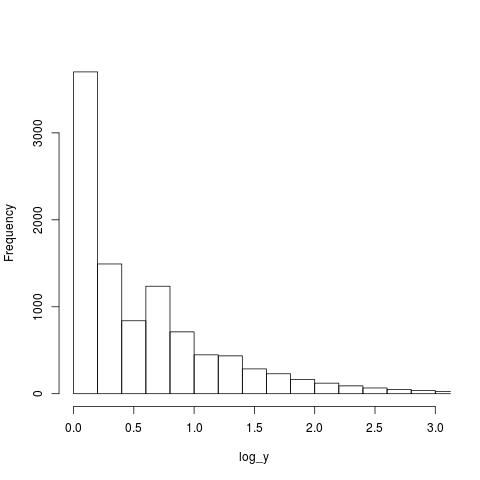
The R code that generated the above plot:
x=1:1e6 y=trunc(1e6/x^1.5) log_y=log10(y) hist(log_y, n=40, main="", xlim=c(0, 3)) |
I tried to mimic the pattern seen in the first histogram by trying various exponents of a power law (a common candidate for this kind of measurement), but couldn’t get anything to work.
Change the bin width can make the second peak disappear, or rather get smeared out. Still a useful pattern to look out for in the future.
Expected variability in a program’s SLOC
If 10 people independently implement the same specification in the same language, how much variation will there be in the length of their programs (measured in lines of code)?
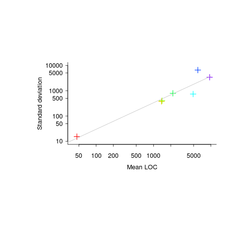
The data I have suggests that the standard deviation of program length is one quarter of the mean length, e.g., 10k mean length, 2.5k standard deviation.
The plot below (code+data) shows six points from the samples I have. The point in the bottom left is based on 6,300 C programs from a programming contest question requiring solutions to the 3n+1 problem and one of the points on the right comes from five Pascal compilers for the same processor.
Multiple implementations of the same specification, in the same language, are very rare. If you know of any, please let me know.
Recent Comments